Panel groups in Jitterbit App Builder
Panel groups are containers that you can use to visually group together related panels that reside on the same page. You can fine-tune the appearance and display of the information within these containers by using configuration options available when creating the groups, or through the use of styles.
Panel groups are not to be confused with Control groups, used for organizing controls in a panel.
Usage
Panel groups are used to organize panels on a page. For instance, the page pictured below has four panels: Orders, Shipping Information, Customer Information, and Order Details:
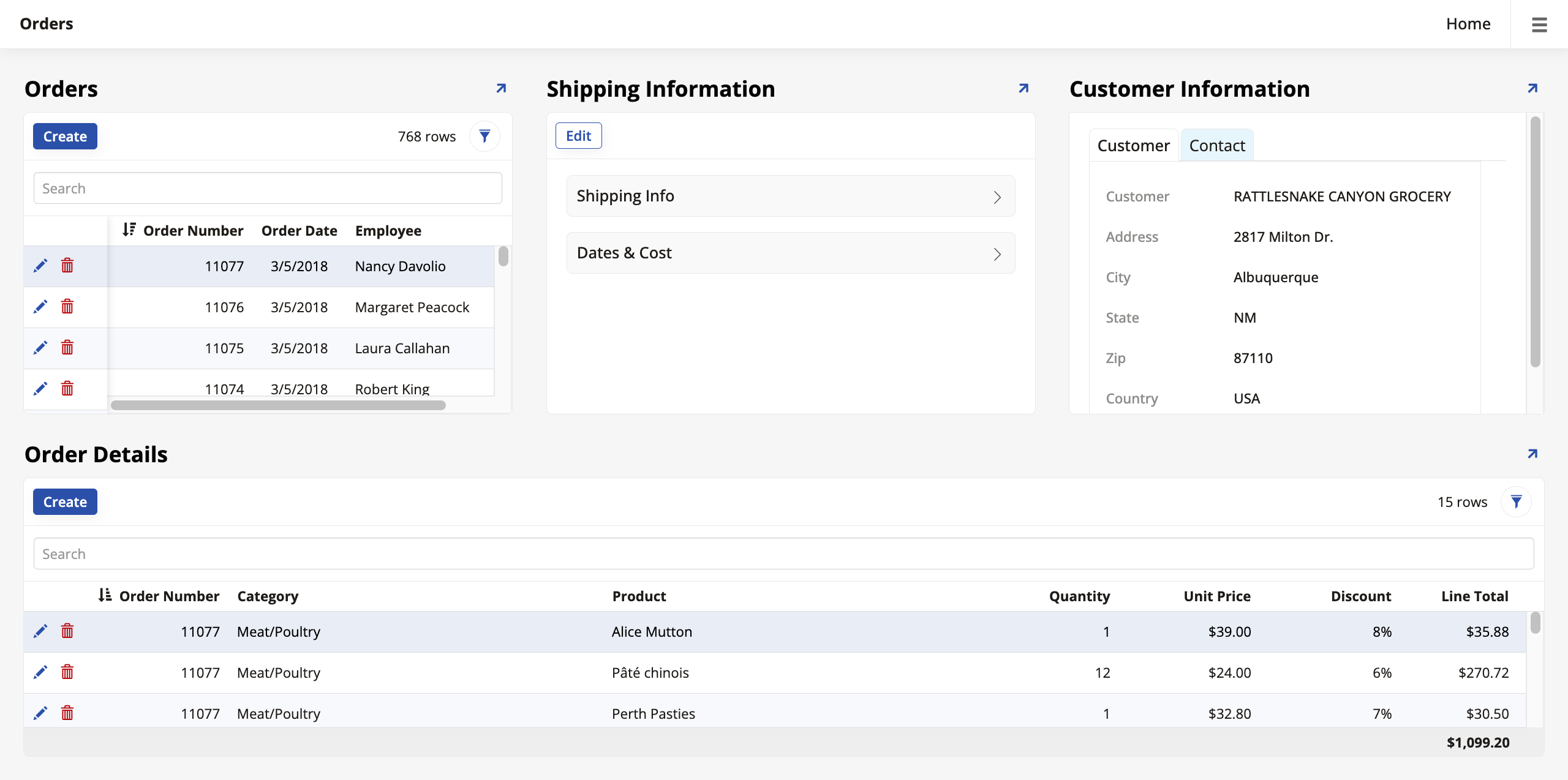
They are organized in two groups: the Orders, Shipping Information and Customer Information panels belong to one group and the Order Details panel belongs to another, and the developer chose to stack them in this order.
Create and organize panel groups
To create a panel group:
-
Go to App Workbench > Pages and select the page where you want to add a panel group.
-
Under Page Panel Layout, click Groups. The Panel Groups dialog opens.
-
Click + Group:
-
Enter a Name for the group.
-
Select a Parent for the group, which can be the page you're working on or even another group.
-
In the Order field, enter a number. This will determine the position of the new group. Other groups with an Order value that's smaller will be shown first, and those with a larger value will be shown later.
-
In the Layout Type field, select one of the options:
-
Side By Side: Places the panels next to each other, or side by side.
-
Stacked: Places the panels on separate lines, stacking one on top of the other.
-
Tabbed: Places the panels in different tabs, which users can click between.
-
-
(Optional) In the Size field, select a size for the group: Extra Extra Tiny, Extra Tiny, Tiny, Small, Regular, Large, or Extra Large. If you don't pick a size, App Builder will automatically adjust the panels in this group to the window size.
-
(Optional) This option is disabled by default. Enabling it makes the whole group scrollable, meaning that an overflowing panel makes a scrollbar for the group (including all panels in it) appear. When this option is disabled, each overflowing panel inside the group will have its own independent scrollbar.
-
-
Click the checkmark icon to save. The new group is now available.
Any panel on the page can now be assigned to the panel group you've created. Select the panel you want to assign to a group, and in the Panel tab, find the Parent field under Position. Use the dropdown menu to select a group and click Save.
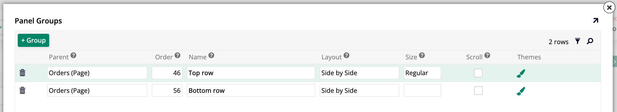
In the page pictured earlier, three panels were assigned to a panel group called Top row and one panel was assigned to another called Bottom row:
You can choose how to display your panel groups. In the edit screen of the page you're working on, locate the Layout field in the Page Properties section. Opening the dropdown menu reveals the following options:
-
Side by Side: The panel groups are shown side by side from left to right.
-
Stacked: The panel groups are shown in a stack from top to bottom.
-
Wizard: The panel groups are shown one after the other, like steps on a wizard. The UI displays Next and Previous buttons to aid user navigation.