Project pane Workflows tab in Jitterbit Studio
Introduction
The project pane's Workflows tab is one of three tabs accessible in the project pane.
The Workflows tab displays a hierarchically organized tree view of an open project's workflows, operations, and other components referenced within each operation.
Hierarchical tree
In a project, workflows are at the highest hierarchical level, followed by operations, and then by other components used as steps within an operation (made up of activities, transformations, or scripts).
This structure is represented in an open project's Workflows tab, where workflows appear at the top with a workflow icon to the left of the workflow's name. Workflows are expandable to reveal operations (indicated with an operation icon) indented below each workflow. Operations are expandable to reveal the components referenced as steps within each operation. Both workflows and operations are auto-assigned numbers to represent their position in the tree:
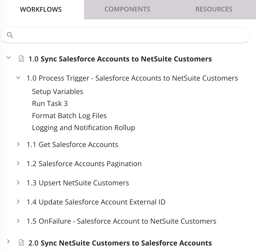
When each workflow and operation is expanded, all workflows, operations, and operation steps are displayed.
Search
To search within the Workflows tab, use the search box to enter a single keyword or keyword string. The hierarchical tree is automatically expanded to show workflows and components where the keyword string appears. The keyword string becomes bold (if not already) and purple within the name of the workflow or component:
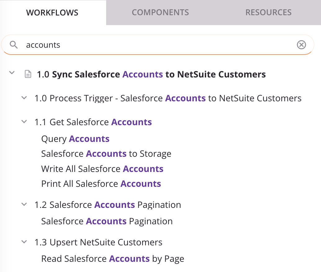
To clear the search, click the remove icon.
Expand and select items
To expand or collapse workflows or operations, click the carets next to the workflow or operation.
To expand or collapse all workflows and operations at once, click the expand all or collapse all icons next to the search box.
As you work on projects, Studio remembers the display states that a given user was last using for a given project, including whether the items in the project pane are expanded or collapsed.
Click a workflow to select it and open it on the design canvas. A selected workflow is displayed with a purple name and gray background:

When a workflow is expanded, click an operation within the workflow to select it and auto-scroll to it on the design canvas. A selected operation is displayed with a gray background:
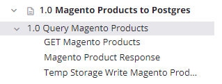
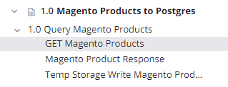
When an operation is expanded, click an operation step within the operation to select it and auto-scroll to it on the design canvas. A selected operation is displayed with a gray background:
The project pane can also be resized to be narrower or wider, as described in Project pane.
View validity errors
When using the Highlight Invalid Items option on the design canvas, the names of invalid workflows, operations, and other components appear in italics and the color red. When selected, an invalid workflow is displayed with a pink background.
If the workflow or component is implicitly invalid, an error icon is also displayed:
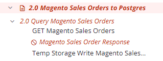
You can view the validation errors associated with invalid workflows and components as described in Workflow validity, Operation validity, and Component validity.
Actions menus
To open a menu of actions to take on each workflow or component, do one of these:
- Right-click the item.
- Hover over the item, and then click the actions menu icon.
The actions available in each menu depend on the context and vary according to the item.
Workflow actions menu
The workflow actions menu includes these actions:
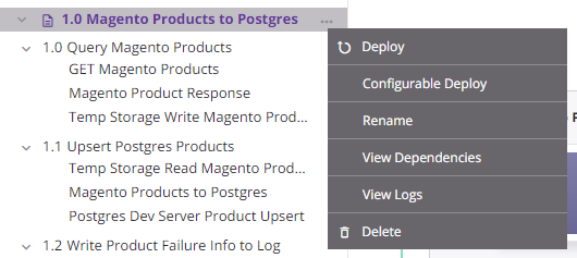
| Menu Item | Description |
|---|---|
| Deploy deploys the workflow and its dependencies (see Workflow deployment). | |
| Configurable Deploy opens the deployment screen, where you can select workflows and operations to deploy (see Workflow deployment). | |
| Rename positions the cursor on the workflow name for you to make any edits as necessary. | |
| View Dependencies changes the view in the project pane to display any other parts of the project that the specific workflow is dependent on (see Workflow dependencies and deletion). | |
| View Logs opens the operation log screen, which includes logs for any operations contained in the workflow that have been deployed and executed, as well as any operations chained from the workflow that have been deployed and executed (see Operation logs). | |
| Delete permanently deletes the workflow (see Workflow dependencies and deletion). |
Component actions menu
Some actions are available only on certain types of components, as detailed in the subsections below:
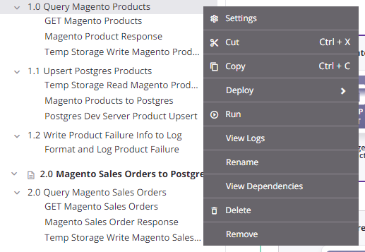
- Operations: The actions menu for operations (shown in the left image) has unique items such as Settings, Run, and View Logs and unique sub-menus for Deploy. It also includes common actions such as Cut, Copy, Rename, View Dependencies, Delete, and Remove.
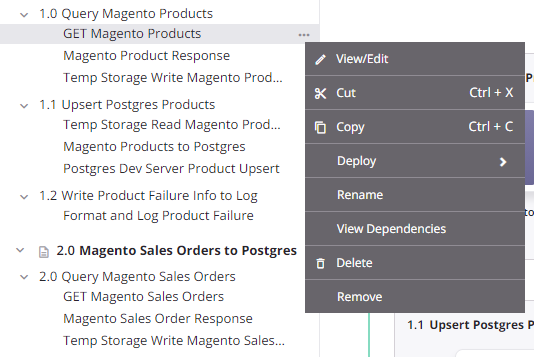
- Activities and tools: The actions menus for these components (shown in the image on the right) share the same actions, including View/Edit, Cut, Copy, Rename, View Dependencies, Delete, and Remove.
Operation actions menu
Activity and tool actions menu
Operations
These items are available in an operation's actions menu:
| Menu Item | Description |
|---|---|
Settings opens the operation settings, containing three tabs:
|
|
| Publish as an API opens a dialog to configure and publish an API Manager custom API to be used to expose the operation for consumption (see Publish as an API). The number of APIs the operation is assigned to is displayed next to this menu item. This action is visible only when the operation has no undeployed changes. | |
| Publish as an API using AI opens the APIM AI Assistant, which guides you through publishing the operation as an API through interactive prompts. This action is visible only when the operation has no undeployed changes and the organization is licensed for the APIM AI Assistant. | |
| Cut places a copy of the operation on your clipboard and deletes the original operation from the project (see Operation reuse). | |
| Copy places a copy of the operation on your clipboard (see Operation reuse). | |
|
Duplicate shows these menu actions (see Operation reuse):
|
|
Deploy shows these menu actions:
|
| Run runs an already-deployed operation and any downstream (linked) operations (see Operation deployment and execution). | |
| View Logs opens the operation log screen, which includes logs for this operation and any child operations that have been deployed and executed (see Operation logs). | |
| Rename positions the cursor on the operation name for you to make any edits as necessary. | |
| View Dependencies changes the view in the project pane to display any other parts of the project that the specific operation is dependent on (see Operation dependencies, deletion, and removal). | |
| Add to Group opens a dialog to create a new custom group or to add the component to an existing group (see Component groups). | |
| Selective transfer opens a configuration screen where you can select specific components to transfer to another environment. For more information, see Project transfer. | |
| Delete permanently deletes the component (see Operation dependencies, deletion, and removal). | |
| Remove removes the operation from the design canvas. Any other references to the operation, such as within scripts, transformations, or configuration settings, are unaffected (see Operation dependencies, deletion, and removal). |
Activities and tools
These actions are available for activities and tools:
| Menu Item | Description |
|---|---|
| View/Edit opens the configuration screen for the component. For details on configuration, refer to the respective component under Connectors, Scripts, or Transformations. | |
| Cut places a copy of the component on your clipboard and deletes the original component from the project (see Component reuse). | |
| Copy places a copy of the component on your clipboard (see Component reuse). | |
| Rename positions the cursor on the component name for you to make any edits as necessary. You can also double-click a component name to enter rename mode. | |
| View Dependencies changes the view in the project pane to display any other parts of the project that the specific component is dependent on (see Component dependencies, deletion, and removal). | |
| Delete permanently deletes the component (see Component dependencies, deletion, and removal). | |
| Remove removes the component as an operation step from the operation. Any other references to the component, such as within scripts, transformations, or configuration settings, are unaffected (see Component dependencies, deletion, and removal). |
Reorder workflows and operations
Workflows and operations can be reordered by dragging and dropping them in the project tree.
Reorder workflows
To reorder workflows, drag a workflow to another location in the project tree:
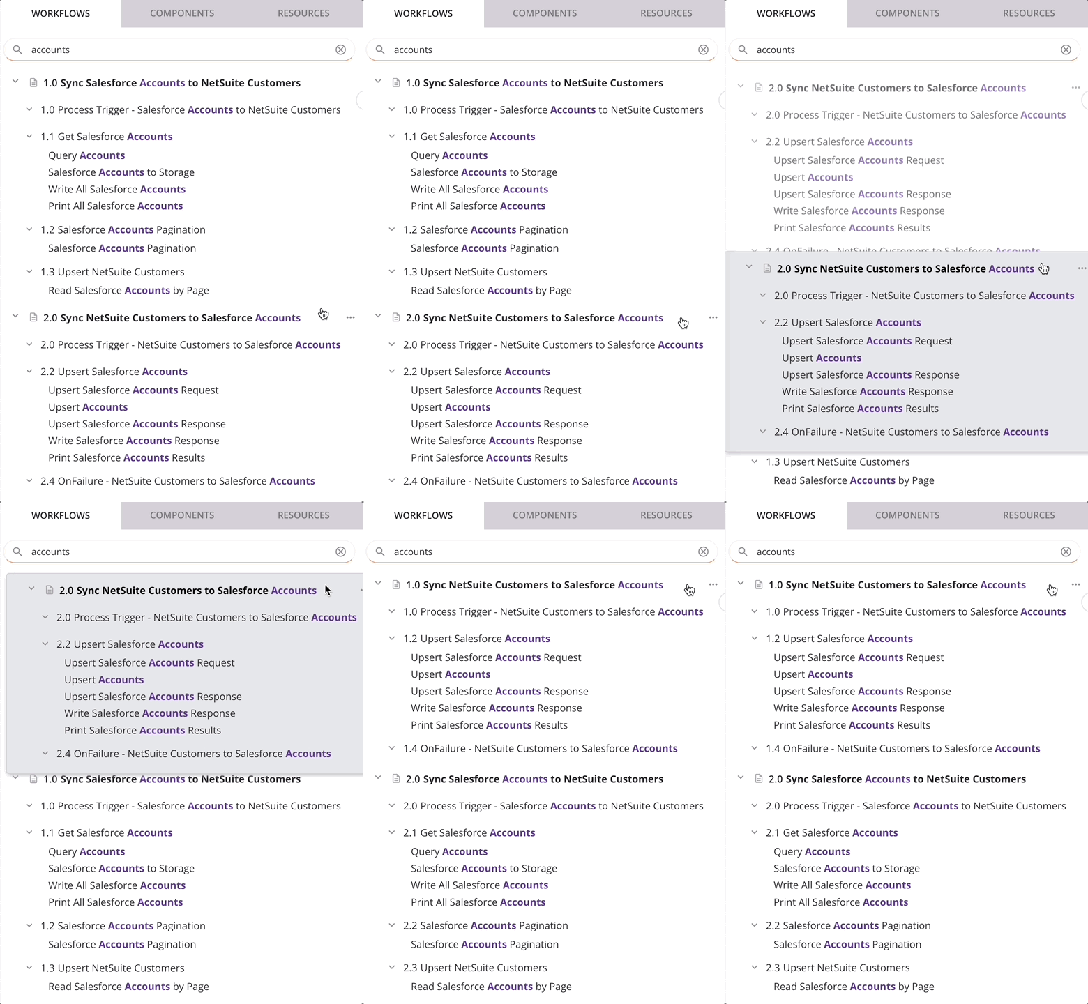
This action has a cascading effect of renumbering both the workflows and the operations contained within each workflow.
Reorder operations
To reorder operations, drag an operation name to another location within or between workflows in the project tree:
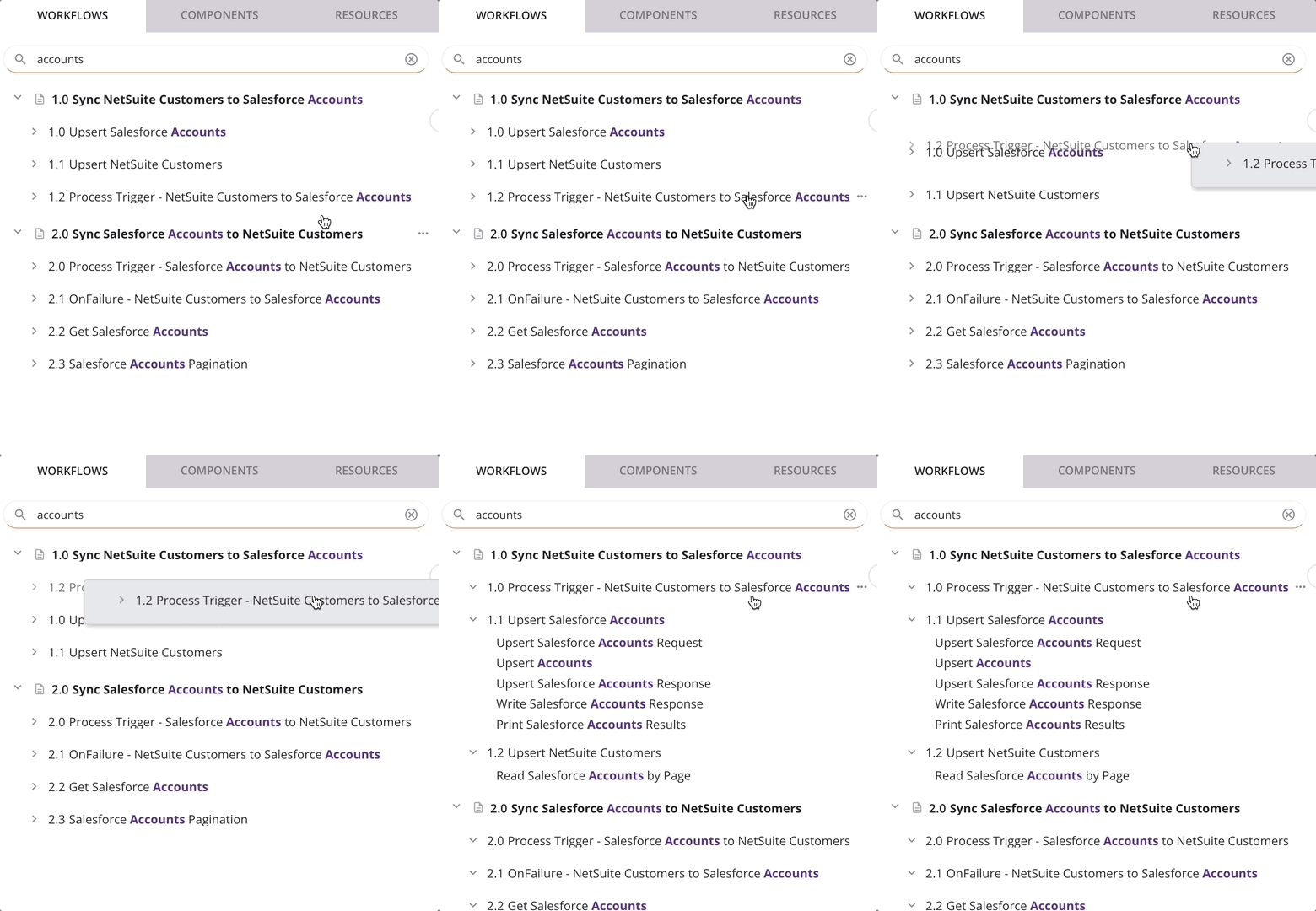
This action has a cascading effect of renumbering the operations above or below it in the tree.
Tip
While dragging an operation, you can use the escape (ESC) key on your keyboard to cancel the move.