Autocomplete (control type) in Jitterbit App Builder
The Autocomplete control type lets users quickly fill in a field by choosing from values that were already entered in that column. For example, a Ship City field using autocomplete suggests cities that were previously entered for other orders, so users don't have to type the full city name or maintain a separate list of valid cities.
When a user edits a field configured with autocomplete, App Builder shows a dropdown list of values already stored in that column, filtered as the user types. Unlike a List control, Autocomplete doesn't require a separate list object to supply the dropdown's values: it can pull matching values directly from the column itself, or from a specific data object if one is configured.
Set up an Autocomplete control
To change an existing control to use the Autocomplete control type:
- Navigate to the page containing the control.
- Click the hamburger icon to open the action drawer, then select Live Designer.
- Click the control in the page view to select it. The live designer shows edit options for that control.
-
In the Control Properties tab, change the Control Type field to AutoComplete:
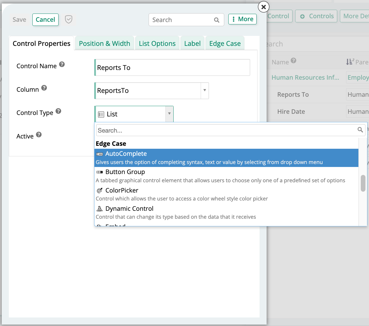
-
Click Save.
Refresh the page to confirm the update. The control now shows a dropdown list populated with values previously entered in that column.
To add a new control using the Autocomplete control type instead of changing an existing one, use the Add a Control dialog and select AutoComplete as the Control Type.
Matching types
Autocomplete supports three matching options for filtering the dropdown:
- Any: Shows all entries containing the typed characters.
- Exact: Shows only entries that exactly match the typed text.
- Starts With: Shows only entries that start with the typed text.