List (control type) in Jitterbit App Builder
A List control lets users select a value from a predefined list of options instead of typing free-form text, and can also substitute a column's raw key value with a human-legible title. For example, a Products panel might use a List control so its Product field displays each product's name instead of the underlying product ID.
Before you can use the List control type on a column, you need a list object already defined in the business layer to supply the dropdown's values. See Create a list object in Lesson 3 of the Introduction to App Builder tutorial series for how to create one.
Add a List control
To add a new List control to a panel, use the Add a Control dialog and select List as the Control Type:
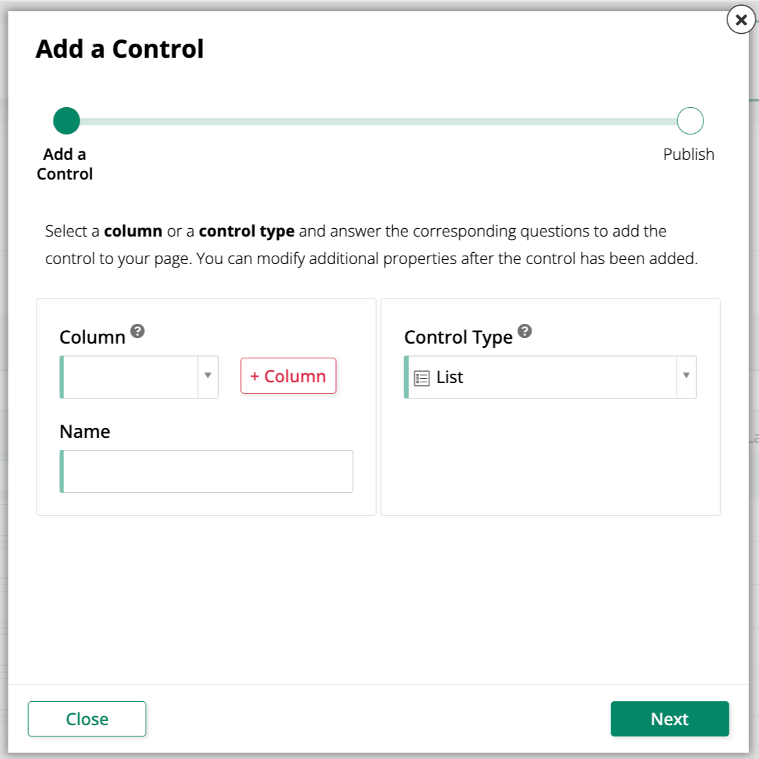
This reveals the following fields:
- Source: The list object that supplies the dropdown's values.
- Key (Column): The column from the source object that uniquely identifies each record, typically its primary key.
- Title (Column): The column from the source object containing the human-legible value to display.
If the column you select is a foreign key, App Builder automatically selects List for you. If the source list object's columns already use the correct Column usage types, App Builder also pre-populates Key (Column) and Title (Column).
Convert an existing control to a List control
To change an existing control to use the List control type:
-
Navigate to the control, using either the Live Designer or the App Workbench:
-
From the app preview, open the page containing the control and select Action Drawer > Live Designer.
-
From the App Workbench, open the Pages tab, then in the Pages panel, locate the page containing the control and either double-click its row or click the Open record icon. In the Page Panel Layout panel, find the panel that houses the control and click Controls.
-
-
If you're in the Live Designer, click the control in the page view; this will populate the Live Designer with edit options for that control. If you're in the App Workbench, in the Controls panel, find the control and either double-click its row or click the Open record icon at the end of its row; App Builder opens a dialog similar to the Live Designer's.
-
In the Control Properties tab, set the Control Type field to List.
-
In the List Options tab, configure the Source, Key (Column), and Title (Column) fields (see Add a List control for details).
-
Click Save.
Refresh the application view to confirm the update. The control now displays the title value instead of the raw key, and when editing a record, presents the available options as a dropdown instead of a free-form text field.
Show a subtitle in the list menu
A List control's menu can show a second line of text, a subtitle, below each option's title. For example, a Product list might show each product's name as the title and its category as the subtitle, to help distinguish between similarly named products.
To configure a subtitle:
-
Navigate to the control, using either the Live Designer or the App Workbench:
-
From the app preview, open the page containing the control and select Action Drawer > Live Designer.
-
From the App Workbench, open the Pages tab, then in the Pages panel, locate the page containing the control and either double-click its row or click the Open record icon. In the Page Panel Layout panel, find the panel that houses the control and click Controls.
-
-
If you're in the Live Designer, click the control in the page view; this will populate the Live Designer with edit options for that control. If you're in the App Workbench, in the Controls panel, find the control and either double-click its row or click the Open record icon at the end of its row; App Builder opens a dialog similar to the Live Designer's.
-
In the List Options tab, expand List Properties (Additional) and set Subtitle (Column) to the column you want to display as the subtitle.
-
Click Save.
-
(Optional) To keep the subtitle visible even when the control is in display mode, rather than only while a value is being picked, open the Edge Case tab and expand the Rare List Properties group (prefixed with the control's source list object, for example Region - Rare List Properties). Select Keep subtitle in display mode, then click Save again.
Refresh the application view to confirm the update.