Control types in Jitterbit App Builder
Overview
Control Type is a field that determines how a control's data is displayed, and specifically what the control looks like on the page. For example, setting a control's Control Type to Checkbox displays its data as a checkbox tied to a boolean value, while setting it to Date displays a calendar picker instead. Most control types require selecting a data object to source their data from, though some, such as Line and Space, do not.
You set Control Type when you add a control to a panel, in the Add a Control dialog, or change it afterward from the control's own Control Properties tab. See Controls for the broader concept of what a control is and how controls fit into panels and pages.
The Add a Control dialog groups its control types into three categories, each listed in its own table below: Basic, Groups, and Edge Case.
Add a control
To add a control to a panel, open the panel's control list and click + Control to open the Add a Control dialog:
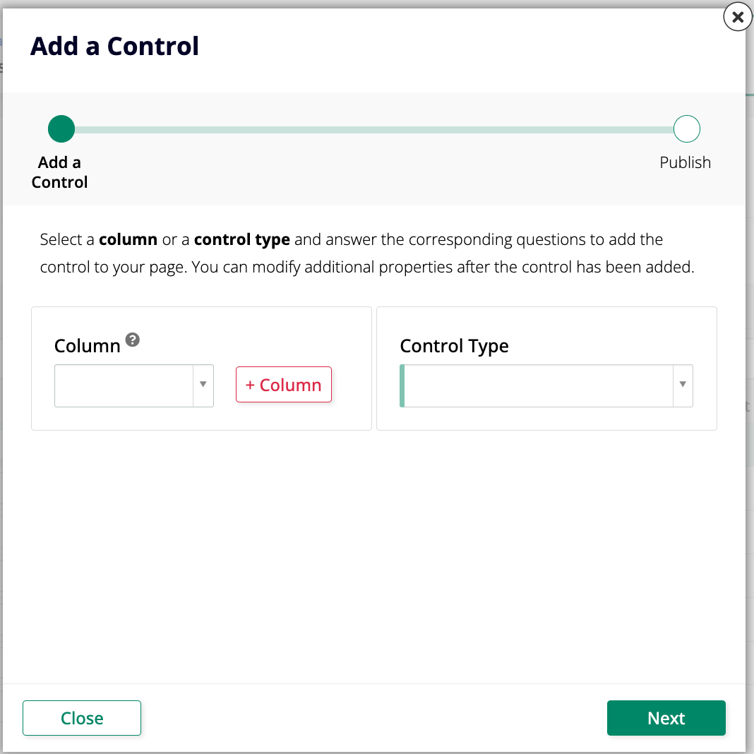
Select a Column, or a Control Type directly if the control doesn't map to a column, then follow the dialog's remaining steps. See Controls for the full procedure, including how to open a panel's control list and how to add several controls at once.
Basic
The following control types appear under Basic in the Control Type dropdown:
| Control Type | Description |
|---|---|
| Button | Places a clickable button on a panel. |
| Checkbox | Displays and edits a boolean value as a checkbox. |
| Date | Displays and edits a date, a time, or both. |
| List | Lets a user select a value from a predefined list of options. |
| Numeric | Displays and edits a number stored in a column. |
| Radio | Lets a user choose one of a predefined set of options, displayed as radio buttons. Requires a source data object to pull the Key and Title values from, and is available on all three Dynamic panel types (Grid, Tile, and Form), plus Lane. |
| Text | Displays and edits a column's value as plain text. |
| Text Area | Displays and edits a column's text value in a larger, multi-line region. |
Groups
The following control types appear under Groups in the Control Type dropdown:
| Control Type | Description |
|---|---|
| Accordion | Groups other controls so they're shown or hidden in an accordion that users can open and close. |
| Field Group | Groups other controls together in a titled container with a customizable layout. |
| Tab | Groups other controls so they're shown in tabs that users can click between. |
Edge Case
The following control types appear under Edge Case in the Control Type dropdown:
| Control Type | Description |
|---|---|
| Autocomplete | Lets a user quickly fill in a field by choosing from values already entered in that column. |
| Button Group | Lets a user choose one of a predefined set of options, as clickable buttons. See below for details. |
| Color Picker | Displays a color swatch and lets users pick a new color from a color wheel. |
| Dynamic | Renders as a different control type at runtime, based on the state of the underlying data object. |
| Embed | Embeds a file from a URL stored in a table column, which could be a binary object or embedded within a Form panel. |
| File | Lets a user upload a file. The column it's bound to must be binary for the control to work properly. |
| HTML | Displays HTML content from a bound column, typed directly into a WYSIWYG (What You See Is What You Get) editor. |
| Image | Displays an image from App Builder's image library. |
| Inline Menu | Displays one of your application's existing menus directly inside a panel. Available only on Form panels. |
| Line | Displays a thin, horizontal line when added to a panel. Primarily designed for use in a Form panel. |
| Password | Masks a column's text value as dots. |
| Progress Bar | Visually cues how far along a process or task is. See below for details. |
| Space | Inserts visual white space without needing custom HTML. Primarily designed for use in a Form panel. |
| Tags | Lets a user select one or more values from a list, instead of just one. |
| Template | Binds a reusable HTML template to a panel. See below for details. |
Button Group
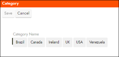
A Button Group control sources its data the same way a Radio control does, but displays clickable buttons instead of radio buttons to set the value. Like other controls, Button Group supports Excel Mode; unlike a Checkbox control, which changes appearance to autosave its value in Excel Mode, a Button Group control still displays as buttons. You can control some of its styles using themes applied to the field.
Progress Bar
A Progress Bar control visually cues how far along a process or task is. For example, you might display a Progress Bar to show how complete a multi-field form currently is. The bar's fill percentage comes from a database value between 0 and 1, where 1 equals 100% (a value of 0.4 displays as 40%).
Progress Bar supports two sub-types, set through Control Subtype:
- Stacked displays the label and percent value under the bar.
- Normal bar displays the percent inside the bar.
You can format the displayed text using Format String, found in Edge Case, and further customize the control's appearance using Styles.

Template
A Template control binds a reusable HTML template to a panel, selected in its Template field from templates created in Look & Feel > Templates. Available templates are grouped by source: App Builder (built-in), Third Party (such as a Google Maps Directions or LinkedIn embed), and Customer (templates your organization created). See Create and use HTML templates for how to create a custom template.