Dynamically changing an icon in Jitterbit App Builder
Overview
An icon or image on a page is normally fixed at design time, but you can also make it change dynamically based on the underlying data. For example, on a page that shows the people invited to an event, you could show a thumbs-up or thumbs-down icon depending on whether each person is attending.
Dynamic icons rely on the Image control: App Builder resolves both its built-in icon sets and any images you upload through the same unified image library, so a Business Object column or a List control can reference a built-in icon by name, or any image by its Relative URL GUID. This page covers two techniques for selecting an icon based on data: an IIF statement, best suited to two or three fixed options, and a List control driven by a data column, which scales to any number of options.
For a list of the icon sets that ship with App Builder, including Font Awesome, see Icon categories. To browse the named icons available in the Font Awesome library specifically, see fontawesome.com.
If you're using App Builder 4.67 or earlier, see App Builder 4.67 and earlier instead.
This page covers the following:
-
Look up an image's Relative URL GUID
Both techniques below reference an icon by this value. -
Use an
IIFstatement
A quick approach best suited to two or three fixed options. -
Use a List control with an Icon column
A more scalable approach driven by a data column instead of a formula.
Look up an image's Relative URL GUID
Both techniques on this page can reference a built-in icon directly by name (see the examples below). To reference an uploaded image instead, or to avoid typing the icon's exact name, use its Relative URL GUID, a unique identifier for a specific record in the image library. To look up this value for an image already in the library:
- Open the image in App Builder.
-
Copy the value from the Relative URL field that appears after
.../image/.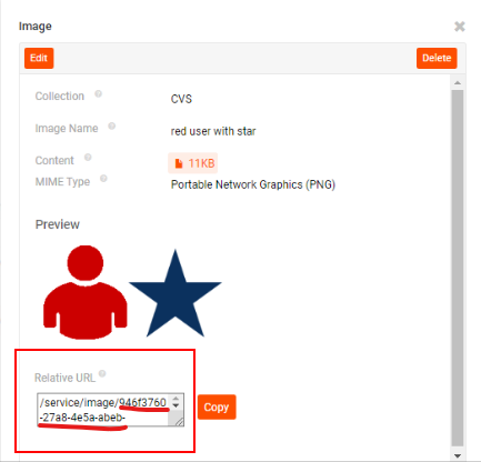
Use an IIF statement
For a status with only two or three fixed options, you can insert an IIF statement into your Business Object to determine which icon to display, referencing each option by name or by Relative URL GUID. For example, to denote attendance for an event, you could use an expression such as IIF(Status = Accept, 'thumbs-up', 'thumbs-down'), using each built-in icon's name directly. To reference an uploaded image instead, substitute its Relative URL GUID (looked up above) for the name.
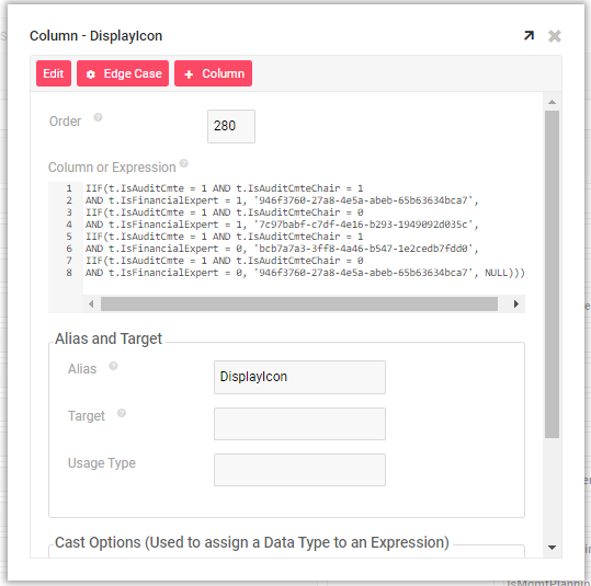
This approach works well for a couple of fixed options, but doesn't scale. Adding a third state, such as a question mark icon for an invitation that hasn't been accepted or declined yet, means writing a larger and more complicated IIF statement, and every additional state means more logic to maintain. For a status with more options, or one that may grow over time, use a List control with an Icon column instead.
Use a List control with an Icon column
A List control is typically used to display a list of text values, but it can also display an image alongside the text, or the image alone. Because the icon comes from a column on the underlying table rather than from logic you maintain, this technique scales to any number of states: adding a new option only means adding a new row, not rewriting an IIF statement.
To display a dynamic icon this way, you need a column that stores each row's Relative URL GUID, so the List control can look up the right image per record. Continuing the event attendance example, now expanded to a third Maybe status:
- Create a
Statustable withStatusID,Status, andIconcolumns. - Populate the
Iconcolumn with each status's Relative URL GUID (looked up as described above), one row per status, for exampleAccept,Decline, andMaybe. - Create a Business Object that joins to the
Statustable, bringing in itsIconcolumn. For example, an object namedEmployee (Status). - Build a panel on that Business Object, then add a List control using the object's
StatusIDandStatuscolumns to display the options. - In the control's Additional Attributes, set Icon (Column) to the
Iconcolumn. A List control always renders this value as an icon.
Once configured, App Builder resolves each row's Icon value against the image library and displays the corresponding icon next to that row's option, the same way it already uses the row's Status value as the option's label.