Image (control type) in Jitterbit App Builder
An Image control displays an image from App Builder's unified image library on a panel in the UI layer. This library holds both photos you upload and App Builder's built-in icon sets, so the same Image control can display a user-uploaded photo, a static logo, or one of the built-in icons, depending on which image you select and how you set Image Purpose.
Add an Image control
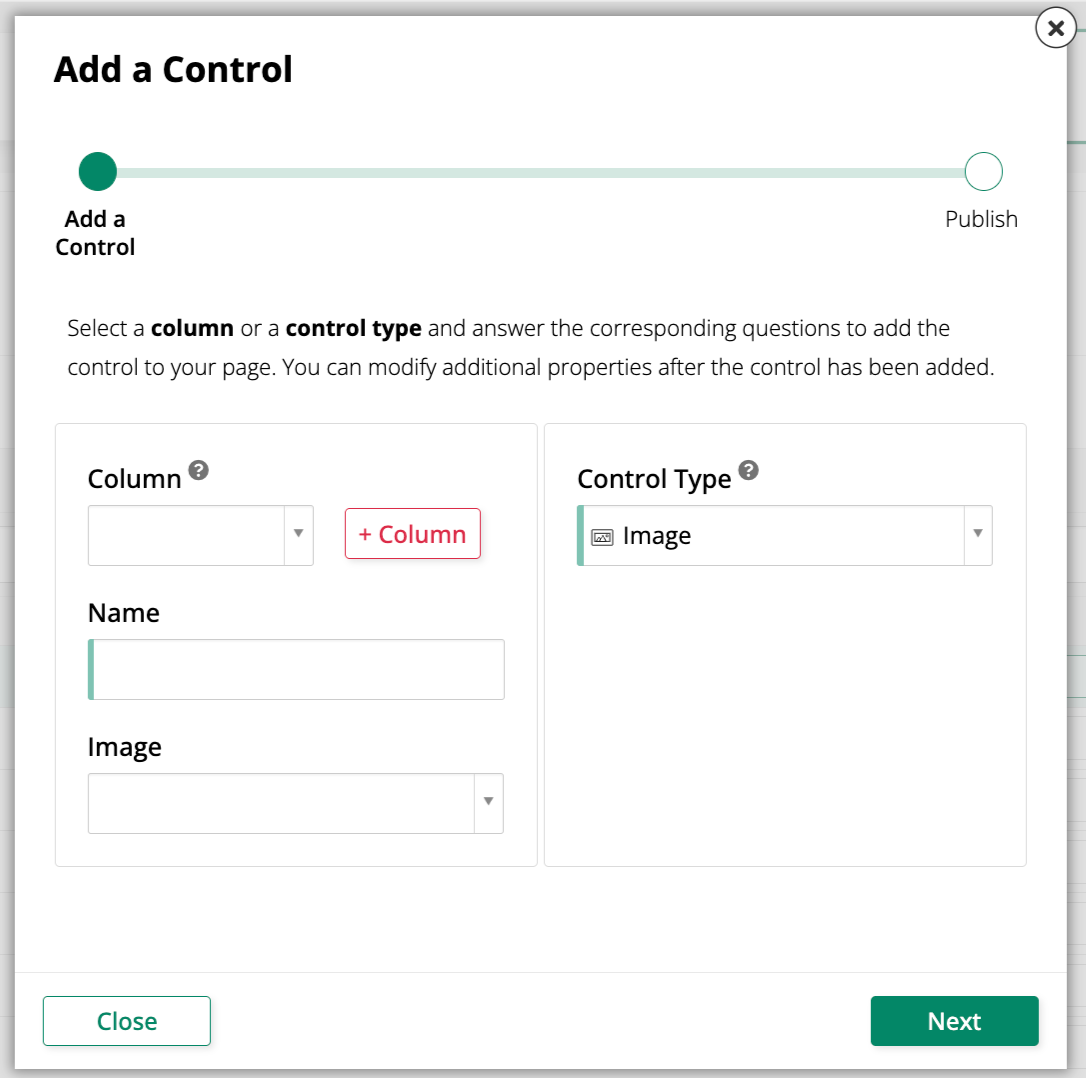
To add a new Image control to a panel, use the Add a Control dialog and select Image as the Control Type:
Convert an existing control to an Image control
To change an existing control to use the Image control type:
-
Navigate to the control, using either the Live Designer or the App Workbench:
-
From the app preview, open the page containing the control and select Action Drawer > Live Designer.
-
From the App Workbench, open the Pages tab, then in the Pages panel, locate the page containing the control and either double-click its row or click the Open record icon. In the Page Panel Layout panel, find the panel that houses the control and click Controls.
-
-
If you're in the Live Designer, click the control in the page view; this will populate the Live Designer with edit options for that control. If you're in the App Workbench, in the Controls panel, find the control and either double-click its row or click the Open record icon at the end of its row; App Builder opens a dialog similar to the Live Designer's.
-
In the Control Properties tab, set the Control Type field to Image.
-
In the Image tab, use the Image field to search for and select an image. The dropdown includes both uploaded photos and App Builder's built-in icon sets; see Icon categories for the available icon sets.
-
Set Image Purpose to Icon or Photo to match the kind of image you selected. This setting controls only how the image renders; it doesn't filter which images are available to select.
-
(Optional) Set Badge Source (Column) to a column value to display a numeric badge on the image. See Badges with buttons for details.
-
Click Save.
Refresh the application view to confirm the update.
Icon categories
Icons are organized by categories in selection dropdowns such as the ones present in the Icon field in the Menu Item dialog or the Image field on a Button or Image control. As you type in the dropdown's search field, matching icons appear in a list grouped under category headings representing different icon sources.
The following categories are available:
| Category | Source | Description |
|---|---|---|
| Brands | Font Awesome Brands | Logos for companies and services (for example, youtube, youtube-square). |
| Solid | Font Awesome Solid | The default, solid-filled Font Awesome icon style. |
| Regular | Font Awesome Regular | An outlined, unfilled variant of the Font Awesome icon style. |
| Material Filled | Google Material Icons | A solid-filled variant of Google's Material Icons library. |
| Material Rounded | Google Material Icons | A variant of Google's Material Icons library with rounded corners. |
| Material Sharp | Google Material Icons | A variant of Google's Material Icons library with sharp corners. |
Note
Google distributes its Material Icons library as an outlined font, "Material Icons Outlined." App Builder applies a fill to this font and exposes the result here as Material Filled to align with Font Awesome's solid style.
For more information on switching icon styles currently in use, see Change button icon from solid to regular fill.
Upload and replace a photo
Pair an Image control with a File control to let users upload a new photo that replaces the one currently displayed. Set the paired Image control's Image Purpose to Photo for this use case.
App Builder 4.67 and earlier
In App Builder 4.67 and earlier, built-in icons and uploaded images are stored separately, so the following behavior differs from what this page describes:
- Built-in icons are displayed using a separate Icon control type. To display an icon dynamically, pass the icon's CSS name (for example,
times-circle-o) to the Icon control. - The Image field on Image, Checkbox, and List controls lists only uploaded images, not the built-in icon sets.
See Icon categories for the icon sets available in App Builder.