User guide for navigating the user interface in Jitterbit App Builder
Overview
This guide walks through navigating App Builder's user interface, covering the following topics:
- Panel layout service: The building blocks App Builder uses to lay out a page: panels, layouts, slides, and screen sizes.
- Navigating in App Builder: How pages and panels are organized, and an overview of every panel type.
- Navigating between pages: How pages link to each other, including nested menus and popup pages.
- Editing panels: Adding, editing, and deleting panel data, and tracking changes with Audit Lite and Full Audit.
- Troubleshooting: Common navigation issues and how to resolve them.
For help installing and configuring App Builder for the first time, see the Installation guide. For additional questions, contact vinylinfo@jitterbit.com.
App Builder is a browser-based development platform that lets multiple users build web applications against any number of data sources, for use cases ranging from displaying customer information and inventory lists to automating payroll updates and building custom customer portals. App Builder is platform-agnostic: it runs in any modern browser, connects to data sources from virtually every major database provider, and its responsive design automatically adapts to any screen size, including mobile devices.
Panel layout service
The Panel Layout Service is App Builder's proprietary responsive design system: it lets you design a page once, and have App Builder render it appropriately no matter the screen size. An App Builder application is built from the following basic components, which the Panel layout service arranges (see also Panel, Page, Layout, and Control in the glossary):
-
Panel: The basic building block of a page. App Builder always displays at least one panel, even on the smallest screen. A panel presents information to the user, whether a collection of rows of data or a single record, formatted in a structured (horizontal or vertical tabular) or unstructured, custom way.
-
Page: A collection of panels. A page might have just one panel, or several.
-
Layout: Defines how panels are displayed when they're all visible on the screen at once. For example, panels may be stacked vertically (panel A above panel B) or horizontally (panel A to the left of panel B). App Builder also supports grouping panels, so that panel A and panel B can be side by side while both sit above panel C, with A and B forming their own group.
-
Slide: A subset of panels rendered on a screen at once. When not all panels fit on the screen, App Builder renders the appropriate subset as a slide, and lets the user flick between slides to see the rest.
-
Screen Size: Measured in pixel height and width, and converted by App Builder into a number of available panels. For example, a screen that fits one panel is 1x1 (one panel high, one wide); a wider screen that fits two panels side by side but still only one panel high is 1x2. Screen size helps App Builder determine the best layout for panels and groups.
-
Control: What a panel displays: a full grid of data, a single entry, a button, or a variety of other options. Controls let users choose what information the application shows, and how it's used.
App Builder uses a page's layout to determine which panels to render, and where. Depending on screen size, App Builder may reduce the number of panels shown while still honoring the layout; the Panel Layout Service decides which panels to omit, and how to lay out the ones that remain.
When the Panel layout service omits panels, it creates a collection of slides, each containing a subset of panels laid out according to the page's layout. The user sees the first slide initially, and can navigate to any additional slides to see the rest.
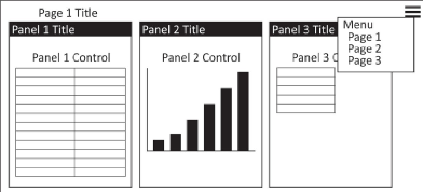
Navigating in App Builder
App Builder's responsive layout uses flexible, proportion-based grids (relative percentages rather than fixed pixel units) to give applications a consistent viewing experience across devices. Panels are grouped and displayed according to their order, a value the application designer sets, with lower numbers taking priority. On a mobile device, App Builder shows only the highest-priority panels on screen; the rest are reachable by scrolling with the arrows in the upper right-hand corner, or through the Action Drawer. On a smaller screen generally, additional scrolling may be necessary to reach every panel in the application.
To start using App Builder, enter your username and password on the login screen (contact an administrator if you don't have credentials). The Site Menu page then shows every application you have access to, arranged by menu priority.
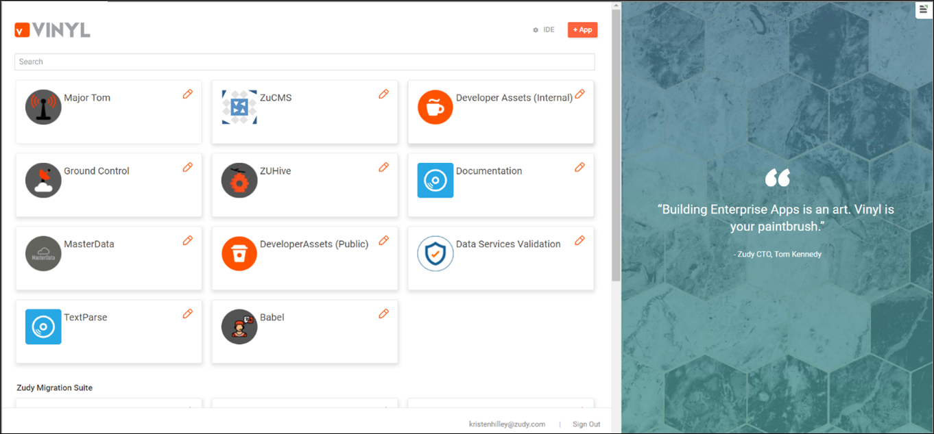
Pages
An App Builder application is the overall set of panels and displays that fulfill a specific need using the available data. Every application contains at least one page, where the data itself is displayed. Each page is reachable from the navigation menu or as a link on another page, and pages can cross-reference each other using text links and popup pages.
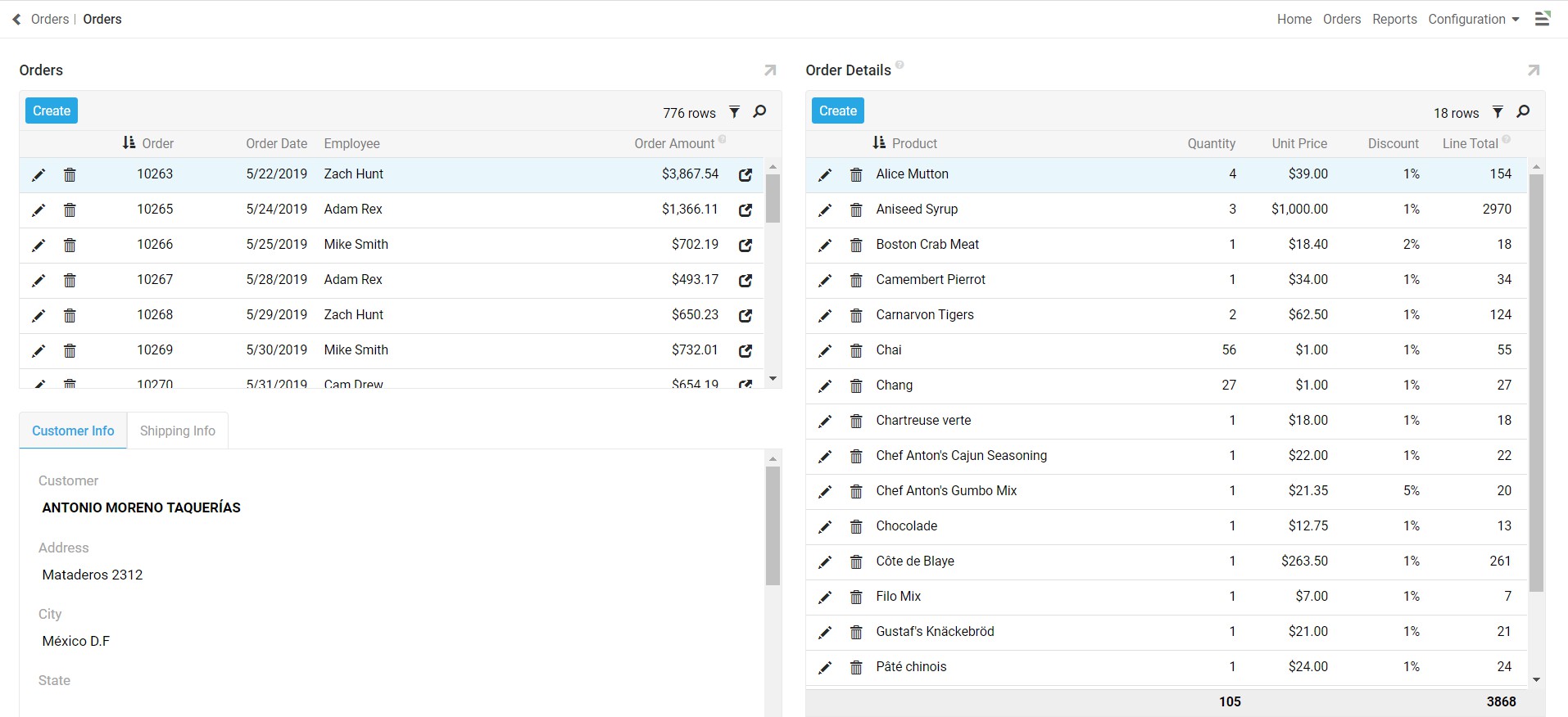
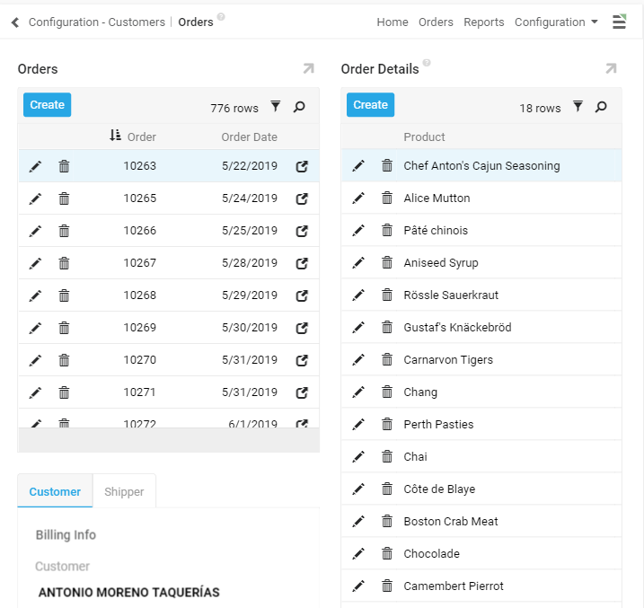
Each page is made up of one or more panels, whether a single large panel or several smaller ones grouped together. Because of App Builder's responsive design, the number of panels shown at once varies by device, based on screen size and resolution; if a screen is too small to show every panel at once, App Builder automatically scales and repositions the page's panels for the best experience.
Wizard pages
App Builder application pages support three layout options:
- Side by Side: App Builder displays panels from left to right, based on order.
- Stacked: App Builder displays panels from top to bottom, based on order.
- Wizard: App Builder displays panels one at a time, with buttons to navigate between them.
Side by Side and Stacked are straightforward: they affect how panels are laid out on the page. Wizard layouts instead affect how the entire page is presented, showing panels one at a time with Previous, Next, and/or Finish buttons.
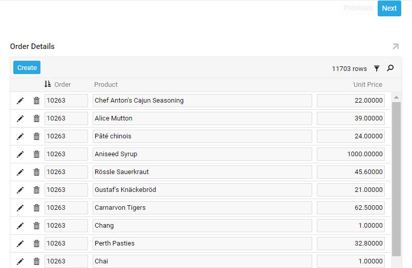
On most application pages, click an Edit button or the Pencil edit icon to edit a data table's fields. On Wizard pages, click any field instead to make every field on that panel editable; click through to the last panel and click Finish to save your changes, or click the X in the upper right-hand corner to dismiss the page without saving.
Panels
Every panel is made up of controls. A control is a defined set of data displayed within a panel, from a subset of a database table's columns to a button or a chart's values. The panel type used determines how a control is displayed.
When a panel contains more controls than fit on the screen, click the up Arrow icon in the panel's upper right-hand corner to maximize the panel and access every control. Click it again to return the panel to its default size.
App Builder groups its panel types into the same three categories shown in the Create a Panel dialog: Dynamic, Report, and Edge Case. See Panels for the complete reference; the sections below cover the same panel types in the context of everyday navigation.
Grid
Grid is the basic panel type for displaying multiple rows of data at once. This panel type shows specific columns from the selected data source table or object. Click a column's title to sort its rows in ascending or descending order.
The total number of rows on a Grid panel appears in the upper right-hand corner, above the column titles. Depending on the total record count, App Builder may display only a subset of rows at a time; click Load More Rows, at the bottom of the panel, to load more.
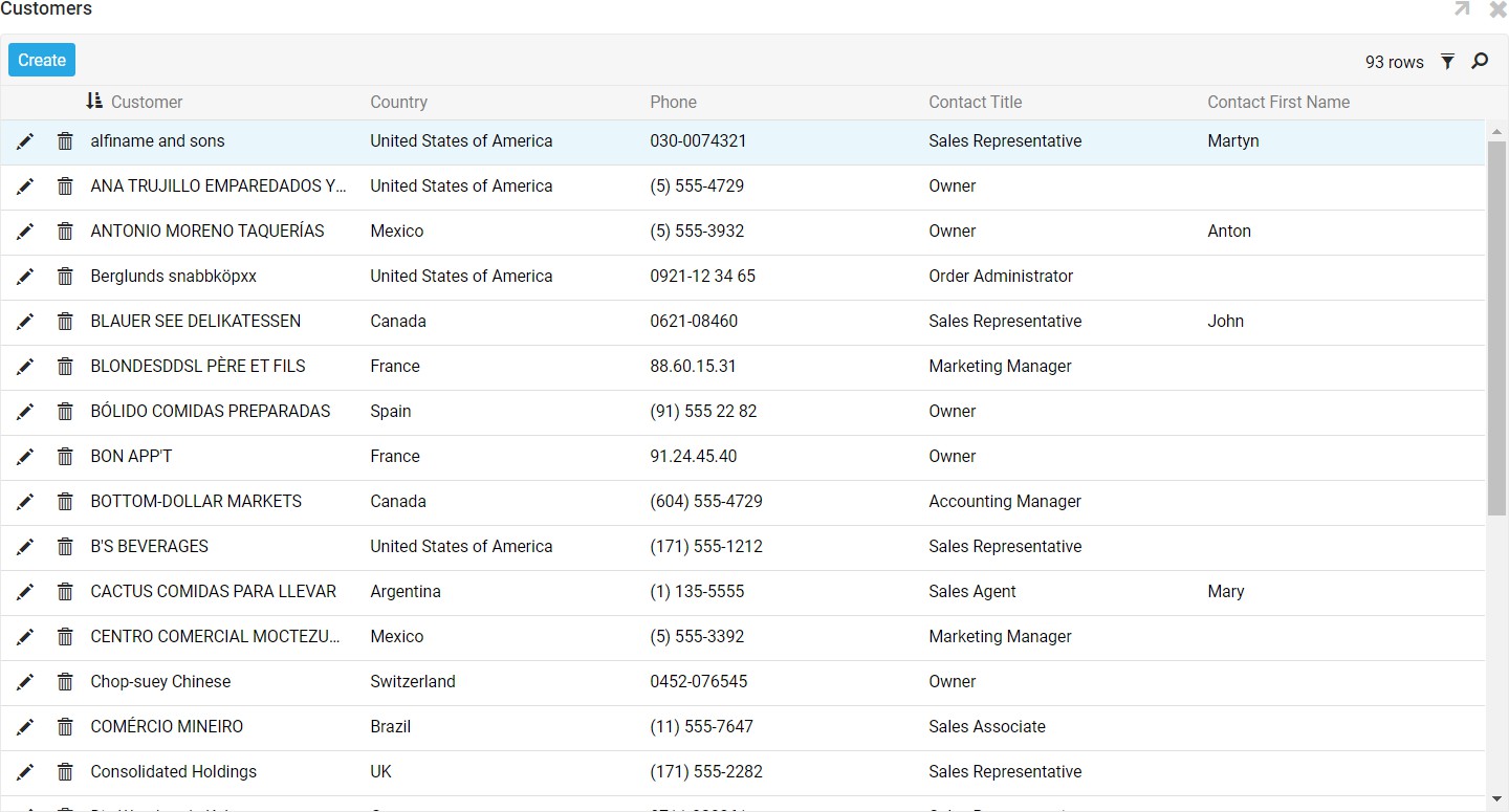
Grid panels support saving, searching, and filtering their data tables, making it easier to work with specific rows. Click the Save icon, in the panel's upper right-hand corner, to save the data table; a save dialog lets you choose where to save the file. App Builder saves data tables as CSV (Comma Separated Value) files, a text-based, table-structured format that opens in nearly any spreadsheet or database management program.
Click the Search icon to open a search bar at the top of the panel, then type a keyword and press Enter to search.
Click the Filter icon, in the panel's upper right-hand corner, to filter a data table down to only the rows that match specific criteria. This opens a popup listing the column titles:
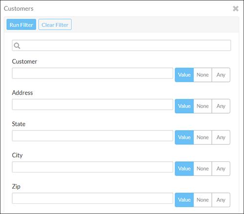
Enter your filtering criteria in the text box, then click Run Filter. You can filter on multiple values or criteria at once.
Note
Available wildcard characters depend on the underlying data source. For example, SQL Server filtering uses % (percent sign) as a wildcard, while other data sources use * (asterisk).
App Builder then shows a heading with the filter criteria applied, and only the rows that match it. Click the X in the criteria header's right-hand corner to remove the filter.
Form
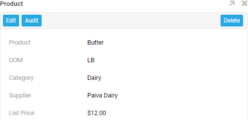
Form panels display a single line of data from the selected data source. This panel type is especially useful as a popup window or a detail page. When a Form panel has multiple controls, each one is displayed individually.
Tile
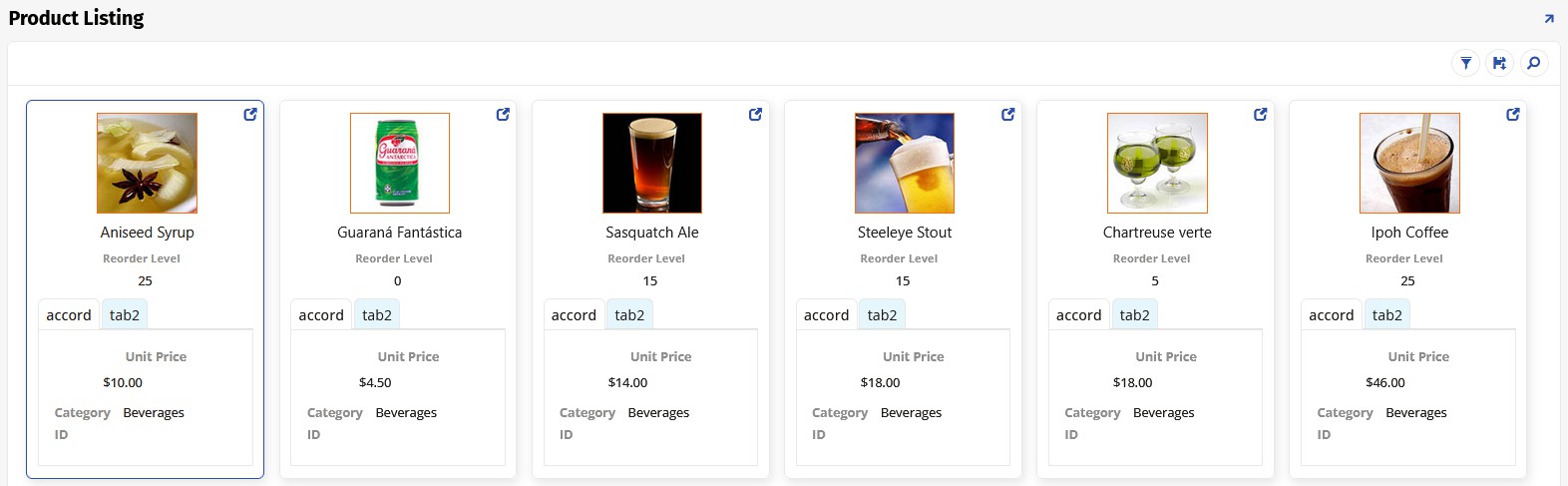
Tile panels combine Grid and Form panel behavior: like Grid panels, they display multiple sets of information at once, but arrange data from the source tables or objects in blocks from left to right instead of in columns. As with Form panels, controls are grouped with other controls in the same position in the data table.
File Browser
File Browser panels link to a local or network file system and look similar to a file directory. This panel type lets users upload files to a server and download them to a device, and supports navigating subdirectories, indicated by a folder icon.
Custom HTML
Custom HTML panels use HTML/CSS templates to display data and images. They offer a high degree of control over the display output, and closely resemble a standard web page.
Charts
Chart panels display data in a graphical representation. App Builder supports many chart types, including Bar, Column, Line, and Area. Charts can be linked to their underlying data, so a user can click through to view the supporting records.
Required control types
- Category: Represents the x-axis (horizontal) on the chart.
- Value: Represents the y-axis (vertical) on the chart.
Optional control types
- Color: Color value used by the chart.
- Sort: Allows you to apply sorting to the selected value.
- Flag: Used to mark an event or point of interest.
- JSON Options Object: JSON object which overrides chart options.
Chart type options include 3D Bar, 3D Column, 3D Donut, 3D Pie, Area, Stacked Area, Bar, Bubble, Column, Funnel, Line, Marimekko, Mixed, Percentage Area, Pie, Pyramid, Semi Circle Donut, Spline, Stacked Bar, and Stacked Column.
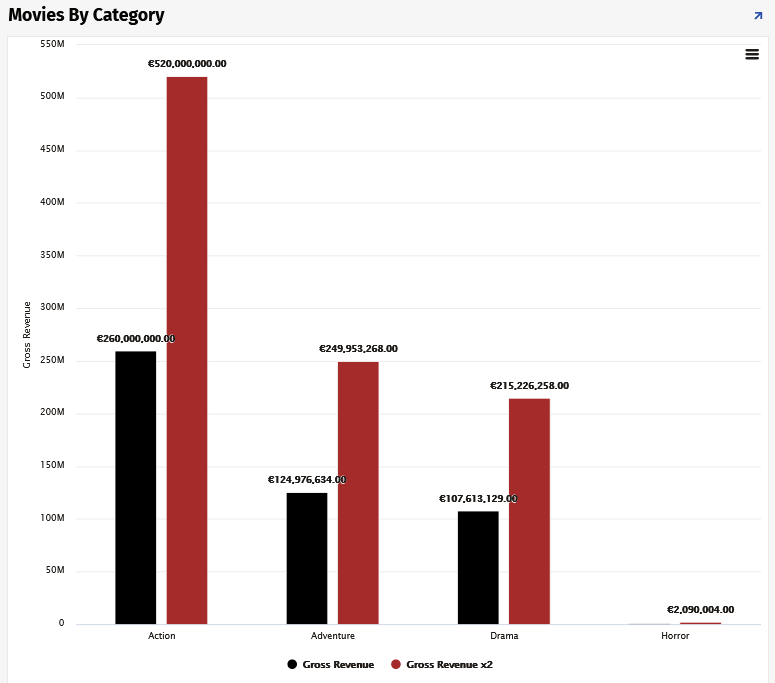
To print a Chart panel, click the Action Drawer menu in the panel's right-hand corner and select Print Chart. You can download the chart as a .PNG, .JPEG, .PDF, or .SVG vector image.
Gantt
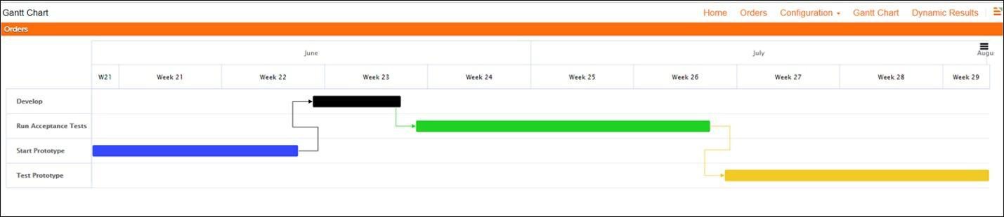
Gantt is a panel type that displays a Gantt chart, useful for planning and scheduling projects: it helps you assess how long a project should take, determine the resources it needs, and plan the order in which you'll complete its tasks. Gantt charts are also useful for managing dependencies between tasks.
To use a Gantt chart on a Gantt panel, you need a business object containing information for the controls it requires. Gantt charts can also represent task dependencies and task groups, provided that information is configured in the business object.
Required control types
- Task: Represents an individual project task being tracked.
- Start Date: Represents the task's begin date.
Optional control types
- End Date: Represents the task's end date.
- Color: Color value for the task on the chart.
- Dependency: Determines the relationship from the task to the other tasks it depends on.
- Parent Task: A reference to another task from the business object, used for hierarchical arrangement.
- Sort: Allows you to apply sorting to the selected value.
- Task Group: Used for grouping or placing multiple tasks on the same row.
Frame
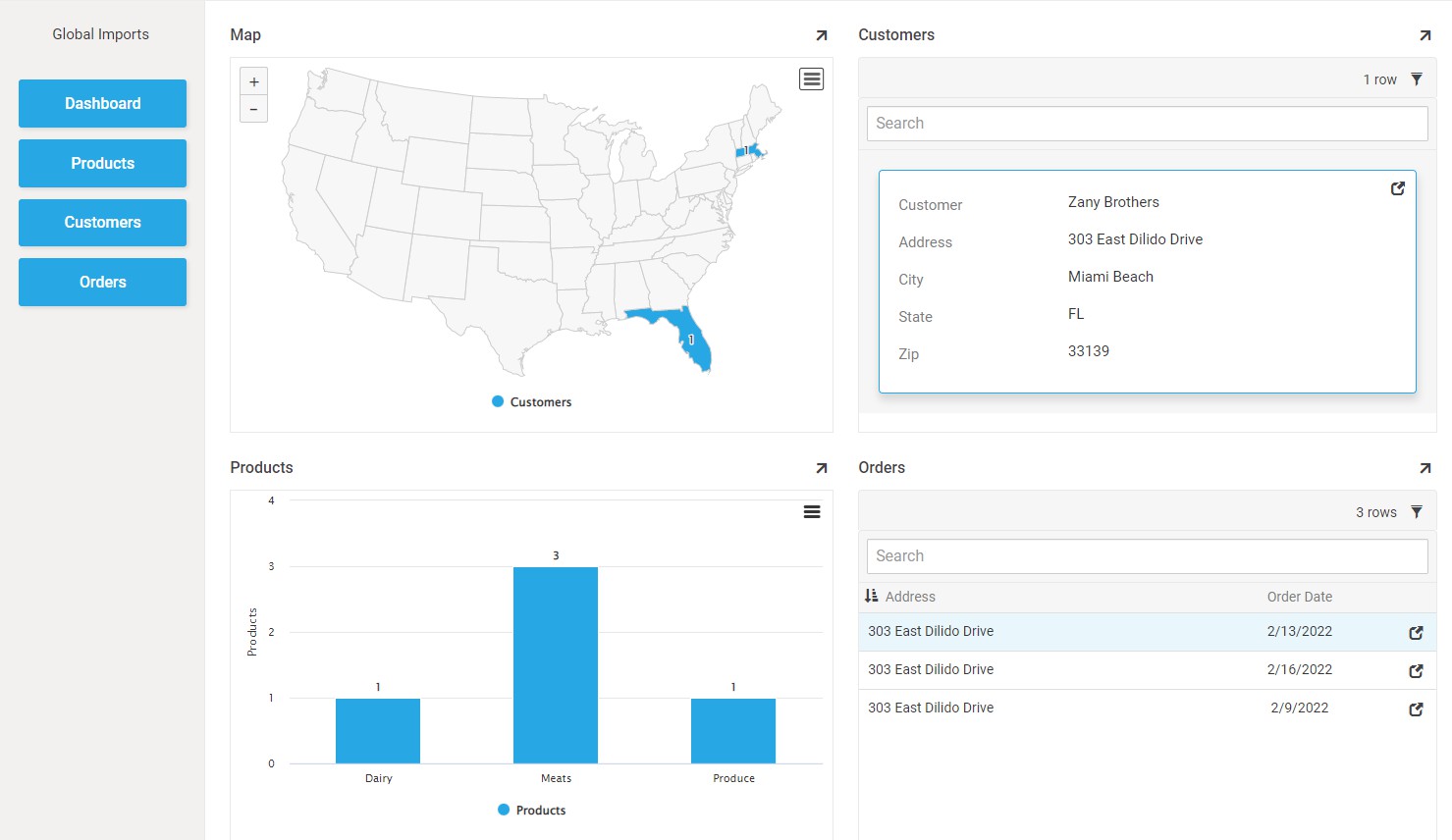
Frame panels reserve a space on the screen that all clicked page links load into. The Frame panel type has no content of its own — when a Frame panel exists on a screen, page navigation is directed into it instead of replacing the entire screen. This panel type is most often used to keep a persistent side menu visible, with the Frame panel's container rendering the page inside of it. For more detail, including how to link out of a Frame panel, see Frame panel.
Calendar
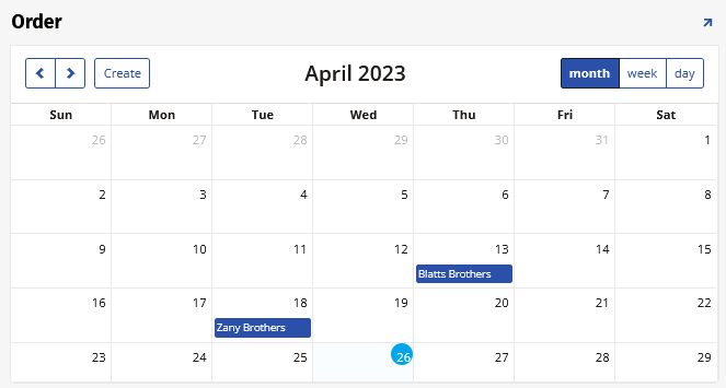
Calendar panels populate a calendar with information from the selected data source. Like Chart panels, Calendar panels can be linked to another panel to display greater detail about an event on the calendar.
Required control types
- Description: Designates what appears on the calendar; typically an event's name.
- Event Start: Designates which day the event starts on; may include timestamps displayed alongside the event description.
- Event End: Designates which day the event ends on; may include timestamps displayed alongside the event description.
Optional control types
- Color: Color value used by the calendar to indicate events.
- Sort: Allows you to apply sorting to the selected values.
To change the date and time of an event:
- Select the event.
- In the panel that displays the event's information, click the Pencil icon.
- Adjust the date and time as necessary, then click the Checkmark icon to save.
To add a new event to the calendar:
- Select any pre-existing event and click the Add button.
- Enter a title for the event, then select a date from the calendar drop-down menu.
- For controls with time and date enabled, click the Time icon to bring up a clock.
- Click the Checkmark icon to save.
- Refresh the page to see your changes reflected.
Pivot
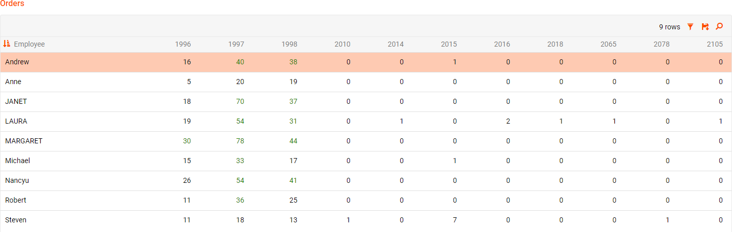
Pivot panels display a pivot table with information from a data source.
Required control types
- Column: Populates the column headings.
- Row: Populates the row headings.
- Value: Displays the relevant data from the source.
Network Graph
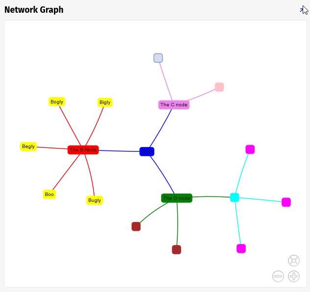
Network Graph panels display interconnections between a set of entities. Each entity is represented by a node, and connections between nodes are represented through links.
Required control types
- From: The node this link comes from.
- Node: The Network Graph node itself.
- Node Label: The Network Graph node's label.
Optional control types
- JSON Options Object: JSON object which overrides chart options.
- Link Color: The Network Graph link color.
- Color: Color value for an event or task.
Lane
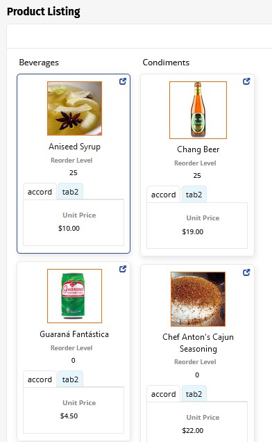
Lane panels display grouped information. They're similar to Tile panels in that they display data grouped into Form panel format, but can be configured either vertically or horizontally.
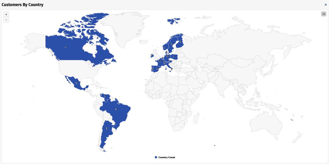
Map
Map panels display a map on which controls can be visualized by geographic location. Different maps, provided through the Highmaps API, can be chosen based on the data you want to display.
Note
Names of map regions in your underlying business object must match identifiers from the Highmaps source maps. For example, if your business object has US county names, those names may not be unique on their own, so you'll need a column that matches the key from Highmaps instead.
Required control types
- Category: Country, state, etc.
- Value: Value associated with the category.
Optional control types
- JSON Options Object: JSON object which overrides chart options.
- Color: Color value for an event or task.
For additional information on Map panels, see the Map panel article. For documentation on the source maps provided in the Map panel, see Highcharts Maps.
Navigating between pages
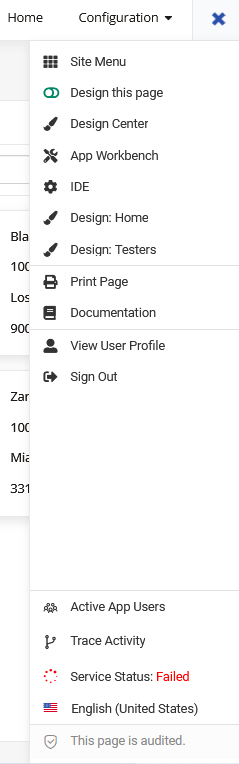
There are two main ways to navigate between pages in applications. On a large screen device, pages are listed as text links in the upper right-hand corner of the screen, with the number shown depending on the available screen width. While this is the fastest and easiest way to swap between pages, it is not feasible on smaller devices, such as a smartphone or a tablet.
However, all pages can be accessed at any time by opening the Action Drawer. When clicked, the Action Drawer icon turns into an X, which can then be clicked to close it. A heading with the currently open application is listed, as well as all the pages contained in the application. Simply click on the desired page to be taken to it.
Pages can be configured to link directly to each other. This link can be added as a button, an image, or a text link, a chevron icon () on the right-hand side of the page, or a panel. When a panel is used to link to another page, its Link Target and Replace Page In History settings control how that link behaves; see Configure how linked pages open below.
Configure how linked pages open
A panel used to link to another page has two related settings in its Edge Case tab's Navigation section:
- Link Target: Controls where the linked page opens, such as in the current window or a new browser tab.
- Replace Page In History: Controls what the < Back button returns to after the linked page loads. Normally, navigating to a new page adds a new stop to the page history, so clicking < Back returns to the page the user just came from. Enabling Replace Page In History skips that step: instead of adding a new stop, the linked page reuses the previous stop's < Back target, so clicking < Back skips over the page the user just left and goes one page further back. For example, if a popup page links to another page with this setting enabled, < Back takes the user to the page the popup itself was opened from, rather than back to the popup. This keeps < Back pointing to a consistent page for the linked page, regardless of which page a user navigated from to reach it.
Not every panel type supports Link To Page and Link Target.
If a link's target changes to one that doesn't support Replace Page In History (for example, changing Link Target to open in a new browser tab instead of the current one), App Builder automatically turns off Replace Page In History rather than leaving it enabled with no effect.
Link Target also appears at the control level, on a control's External Link settings rather than its own; see Configure external links on a control. To link a control's value directly to a page instead, see Configure a control as a navigation link. For linking out of a Frame panel specifically, see Exit the Frame panel.
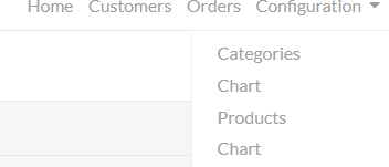
Nested menus
Navigation text links at the top of a page may contain nested menus. These nested menus are an expanded list of links that are stored under a heading and can be accessed by clicking on the drop-down arrow next to the header.
Popup pages
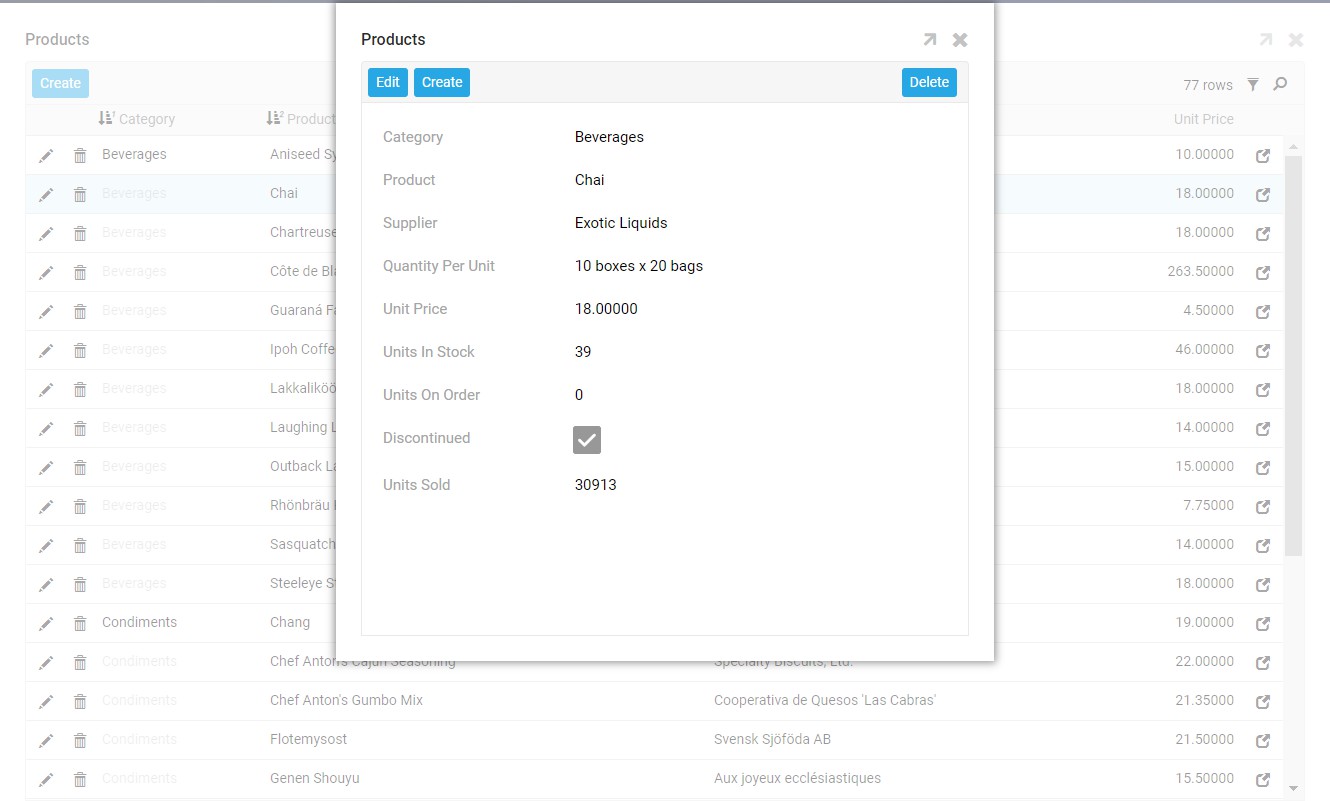
Sometimes, a page will not require a full redirect (such as the edit or detail view page) but can instead be displayed in a popup that shows on top of a base page. These pages are usually accessed by clicking a link, or by clicking on the Popup icon. They may have multiple pages or panels themselves, which can be scrolled through much like a standard page. To return to the main screen, click the X in the upper right-hand corner.
Editing panels
Add, edit, and delete panel data
App Builder developers have full control over whether Insert, Edit, and Delete options are available on a panel, depending on the business use case. If a validation message appears while you're editing a panel, click Proceed to continue, or Cancel to stop.
To add information to a panel, click the Create button in the panel's upper left-hand corner. A text box appears for each column, either at the top or bottom of the panel depending on how it's configured; fill them in and click the Checkmark icon to save, or click the X to cancel.
To delete information from a panel, click its Trash Can icon or Delete button, then click Proceed if a validation message appears.
To edit information in a panel, click its Pencil icon or Edit button; a text box appears in every editable column. Fill them in and click the Checkmark icon to save, or click the X to cancel. A panel can also be configured to always be editable, in which case you can click directly in a field, make your change, then click outside the field to save it.
Audit lite
App Builder offers two ways to track auditing information within an app: Audit Lite, described in this section, and Full Audit, described in Full audit below, which requires additional configuration to enable.
Panels that need changes tracked, especially for a time-sensitive project or update, may include an Audit Lite button, which tracks the following information for a table:
- AddedBy: The username of the person who added the record.
- AddedOn: The date the record was added.
- ChangedBy: The username of the person who last modified the record.
- ChangedOn: The date the record was modified.
When Audit Lite is enabled, Grid and Form panels in an application display this tracking data. Users with permission to read a table's audit information can view it by clicking the Audit button in the running application.
Full audit
Full Audit is enabled by default for newly created data sources and tables. This auditing feature complements Audit Lite, recording business-level changes to your data so you can review them later. When you enable Full Audit, App Builder creates a special audit log table, named App BuilderAuditLog, in your data source, and captures changes there for every table with Full Audit enabled.
By default, App Builder doesn't automatically clean up or purge records stored in the Full Audit table. To change this behavior, see the Audit Config feature, which lets an administrator configure a retention period after which App Builder purges older audit records. For more information, see Full audit.
Troubleshooting
A menu selection, application page, or panel can't be found, even though it was added to the correct place
When navigating an application, keep screen size in mind. Because of App Builder's responsive design, a page's format may change slightly on smaller screens: stacked panels may show up in a navigable menu instead, or a column may be hidden to keep the most important data visible. Page navigation may also move from the top bar into the Action Drawer.
A new application is missing from the Applications list, or changes to menu items, pages, panels, or controls don't appear when testing an application
Refresh the browser (F5, on most browsers) to see changes made to an updated application's pages, panels, or controls. If refreshing doesn't show the changes, make the edit again and be sure to click Save or Proceed.
An application is open and running, but there's no way to edit it
The ability to edit an application's data varies by user, based on the permissions an administrator has granted. Some users may not have permission to edit pages; contact an administrator to verify that edit permission has been granted.