Text (control type) in Jitterbit App Builder
A Text control displays and edits a column's value as plain text, without applying any special formatting or masking. App Builder uses Text as the default Control Type for most columns, so it may already be selected when you choose a column. For example, an Employee panel might use Text controls for fields like First Name, Last Name, and Title.
For a column to be usable with the Text control type, its logical data type must be set to String. See String in Appendix A of the Introduction to App Builder tutorial series for how to set a column's logical data type.
A Text control's value can also be configured as a link to another page. See Configure a control as a navigation link for details.
Add a Text control
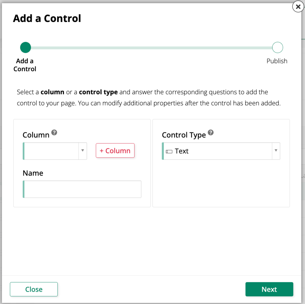
To add a new Text control to a panel, use the Add a Control dialog and select Text as the Control Type:
Convert an existing control to a Text control
To change an existing control to use the Text control type:
-
Navigate to the control, using either the Live Designer or the App Workbench:
-
From the app preview, open the page containing the control and select Action Drawer > Live Designer.
-
From the App Workbench, open the Pages tab, then in the Pages panel, locate the page containing the control and either double-click its row or click the Open record icon. In the Page Panel Layout panel, find the panel that houses the control and click Controls.
-
-
If you're in the Live Designer, click the control in the page view; this will populate the Live Designer with edit options for that control. If you're in the App Workbench, in the Controls panel, find the control and either double-click its row or click the Open record icon at the end of its row; App Builder opens a dialog similar to the Live Designer's.
-
In the Control Properties tab, set the Control Type field to Text.
-
Click Save.
Refresh the application view to confirm the update. The control now displays and edits the column's value as plain text, without any special formatting or masking.