How to create a mobile theme in Jitterbit App Builder
App Builder can automatically convert any app to be mobile friendly. However, you may want more granular control over the mobile presentation of an app. Like how standard themes work in App Builder, a mobile theme can be applied site wide or more specifically to a page in an app. This page provides information on how mobile themes work in App Builder, and steps through the basic configuration for creating a mobile theme for an app.
Note
Since App Builder 4.67, the predefined Light, Dark, Shapes, Violet, Gradient, Light - Modern, and Login Base Theme themes each include a pre-built, mobile-optimized mobile theme, with touch-friendly hit targets, mobile-scaled typography, compact spacing, and single-column form field stacking. This applies automatically only to apps using one of these system themes directly, and does not carry over to a custom theme based on one of them. See Use a predefined mobile theme with a custom base theme to use one of these mobile themes with an existing custom theme instead.
How mobile themes work in App Builder
- Mobile themes are themes that get called in when App Builder detects you are using a mobile device (note they apply to mobile only, not iPad or tablet devices).
- Mobile themes are set up in the same way as standard themes, most notably they have a base theme, and the base theme is what determines when and where a mobile theme gets called and applied. A mobile theme must have a base theme to work, and wherever that base theme is used (either as an application wide theme or just a specific page level theme), the mobile theme will be called in addition.
- Mobile themes get applied "on top" of other pre-existing themes; they don't replace them, so in order for any styles from a mobile theme to be applied, they need to be more specific than any pre-existing styles that are getting applied from other themes already on the page.
Note
See the W3Schools article on CSS Specificity for more information on the order in which CSS gets applied.
Site wide mobile themes
An app named Budget Calculator has its base theme set as App Base Theme, meaning that theme applies across the entire application. In addition, there is a mobile theme called Mobile Theme, and the base theme for this mobile theme is set as the App Base Theme. In this scenario, the mobile theme will be active across the entire application, as every page uses the App Base Theme.
Page specific mobile themes
An app named Budget Calculator has a page called Home, which has a page-level theme applied called Home Page Theme, meaning this theme only applies on the Home page. In addition, there is a mobile theme called Home Page Mobile Theme, and the base theme for this mobile theme is set as the Home Page Theme. In this scenario, the mobile theme will only be active on the Home page of the application, as it only gets called in on pages that use the Home Page Theme, which in this case is only the Home page.
How to create a mobile theme
An example of when you may want to use a mobile theme is to add padding to outer containers on mobile so that all the app pages have a bit more space to breathe.
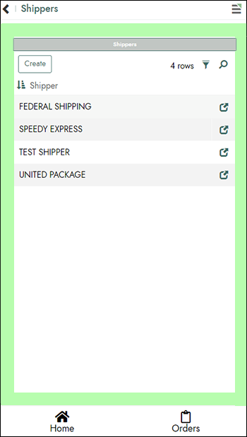
Step 1: Create a mobile theme
When you're ready to create a mobile theme for an app, we will assume that you have an existing app theme already configured. This app theme should be used as the base theme for your mobile theme.
- Navigate to Look & Feel for your app.
- Select Mobile from Theme Type.
- Click the + Theme button.
- Assign a Theme Name. For example:
Theme Mobile. - Set the Base Theme value to the main theme the app is using. For example:
Themes Exercise. - Confirm or set the Collection to a collection your app has access to. For example:
NorthwindsTraining. - Set the Type to Mobile.
- Click Save.
-
Add any mobile specific style(s) needed. For example:
- Select Panel as Component.
- Click + Style from the Styles panel.
- Set Area to Container.
- Set Value Type to Spacing.
- Under Values, set 3-Padding to the desired setting. For example:
2em. - Click Save.
Step 2: Associate mobile theme to app
In this step you will associate the mobile theme to the app. For this example we want the mobile theme to appear site wide, so we will confirm that the base theme is the theme associated with our app.
- Navigate to the App Workbench.
- Under App Settings, check that the Theme value is set to the base theme used by your mobile theme created in Step 1.
- Return to the application view, refresh the web browser and test.
Note
Additional mobile settings are available for configuration from the App Settings tab of the App Workbench, under More > Edge Case.
Use a predefined mobile theme with a custom base theme
Predefined mobile themes only apply automatically to apps that use one of the standard system themes directly. If your app uses a custom theme based on a system theme, follow these steps to use that system theme's predefined mobile theme instead of building a new one from scratch:
- Navigate to Look & Feel for your app.
- Locate the predefined mobile theme for the system theme your custom theme is based on.
- Click Copy to add the mobile theme to your collection.
- Set the copy's Base Theme to your custom theme.
The copied mobile theme now applies wherever your custom theme is used, the same way any other mobile theme does.