Wizard pages in Jitterbit App Builder
The Wizard layout is one of the page layout options available in App Builder. On a page using the Wizard layout, App Builder displays each panel as a separate step, with Previous, Next, and Finish buttons to navigate between them. This page describes how to configure a Wizard page, use its built-in navigation features, and customize its navigation buttons.
On a Wizard page, clicking any field makes all editable fields on that step available for editing. To save your changes, click through to the last step, then click Finish. Click the X in the upper-right corner to dismiss the page without saving your changes.
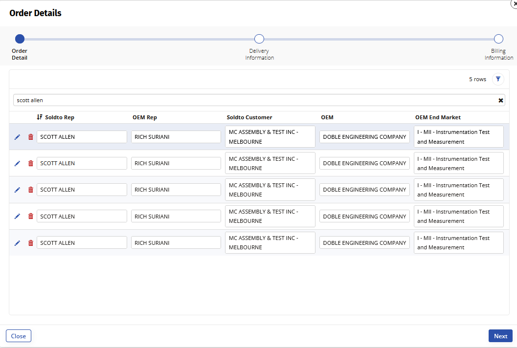
Wizard pages are useful whenever you need to guide users through a multi-step process, such as an order entry form that separates each step into its own screen:
Configure a Wizard page
Create the page
To create a page using the Wizard layout:
- Go to App Workbench and click + Page.
- Enter a Page Name, for example
Order Details. - Click Next.
- In Select a Menu, select the menu you want to link the page from, for example Home.
- Click Next.
- In Select a Layout, select Wizard.
- Click Next.
- Review the proposed updates and click Finish.
Add a screen
Each screen in a Wizard page is a panel, added the same way as any other panel on a page:
- If you're using the Live Designer, click + Panel. If you're in the App Workbench, click + Choose Panel Type in the Page Panel Layout panel. The Create a Panel dialog opens.
- Select the panel type for display, for example Grid, and click Next.
- Select the panel source and click Next.
- Select whether to Auto Build the panel or Choose Manually, then click Next.
- Click Finish.
- Repeat these steps for each additional screen you want to add to the Wizard page.
After adding a screen, you can customize its navigation buttons or configure a Finish button.
Wizard page navigation
Wizard pages include the following navigation features:
- Progress bar: Displayed on each screen to track the current step in the Wizard page.
-
Panel visibility: Controls whether a panel appears as a step in the Wizard page, using the panel's Panel Visibility field:
- Show: The panel is listed as a step, and users navigate to it normally.
- Hidden: The panel isn't listed as a step, and users skip over it.
- Disabled: The panel is listed as a step, but appears struck out, and users skip over it.
-
Help text: A panel's help text appears below the progress bar.
- Link to Panel: Clicking a button configured with the Link to Panel option switches the Wizard page to the step containing the target panel. This option is also available on other page layouts; see Button controls for details.
Wizard pages also support custom Previous, Next, and Finish buttons, letting you promote a button from a panel to replace one of those buttons in the page's navigation. See Customize navigation buttons below.
Customize navigation buttons
You can override the Previous, Next, and Finish buttons on a Wizard page. This lets you customize the button's behavior, for example to execute a custom event when the Next button is clicked, or to navigate to a new page when the Finish button is clicked.
To override a Wizard page's navigation buttons:
- Open the desired page and select Action Drawer > Live Designer. Alternatively, open the desired page's edit screen by going to App Workbench > Pages.
- If you're using the Live Designer, select the panel where you want to override a button; its options populate the Live Designer. If you're in the App Workbench, select the panel where you want to override a button and click its Controls button.
- Click + Control. The Add a Control dialog opens.
- Set Control Type to Button.
- Enter a Name for the button, for example
Submit. -
In the Control Subtype field, select the button you want to target:
- Next: The navigation button that moves forward to the next screen.
- Finish: The navigation button that completes and ends the Wizard page.
- Previous: The navigation button that moves to the previous screen.
-
Click Next.
- Optionally, assign an event to execute or a page to link to, then click Next.
- Review the proposed updates and click Finish.
Configure a Finish button
A Finish button is a special case: it only appears when it's defined on the last visible panel of a Wizard page. To configure or override a Finish button, you must do so from the last visible panel of the Wizard page.
If your Wizard page has conditional paths, you can define a Finish button on every panel that might end up being the last visible one, and App Builder shows either the Next or Finish button, as appropriate. If you need a Finish button to appear before the last visible screen, define a Next (or other) button, set its Label to Finish, and have it close the Wizard page or navigate to another page to achieve the same effect.
- Open the desired page and select Action Drawer > Live Designer. Alternatively, open the desired page's edit screen by going to App Workbench > Pages.
- If you're using the Live Designer, click the All Panels tab, locate the last visible panel, and click its Open record icon. If you're in the App Workbench, locate the last visible panel in the Page Panel Layout panel and click its Open record icon.
- Click + Control.
- Set Control Type to Button.
- Set Control Subtype to Finish.
- Enter the Name you want to appear on the button, for example
Submit. - Click Next.
- If the button should execute an event or link to a page, set those values.
- Click Next.
- Review the proposed updates and click Finish.