Color Picker (control type) in Jitterbit App Builder
A Color Picker control displays a color swatch for a hex color code stored in a column, and lets users pick a new color from a color wheel; App Builder saves the selected color's hexadecimal value back to that column. For example, a Teams panel might use a Color Picker control to record each team's color.
Add a Color Picker control
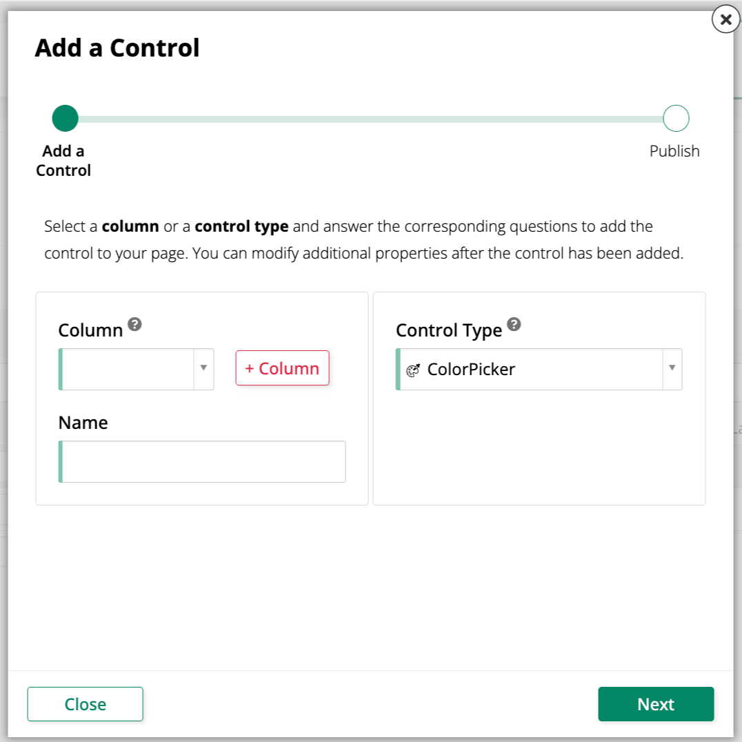
To add a new Color Picker control to a panel, use the Add a Control dialog and select ColorPicker as the Control Type:
Convert an existing control to a Color Picker control
To change an existing control to use the Color Picker control type:
-
Navigate to the control, using either the Live Designer or the App Workbench:
-
From the app preview, open the page containing the control and select Action Drawer > Live Designer.
-
From the App Workbench, open the Pages tab, then in the Pages panel, locate the page containing the control and either double-click its row or click the Open record icon. In the Page Panel Layout panel, find the panel that houses the control and click Controls.
-
-
If you're in the Live Designer, click the control in the page view; this will populate the Live Designer with edit options for that control. If you're in the App Workbench, in the Controls panel, find the control and either double-click its row or click the Open record icon at the end of its row; App Builder opens a dialog similar to the Live Designer's.
-
In the Control Properties tab, set the Control Type field to ColorPicker.
-
Click Save.
Refresh the application view to confirm the update. The control now displays a swatch of the column's stored color. Clicking the control opens a color wheel; selecting a new color saves its hexadecimal value to the column and updates the swatch.