Configure a control as a link in Jitterbit App Builder
A control can be configured to turn its value into a link, so that when users click it they either navigate to another page (inside or outside the application), or trigger an event. This works on most control types, including Text, Image, and List controls. This page describes how to configure this behavior.
Note
A Button control has its own Link to Page option, set while configuring its click behavior, instead of through the steps on this page.
For an example walkthrough that links a chart to a page with automatic binding, see Add chart drill-down in Appendix C of the Introduction to App Builder tutorial series.
This links directly from a control's value. To link an entire panel to another page instead, including how the linked page opens, see Configure how linked pages open.
Set up a control to act as a link
Follow these steps to configure a control to act as a link.
-
Navigate to the control, using either the Live Designer or the App Workbench:
-
From the app preview, open the page containing the control and select Action Drawer > Live Designer.
-
From the App Workbench, open the Pages tab, then in the Pages panel, locate the page containing the control and either double-click its row or click the Open record icon. In the Page Panel Layout panel, find the panel that houses the control and click Controls.
-
-
If you're in the Live Designer, click the control in the page view; this will populate the Live Designer with edit options for that control. If you're in the App Workbench, in the Controls panel, find the control and either double-click its row or click the Open record icon at the end of its row; App Builder opens a dialog similar to the Live Designer's.
-
Click the Edge Case tab.
-
Open the Rare Navigation Settings section. It has three mutually exclusive top-level fields; continue with whichever matches what you want to do:
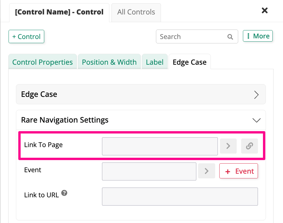
- To link to another page in the application, continue with Link To Page below.
- To trigger one of the control's configured events instead, continue with Event below.
- To link to an external URL, or another App Builder page by address, continue with Link to URL below.
Link To Page
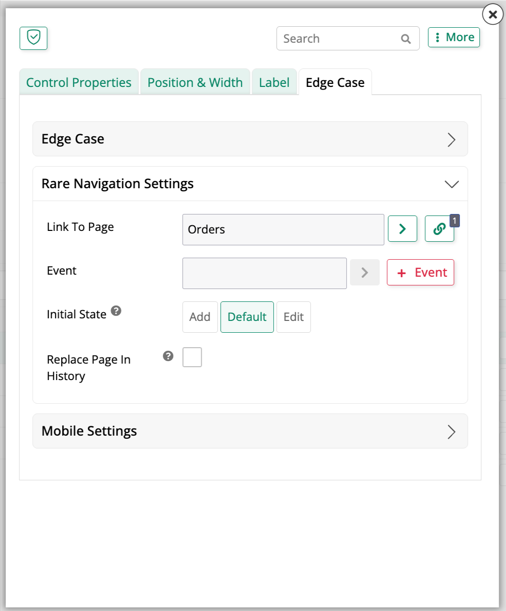
Selecting a page in the Link To Page field also reveals Event, Initial State, and Replace Page In History:
-
In the Link To Page field, select the target page.
-
Click the binding icon to open the Control Link Criteria dialog and confirm App Builder bound the two pages on the correct column. Adjust the Source Column if it didn't bind the way you expect.
-
(Optional) Set Initial State to determine what state the linked page loads in: Add, Default, or Edit, for example opening directly into edit mode instead of its normal view.
-
(Optional) Enable Replace Page In History, which behaves the same way for controls as it does for menu items and panels; see Configure how linked pages open. If a control's link target changes to something that doesn't support it, App Builder automatically turns it off.
-
Click Save.
Refresh the application view to confirm the update. The control's value now behaves like a link: clicking it takes the user to the selected page, filtered to that record.
To link each record in a List, Icon, or Button control to a different target page depending on its data, rather than a single fixed page, see Dynamic page linking instead.
Event
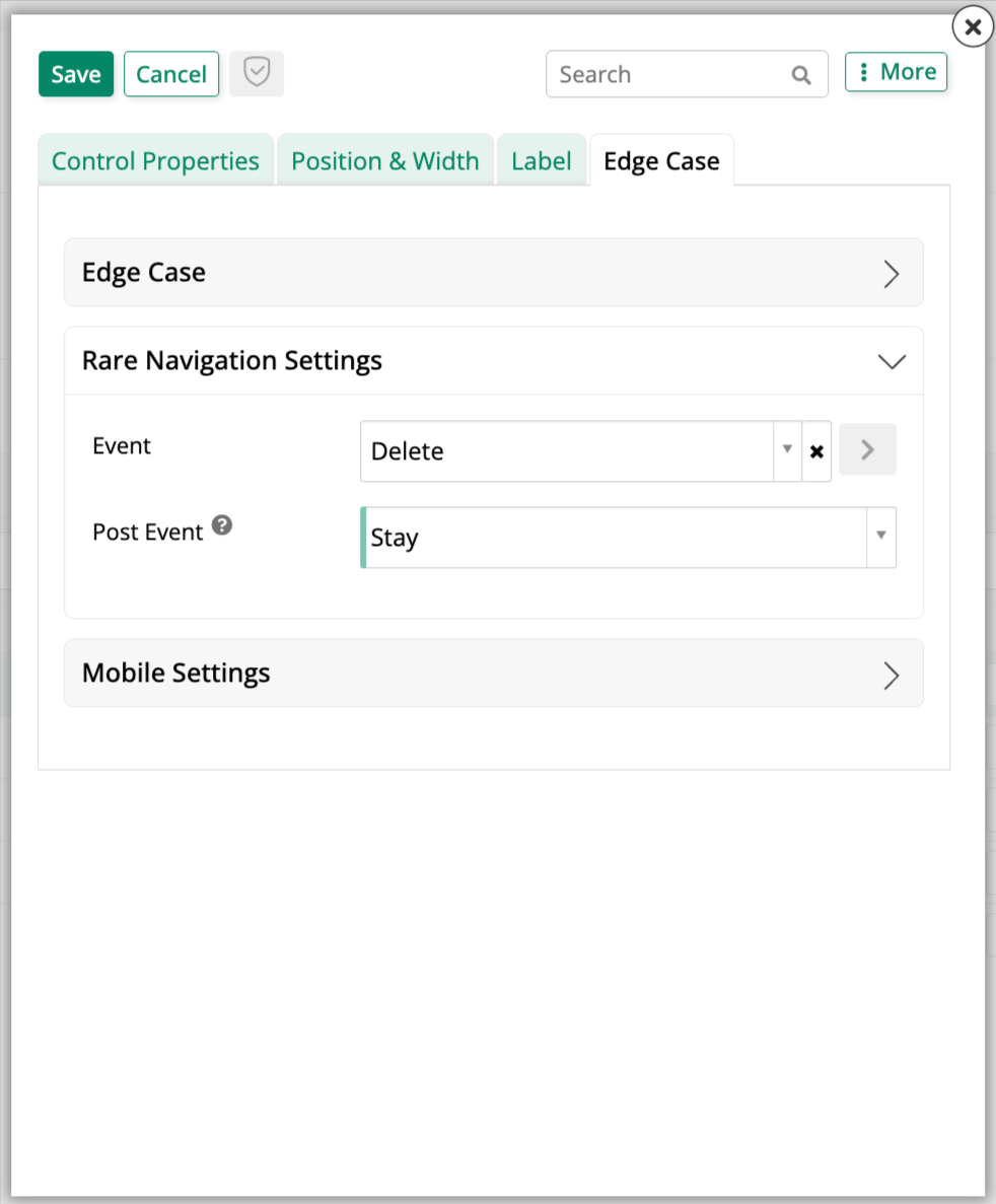
Instead of linking to a page or URL, a control can trigger one of the events already configured on its underlying table, both intrinsic events like Delete and Save, and any custom events; see Configure events. Selecting one also reveals Post Event in place of Link To Page and Link to URL, which disappear:
-
In the Event field, select the event to trigger.
-
Set Post Event to one of the following:
- Close: Closes the current page or popup, returning to the previous one.
- Stay: Stays on the current page.
- Link to Page: Brings Link To Page and Link to URL back, letting you choose the page or URL to navigate to once the event completes.
-
Click Save.
Refresh the application view to confirm the update, then trigger the control's event to confirm Post Event behaves the way you expect.
Link to URL
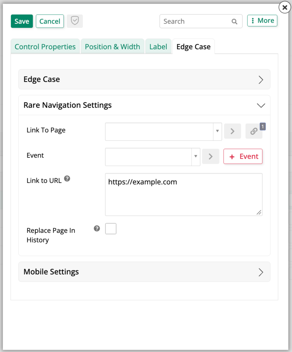
An External Link attaches a URL to the control instead, navigating to another page on the App Builder server, or to an external web resource, when clicked, for example attaching one to a control that shows a FedEx tracking number, so clicking it opens FedEx's own tracking page for that number. Selecting this also reveals Event and Replace Page In History, the same as described above:
-
In the Link to URL field, enter the full URL. For example:
https://www.fedex.com/apps/fedextrack/?tracknumbers={{FedExTrackingNo}}. The URL must begin with the protocolhttps://orhttp://. -
To make the link dynamic, use curly brackets
{{}}inside the URL to substitute data from the business object on your panel, as in the example above. -
Open the Edge Case accordion above and set Link Target to control where the link opens:
_blank: Opens the link in a new tab or window, depending on the user's browser settings._parent: Opens the link in the parent frame, if the application is loaded in an iframe of another application._self: Opens the link in the current window._top: Opens the link in the top-most frame, if the application is loaded in multiple iframes of another application.- App Builder: Opens the link in the current App Builder instance.
- App Builder - Exit Frame Panel: Opens the link in App Builder, exiting the Frame panel; see Exit the Frame panel for details.
Note
The Edge Case accordion's exact fields can vary depending on the panel housing the control.
-
Click Save.
Refresh the application view to confirm the update, then click the control to confirm it opens the URL.