Checkbox (control type) in Jitterbit App Builder
A Checkbox control displays and edits a boolean value from a Bit column as a checkbox in the UI layer: a checked box represents 1 (True), and an empty box represents 0 (False). For example, a Products panel might use a Checkbox control to show and toggle whether a product is discontinued.
For a column to be usable with the Checkbox control type, its physical data type must be set to Bit. See Boolean in Appendix A of the Introduction to App Builder tutorial series for how to set a column's physical data type.
Add a Checkbox control
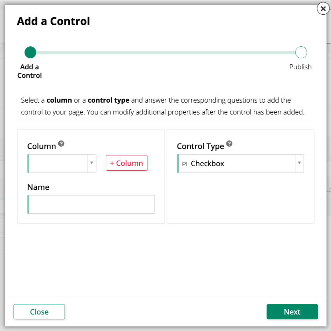
To add a new Checkbox control to a panel, use the Add a Control dialog and select Checkbox as the Control Type:
Convert an existing control to a Checkbox control
To change an existing control to use the Checkbox control type:
-
Navigate to the control, using either the Live Designer or the App Workbench:
-
From the app preview, open the page containing the control and select Action Drawer > Live Designer.
-
From the App Workbench, open the Pages tab, then in the Pages panel, locate the page containing the control and either double-click its row or click the Open record icon. In the Page Panel Layout panel, find the panel that houses the control and click Controls.
-
-
If you're in the Live Designer, click the control in the page view; this will populate the Live Designer with edit options for that control. If you're in the App Workbench, in the Controls panel, find the control and either double-click its row or click the Open record icon at the end of its row; App Builder opens a dialog similar to the Live Designer's.
-
In the Control Properties tab, set the Control Type field to Checkbox.
-
(Optional) Set On Image and/or Off Image to replace the default checkmark or blank fill with a selected image when the control is in its checked (
True) or unchecked (False) state, respectively. As of App Builder 4.68, you can also select icons in these fields. -
(Optional) Select the Invert checkbox to flip which value each state represents: the box appears checked when the column's value is
False(0) and empty when it'sTrue(1). -
Click Save.
Refresh the application view to confirm the update. The control now displays as a checkbox: checked for True values and empty for False values.