Panels in Jitterbit App Builder
Introduction
Panels in App Builder are the containers on your applications' pages that house the information displayed on the UI, such as data, images, and all sorts of controls.
All pages in App Builder applications are organized with the use of panels. There are several types of panels, described on this page.
Panel types
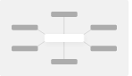
In the App Workbench Pages tab, you can select any of your application's pages or click to create a new one. When you do, you are taken to that page's edit screen, where the Page Panel Layout panel allows you to configure all the panels on that page.
Clicking the + Add Panel button brings up the Create a Panel dialog:
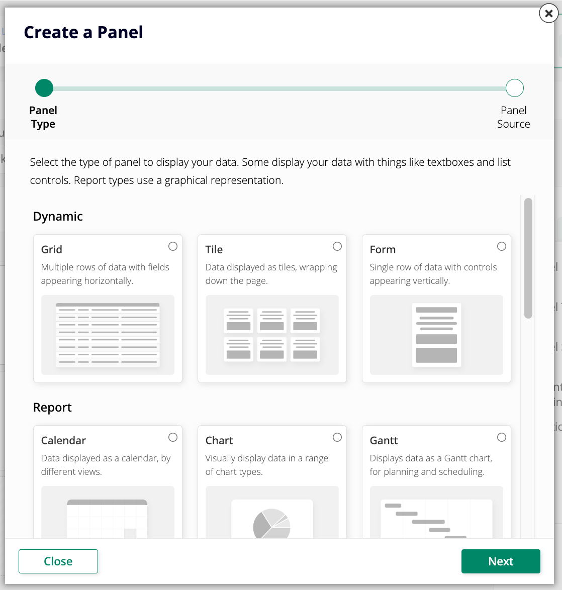
The dialog lists all the available types of panel, also described in the sections below:
-
Dynamic
-
Report
-
Calendar
Data displayed as a calendar, by different views. -
Chart
Visually display data in a range of chart types. -
Gantt
Displays data as a Gantt chart, for planning and scheduling. -
Map
Display a map to visualize geographic relationships. -
Network Graph
Visually show relationships between connected items. -
Pivot
Displays data in a pivot table format.
-
-
Edge Case
-
Agent Chat
A chat interface for interacting with your configured Agents. -
Custom HTML
Allows you to display custom HTML. -
Event Diagram Panel
Display a visual workflow in a panel on your page. -
File Browser
Adds a file browser control to your panel. -
Frame
Reserve space on the page to load other content. -
Lane
Data displayed as tiles in a series of lanes.
-
Dynamic
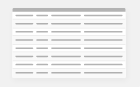
Grid
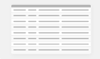
Grid is the basic panel type for displaying multiple rows of data at one time. This panel type displays specific columns from the selected data source table or object. Clicking on a column's title allows rows to be sorted in either ascending or descending order. The total number of rows on a Grid panel is displayed in the upper right-hand corner, above the column's titles. The number of rows loaded at one time (depending on total records) for display purposes may be fewer than the total or may be a subset of all records. To view more rows, click on the Load More Rows button at the bottom of the panel.
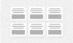
Tile
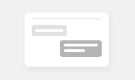
Tile panels combine the behavior of Grid panels and Form panels. Like Grid panels, Tile panels display multiple sets of information at once. However, information from data source tables or objects is presented in blocks arranged from left to right instead of in columns. As with Form panels, controls are grouped with other controls in the same position in the data table.
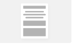
Form
Form panels are designed to display a singular line of data from the selected data source. This panel type is especially useful as a pop-up window or detail page in an application. When Form panels are assigned multiple controls, each control gets displayed individually.
Report
Calendar
Calendar panels populate a calendar with information from the selected data source. Like Chart panels, Calendar panels can be linked to another panel to display greater detail about an Event on the calendar.
Required control types
- Description: Designates what will appear on the calendar; typically an Event's Name.
- Event Start: Designates which day the Event starts on; may include timestamps displayed alongside the event description.
- Event End: Designates which day the Event ends on; may include timestamps displayed alongside the event description.
Optional control types
- Color: Color value used by the calendar to indicate Events.
- Sort: Allows you to apply sorting to the selected value.
Chart
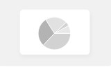
Chart panels display data in a graphical representation. App Builder supports many chart types, including Bar, Column, Line, and Area. Charts can be linked to the underlying data so a user can click through and view the supporting data.
Required control types
- Category: Represents the X-axis (horizontal) on the chart.
- Value: Represents the Y-axis (vertical) on the chart.
Optional control types
- Color: Color value used by the chart.
- Sort: Allows you to apply sorting to the selected value.
- Flag: Used to mark an event or point of interest.
- JSON Options Object: JSON object which overrides chart options.
Gantt
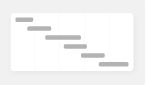
Gantt panels display Gantt charts, which are useful for planning and scheduling projects. They help assess how long a project should take, determine the resources needed, and plan the order in which tasks will be completed. Gantt charts are also a helpful tool for managing dependencies between tasks.
To use a Gantt chart on a Gantt panel, you need a business object that contains information for the required controls. Gantt charts can also represent Task Dependencies and Task Groups, provided that information is configured in the business object.
Required control types
- Task: Represents an individual project task being tracked.
- Start Date: Represents the task begin date.
- End Date: Represents the task end date.
Optional control types
- Color: Color value for the task on the chart.
- Dependency: Determines the relationship from the task to other tasks it depends on.
- Parent Task: Reference to another task from the business object, used for hierarchical arrangement.
- Sort: Allows you to apply sorting to the selected value.
- Task Group: Used for grouping or placing multiple tasks on the same row.
Map
Map panels display a map where controls can be visualized via geographic location. Names of map regions in your underlying business object must match identifiers from the Highmaps source maps; this can require extra attention to ensure your business object key can be recognized by the source map. For example, if you have a business object with US county names, county names may not be unique — in that case you must have a column that matches the key from Highmaps. Different maps provided through the Highmaps API can be chosen based on the data you wish to display.
For additional information on Map panels, see Map panel. For information regarding source maps provided in the Map panel, see the Highmaps documentation.
Required control types
- Category: Country, State, etc.
- Value: Value associated with the category.
Optional control types
- JSON Options Object: JSON object which overrides chart options.
- Color: Color value for an event or task.
Network Graph
Network Graph panels display interconnections between a set of entities. Each entity is represented by a node, and connections between nodes are represented through links.
Required control types
- From: From node for this link.
- Node: Network Graph node.
- Node Label: Network Graph node label. Required when using UUIDs for relationships.
Optional control types
- JSON Options Object: JSON object which overrides chart options.
- Link Color: Network Graph link color.
- Color: Color value for an event or task.
Pivot
Pivot panels display a pivot table with information from a data source.
Required control types
- Column: Populates the column headings.
- Row: Populates the row headings.
- Value: Displays the relevant data from the source.
Edge Case
Agent Chat
Agent Chat panels provide the interface through which you chat with your configured AI agents. In these panels, users can type messages and receive responses from the agent without leaving the application.
Custom HTML
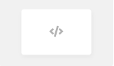
Custom HTML panels use HTML/CSS templates to display data and images. They offer a high degree of control over the display output and closely resemble a standard web page.
Event Diagram Panel
Event Diagram Panel panels embed an interactive visual workflow in a page, displaying the events configured on a table or business object as a BPMN process flow diagram.
File Browser
File Browser panels are linked to a local or network file system and look similar to a file directory. They allow users to upload files to a server and download them to a device. Navigation within subdirectories is also possible, with subdirectories indicated by a folder icon.
Frame
Frame panels reserve a space on the screen that all clicked page links will load into. The Frame panel type does not have content of its own — when a Frame exists on a screen, any page navigation is directed into the Frame instead of replacing the entire screen. This panel type is most often used to keep a persistent side menu visible while the Frame container renders the target page inside of it.
Lane
Lane panels display grouped information. They are similar to Tile panels in that they display data grouped into Form panel format, but can be configured either vertically or horizontally.