Project pane Components tab in Jitterbit Studio
Introduction
The project pane's Components tab is one of three tabs accessible in the project pane.
The Components tab displays all of the components in the open project grouped by component category.
Component categories
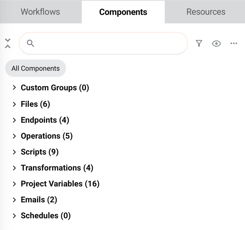
Each of these top-level categories is displayed next to a number in parentheses indicating how many components are in the category:
-
Custom Groups: Custom groups are an organizational tool to help organize project components (see Component groups). After creating a custom group, its user-defined name is displayed as a subcategory under Custom Groups. Under each custom group, any components contained within the custom group are listed.
-
Files: All schemas are listed (see Schemas).
-
Endpoints: An endpoint refers to a specific connection and its activities, created using connectors (see Connectors). The count of components in this category is based on the number of unique endpoint types, rather than the number of endpoint instances. For example, two database endpoints are counted as a single endpoint in the top-level Endpoints category.
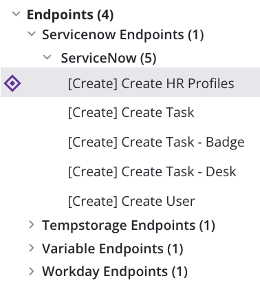
After creating an activity instance associated with a connection, the endpoint type is displayed as a subcategory under Endpoints, followed by the number of connection instances of that type in parentheses. For example, Database Endpoints (2). Connections are not displayed or counted unless at least one activity has been created from them.
The user-defined connection name is listed as an additional subcategory under the endpoint type, followed by the number of activity instances that have been created from each connection in parentheses. For example, PostgreSQL (4).
Under each connection, the user-defined name of each activity instance is listed.
-
Operations: All operations are listed (see Operations).
-
Scripts: All project component scripts are listed (see Scripts). Scripts created on target fields or nodes in a transformation are not project components, as they are considered part of the transformation component.
-
Transformations: All transformations are listed (see Transformations).
-
Invoke Operation: All instances of the Invoke Operation tool are listed (see Invoke Operation).
-
Project Variables: All project variables are listed (see Project variables).
-
Global Variables: All global variables are listed (see Global variables).
-
Emails: All email notifications are listed (see Email notifications).
-
Schedules: All operation schedules are listed (see Operation schedules).
View controls
Within the Components tab, these view controls are available:
Search
To search within the Components tab, use the search box to enter a single keyword or keyword string. The categories are automatically expanded to show components where the keyword string appears. The keyword string becomes bold and purple within the name of the component:
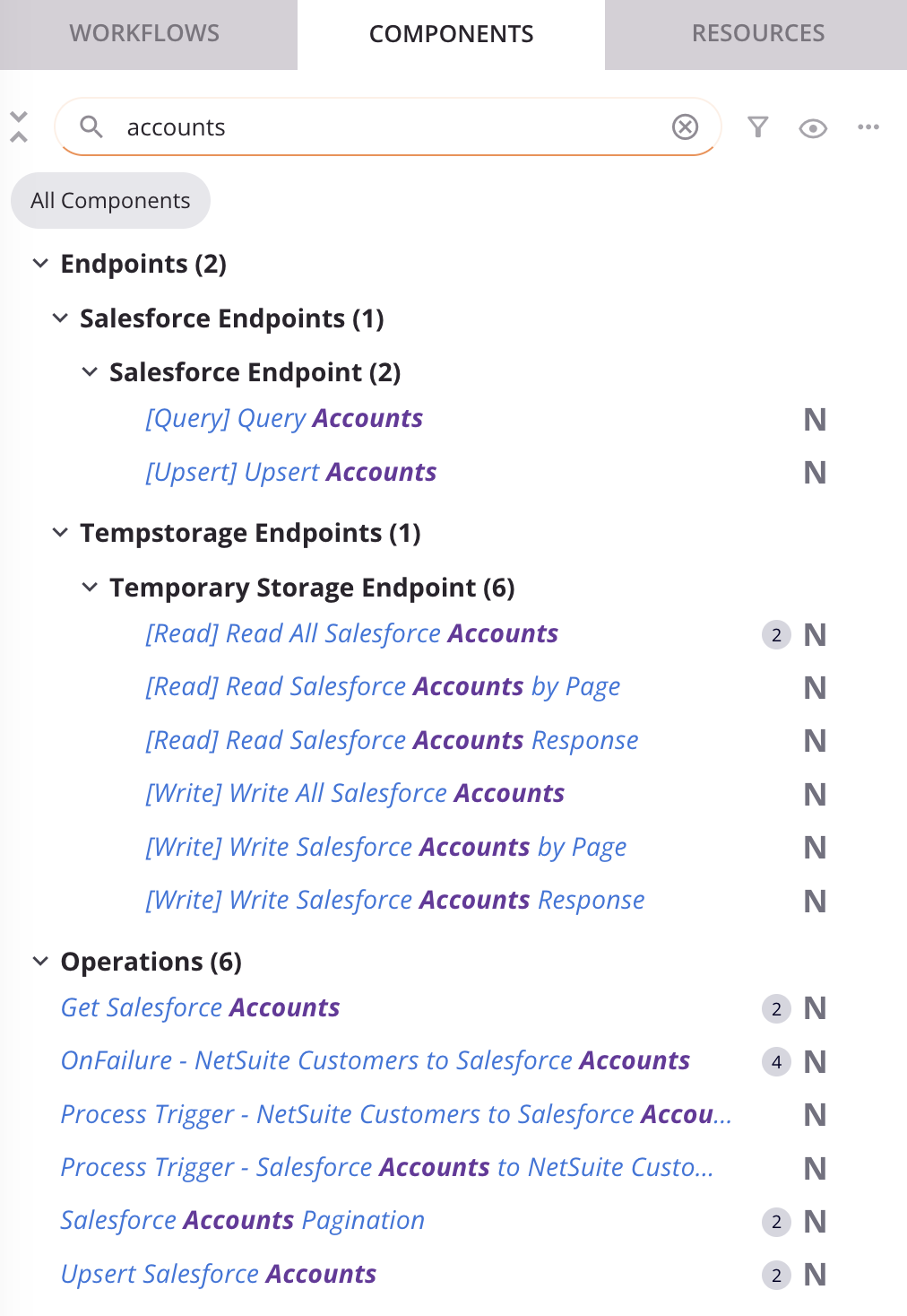
To clear the search, click the remove icon .
Filter
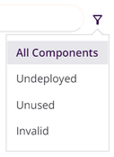
To filter by project component, use the filter icon menu to select from either All Components or any combination of the remaining filter options:
-
All Components: Show all components in the current project.
-
Undeployed: Show only components in the current project that have not yet been deployed or have been modified after they have been deployed.
-
Unused: Show only components that are not referenced by other components or workflows in the current project. Unused components are displayed with an unreferenced (broken link) icon regardless of whether this filter is selected. Unused components are also referred to as unreferenced or orphaned components.
Note
The unused classification is based on the project as it currently exists in the Studio project designer and doesn't take into account whether components have been deployed to Harmony.
-
Invalid: Show only components in the current project that are invalid. Invalid components are not able to be deployed. Validation criteria are described in Component validity. This filter may be useful to identify invalid components that are also unused in case you want to delete the unused component instead of resolving errors.
Once a filter is applied, filter labels are displayed below the filter icon:

To return to the All Components selection, use the filter menu or click the remove icon on all other filter labels.
Icon view preferences
To change the display of component visual indicators use the view icon menu to select from either Hide All or any combination of the remaining component visual indicators. Icon view preferences are remembered for each user and project.
![]()
-
Hide all / Show all: Depending on the current settings, click to either hide or show all component visual indicators. By default, all component visual indicators are shown.
-
Hide: The component visual indicator is visible. Click to hide it.
-
Show: The component visual indicator is hidden. Click to show it.
-
Modified: When shown, this status icon indicates the component has been modified since the last deploy.
-
New: When shown, this status icon indicates the component has been newly created since the last deploy.
-
Deployed: When shown, this status icon indicates the component has been deployed.
-
Unused: When shown, this component references icon indicates the component is not referenced by any of the operations inside a project's workflows.
-
Instances: When shown, this component references icon indicates the number of times the component is referenced on the design canvas, including within other components used on the design canvas.
-
Dependencies: When shown, the dependency icons indicate components that are a dependency of the currently selected component.
-
[Endpoint Activity Types]: When shown, the user-defined activity name is preceded by the activity type enclosed within square brackets. For example, [Create] Create HR Profiles:
Expand and select components
To expand or collapse a single category, click the category name or the carets next to the category.
To expand or collapse all categories at once, click the click the expand all or collapse all icons above the search box. You can also double-click any category name to expand or collapse all categories.
As you work on projects, Studio remembers the display states that a given user was last using for a given project, including whether the categories in the project pane are expanded or collapsed.
When a category is expanded, click a component within the category to select it. A selected component is displayed with a selection icon ![]() and a gray background:
and a gray background:
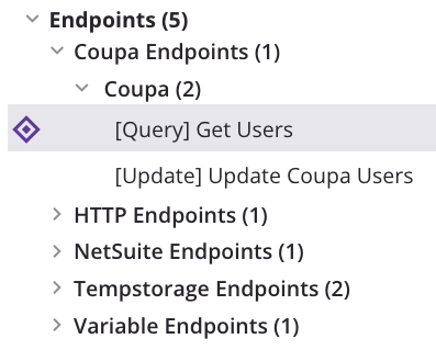
If the component is also referenced on the design canvas, the first instance of it is scrolled into view.
Categories themselves cannot be selected.
The project pane can also be resized to be narrower or wider, as described in Project pane.
Component visual indicators
Visual indications of component validity, dependency, status, and the number of other components that reference a component are displayed around the component's name:
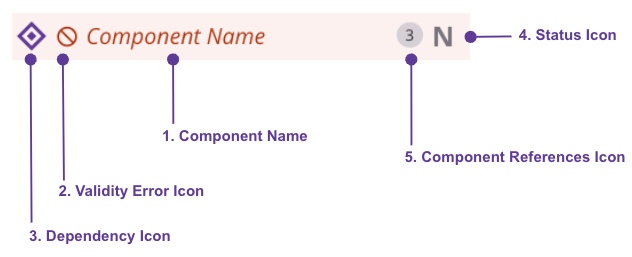
To change the visibility of these visual indicators, see Icon view preferences above.
Component name
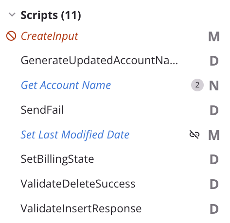
A component's name is displayed in black, blue, or red depending on whether the component is valid or has undeployed changes:
-
Black: Indicates that the component has been deployed or that the component is a global variable or custom group, which are always displayed in black.
-
Blue: Indicates that the component has undeployed changes.
-
Red: When using the Highlight Invalid Items option on the design canvas or when filtering on Invalid items, the color red indicates that the component contains errors and cannot be deployed.
Validity error icon
When using the Highlight Invalid Items option on the design canvas or when filtering on Invalid items, an error icon is displayed next to invalid components:
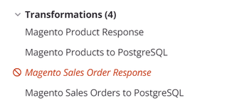
You can view the validation errors associated with invalid components as described in Component validity and Operation validity.
Dependency icon
When selecting a component either on the project pane's Components tab or on the design canvas, a dependency icon is displayed next to the name of a component that is a dependency of the selected component:
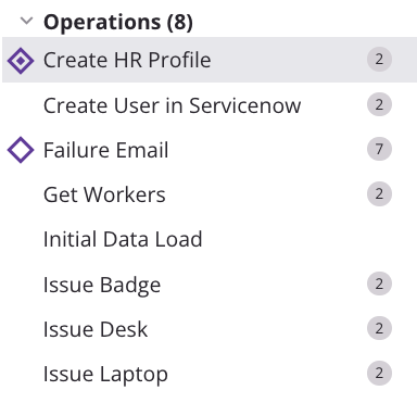
A selected component is displayed with a selection icon ![]() and a gray background.
and a gray background.
Note
A dependency is defined as a component that is needed by the selected component in order for it to function properly. When Component A needs Component B in order to execute successfully, Component B is a dependency of Component A.
Status icon
These status icons are displayed for components:
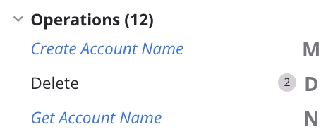
- New Component: Components that have a new component icon
are components that have been newly created since the last deploy. - Modified Component: Components that have a modified component icon
are components that have been modified since the last deploy. - Deployed Component: Components that have a deployed component icon
are components that have been deployed.
Component references icon
A component can be referenced by the components inside a project's workflows.
The number of components that reference the component is indicated by the presence or absence of badges to the right of the component name:
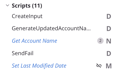
- A component that is not referenced by any of the operations inside a project's workflows is known as an unused component, and is displayed with an unreferenced (broken link) .
- A component that is referenced only once on the design canvas is displayed without any visual indicator.
- A component that is referenced multiple times on the design canvas, including within other components used on the design canvas, has the number of components it is referenced by displayed on a badge
.
Further details are provided in Component reuse and Operation reuse.
Actions menus
To open a menu of actions to take on a component, do one of these:
- Right-click the component.
- Hover over the component, and then click the actions menu icon .
- Use the Components tab actions menu.
The actions available in each menu depend on the context and vary according to the category or component.
Note
The Custom Groups category and components displayed within them are covered in Component groups.
Components tab actions menu
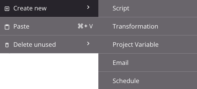
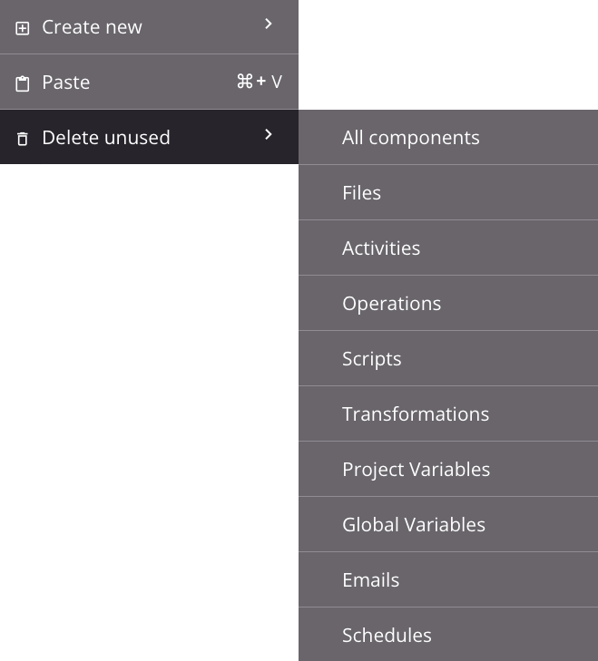
From the Components tab actions menu you can create, paste, or delete components.
Create New Actions Menu
Delete Unused Actions Menu
| Menu Item | Description |
|---|---|
Create New creates a new, unreferenced component of the respective type selected. This action is available for Scripts, Transformations, Invoke Operation, Project Variables, Emails, and Schedules. On clicking the component type, the component configuration screen opens for you to configure the component. |
|
Paste places the cut or copied component that is on your clipboard, thereby creating a duplicate of the component as a new, unreferenced component (see Component reuse). This action is available for Files, Endpoints, Operations, Scripts, Transformations, Project Variables, Emails, and Schedules. On creating the component duplicate, your cursor is positioned on the component name for renaming. |
|
Delete Unused permanently deletes components in the category that aren't referenced by any other components in the current project (see Component dependencies, deletion, and removal). This action is available for Files, Endpoints, Operations, Scripts, Transformations, Invoke Operation, Project Variables, Global Variables, Emails, and Schedules. On clicking a component type or All Components, a list of the unreferenced components for the component type is displayed. Deselect any component you don't want to permanently delete, then click Delete (see Delete unused in Component dependencies, deletion, and removal. |
Component actions menu
Some actions are available only on certain types of components, as detailed in the subsections below:
- Operations
- Files, activities, scripts, transformations, project variables, global variables, emails, and schedules
- Connections
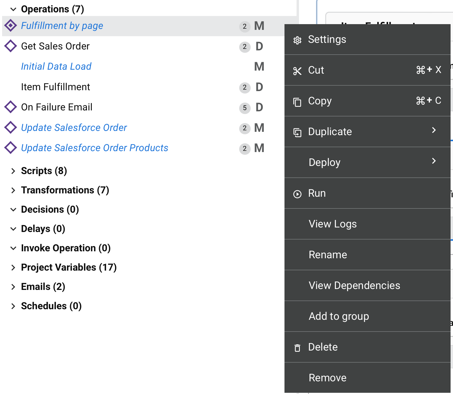
Operation Actions Menu
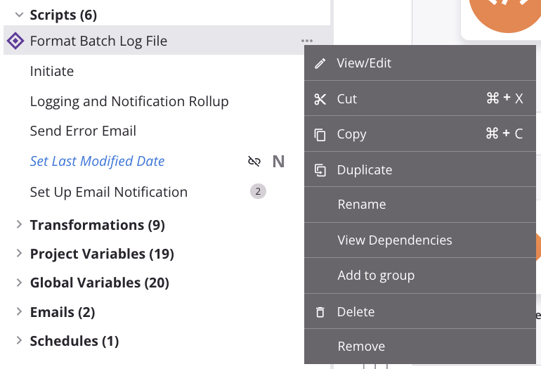
Script Actions Menu
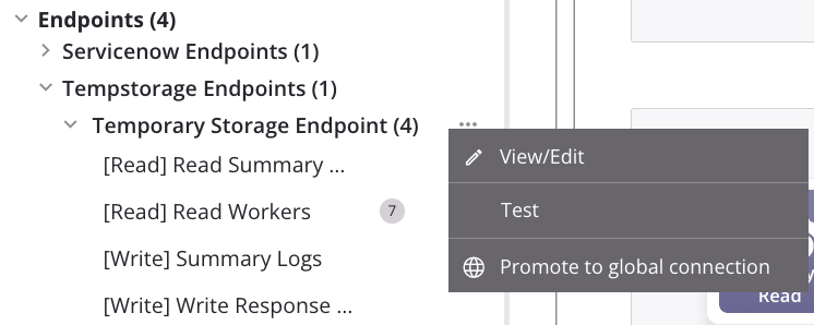
Connection Actions Menu
Operations
These items are available in an operation's actions menu:
| Menu Item | Description |
|---|---|
Settings opens the operation settings, containing three tabs:
|
|
| Publish as an API opens a dialog to configure and publish an API Manager custom API to be used to expose the operation for consumption (see Publish as an API). The number of APIs the operation is assigned to is displayed next to this menu item. This action is visible only when the operation has no undeployed changes. | |
| Publish as an API using AI opens the APIM AI Assistant, which guides you through publishing the operation as an API through interactive prompts. This action is visible only when the operation has no undeployed changes and the organization is licensed for the APIM AI Assistant. | |
| Cut places a copy of the operation on your clipboard and deletes the original operation from the project (see Operation reuse). | |
| Copy places a copy of the operation on your clipboard (see Operation reuse). | |
|
Duplicate shows these menu actions (see Operation reuse):
|
|
Deploy shows these menu actions:
|
| Run runs an already-deployed operation and any downstream (linked) operations (see Operation deployment and execution). | |
| View Logs opens the operation log screen, which includes logs for this operation and any child operations that have been deployed and executed (see Operation logs). | |
| Rename positions the cursor on the operation name for you to make any edits as necessary. | |
| View Dependencies changes the view in the project pane to display any other parts of the project that the specific operation is dependent on (see Operation dependencies, deletion, and removal). | |
| Add to Group opens a dialog to create a new custom group or to add the component to an existing group (see Component groups). | |
| Selective transfer opens a configuration screen where you can select specific components to transfer to another environment. For more information, see Project transfer. | |
| Delete permanently deletes the component (see Operation dependencies, deletion, and removal). | |
| Remove removes the operation from the design canvas. Any other references to the operation, such as within scripts, transformations, or configuration settings, are unaffected (see Operation dependencies, deletion, and removal). |
Files, activities, scripts, transformations, project variables, global variables, emails, and schedules
The actions menus for these components share many of the same actions:
| Menu Item | Description |
|---|---|
View/Edit opens the configuration screen for activities listed in an endpoint type subcategory under Endpoints, and components in the Scripts, Transformations, Project Variables, Emails, and Schedules categories. (This action is not available for components in the Files or Global Variables categories.) The component configuration screen can also be opened by double-clicking a component name. For details on configuration, refer to the respective component under Connectors, Scripts, Project variables, Transformations, Notifications, or Operation schedules. |
|
| Cut places a copy of the component on your clipboard and deletes the original component from the project (see Component reuse). This action is available for activities listed in an endpoint type subcategory under Endpoints, and components in the Files, Scripts, Transformations, Project Variables, Emails, and Schedules categories. (This action is not available in the Global Variables category.) | |
| Copy places a copy of the component on your clipboard (see Component reuse). This action is available for activities listed in an endpoint type subcategory under Endpoints, and components in the Files, Scripts, Transformations, Project Variables, Emails, and Schedules categories. (This action is not available in the Global Variables category.) | |
| Duplicate creates a new, unreferenced component using the same configuration as the original component (see Component reuse). This action is available for activities listed in an endpoint type subcategory under Endpoints, and components in the Scripts, Project Variables, Emails, and Schedules categories. (This action is not available for components in the Files, Transformations, or Global Variables categories.) | |
| Rename positions the cursor on the component name for you to make any edits as necessary. This action is available for activities listed in an endpoint type subcategory under Endpoints, and components in the Files, Scripts, Transformations, Project Variables, Emails, and Schedules categories. (This action is not available in the Global Variables category.) | |
| View Dependencies changes the view in the project pane to display any other parts of the project that the specific component is dependent on (see Component dependencies, deletion, and removal). | |
| Add to Group opens a dialog to create a new custom group or to add the component to an existing group (see Component groups). | |
| Delete permanently deletes the component (see Component dependencies, deletion, and removal). This action is available for activities listed in an endpoint type subcategory under Endpoints, and components in the Files, Scripts, Transformations, Project Variables, Emails, and Schedules categories. (This action is not available in the Global Variables category.) | |
| Remove removes the component as an operation step from all operations. Any other references to the components, such as within scripts, transformations, or configuration settings, are unaffected. This action is available for activities listed in an endpoint type subcategory under Endpoints, and components in the Scripts, Transformations, Project Variables, Emails, and Schedules categories. (This action is not available for components in the Files or Global Variables categories.) It is functional only when used on an activity, transformation, or script that is referenced as a step in an operation, or when used on an email notification that is configured with an operation action (see Component dependencies, deletion, and removal). |
Connections
Connections are listed in an endpoint type subcategory under Endpoints. The actions menu for a connection has the View/Edit, Test, and Promote to global endpoint actions:
| Menu Item | Description |
|---|---|
| View/Edit opens the configuration screen for the connection (see documentation on the specific endpoint connection under Connectors). | |
| Test tests the connection. This action is the same as clicking the Test button available in a connection configuration screen (see documentation on the specific endpoint connection under Connectors). | |
| Promote to global endpoint converts the connection to a global endpoint in the environment where the project resides. This action is not available for API, Variable, or SOAP connections, connections that use variables in their connection configuration, or connections that are already a global endpoint (see Global Endpoints). |