Button control in Jitterbit App Builder
A Button control places a clickable button on a panel. Clicking a button can execute an event, link to another page, or link to another panel, depending on how you configure it. This page describes how to add a Button control, configure what happens when it's clicked, control where it appears on the panel, and apply styles to it.
Add a Button control
To add a Button control to a panel:
- Open the desired page and select Action Drawer > Live Designer. Alternatively, open the desired page's edit screen by going to App Workbench > Pages.
- If you're using the Live Designer, select the panel where you want to add the button; its options populate the Live Designer. If you're in the App Workbench, select the panel where you want to add the button and click its Controls button.
-
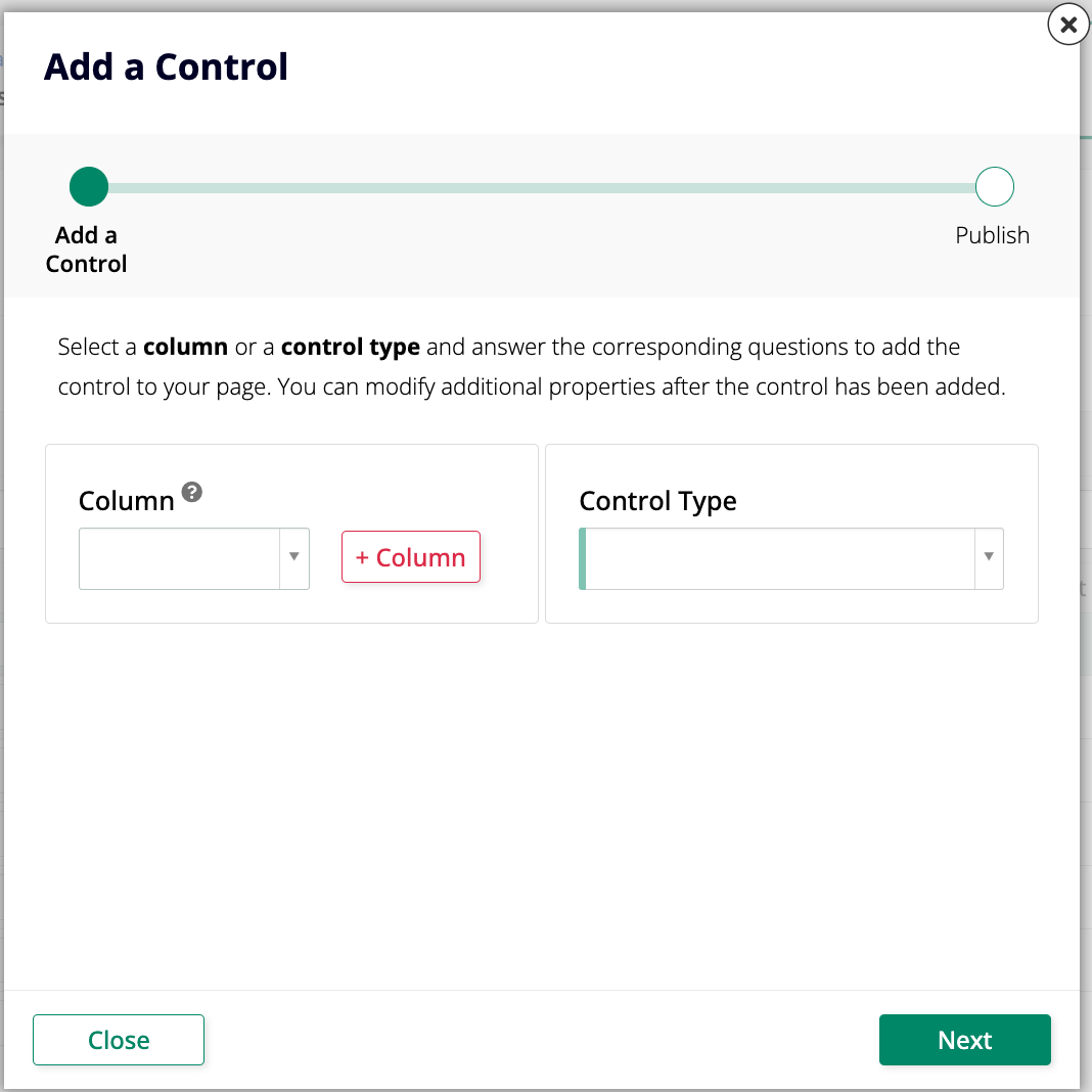
Click + Control. The Add a Control dialog opens:
-
(Optional) If the button should be associated with an underlying column, select it in the Column field.
- Set Control Type to Button.
- Enter a Name. This value appears as the button's label.
-
In the Control Subtype field, select whether the button should appear as Primary or Secondary:
- Primary: Displays as a main button on the panel.
- Secondary: Displays as a secondary button on the panel, with a lighter appearance than a Primary button.
-
Click Next.
- Configure what the button does when clicked. See Configure button click behavior below.
- Click Next, review the changes App Builder proposes, and click Finish.
After creating the button, you can set its location or apply styles from its settings.
Configure button click behavior
In the second step of the Add a Control dialog, choose what happens when a user clicks the button:
- Execute an Event: Select an event to run.
- Link to Page: Select a page to navigate to.
-
Link to Panel: Select a target panel on the same page to bring into view.
Note
The availability of the Link to Panel option depends on the App Builder version:
- In App Builder 4.64 and earlier, Link to Panel is available only on pages with the Wizard layout.
- In App Builder 4.65 and later, Link to Panel is available on any page layout.
Link to Panel also behaves differently depending on the panel's layout:
- On a Wizard page, clicking the button switches to the step that contains the target panel. See Wizard pages for details.
- If the target panel is in an unselected tab within a panel group that uses the Tabbed layout, clicking the button also selects that tab, revealing the panel. See Panel groups for more on Tabbed panel groups.
Button location
Button controls can be placed in one of four areas on a panel. To set this:
- If you're using the Live Designer, select the panel containing the button and click its Open record icon. If you're in the App Workbench, select the panel containing the button and click its Open record icon.
- Open the Control Properties tab.
-
In the Location field, select one of the following options:
- Body: (Default.) Displays inline on the panel.
- Header: Displays in the header region of the panel, defaulting to the right-hand side.
- Panel (Menu): Displays in a nested menu on the panel, in the top-right region.
- Toolbar: Displays in the toolbar region of the panel, defaulting to the right of any existing update method buttons (for example, Create or Audit).
The four possible button locations are illustrated below:

-
Click Save.
Style a button
Use Styles to further customize the appearance of a Button control, such as its size, color, and font weight. You can customize a style if you need more granular control.
- Open the page where the button is and select Action Drawer > Live Designer. Alternatively, open the page's edit screen by going to App Workbench > Pages.
- If you're using the Live Designer, select the button; its options populate the Live Designer. If you're in the App Workbench, select the panel where the button is and click its Controls button, then click the button's Open record icon.
- Go to More > Styles. The Styles dialog opens.
- Click + Style.
- Select Buttons from Style Categories.
- Locate the desired style and click its + Add button.
- Exit the styles and edit screens, then refresh the browser to confirm the update.