Text Area (control type) in Jitterbit App Builder
A Text Area control displays and edits a column's text value in a larger, multi-line region, instead of the single-line field a Text control uses. For example, a panel might use a Text Area control for a Notes field, where entries are often too long to comfortably fit on a single line.
Add a Text Area control
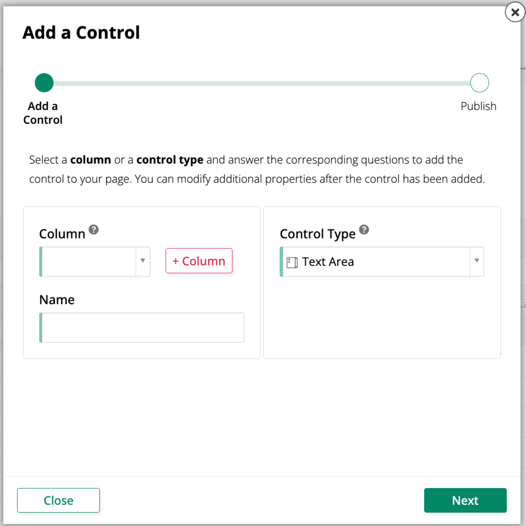
To add a new Text Area control to a panel, use the Add a Control dialog and select Text Area as the Control Type:
Convert an existing control to a Text Area control
To change an existing control to use the Text Area control type:
-
Navigate to the control, using either the Live Designer or the App Workbench:
-
From the app preview, open the page containing the control and select Action Drawer > Live Designer.
-
From the App Workbench, open the Pages tab, then in the Pages panel, locate the page containing the control and either double-click its row or click the Open record icon. In the Page Panel Layout panel, find the panel that houses the control and click Controls.
-
-
If you're in the Live Designer, click the control in the page view; this will populate the Live Designer with edit options for that control. If you're in the App Workbench, in the Controls panel, find the control and either double-click its row or click the Open record icon at the end of its row; App Builder opens a dialog similar to the Live Designer's.
-
In the Control Properties tab, set the Control Type field to Text Area.
-
Click Save.
Refresh the application view to confirm the update. The control now displays a larger, multi-line region for entering and viewing the column's text value.