Panel groups support tabs in Jitterbit App Builder
Use case
This feature allows for tabs to be supported at the Group level to toggle between Group child panels and Groups.
Overview
App Builder pages can fill up quickly with content. This content can get crowded and become hard to interpret. Having groups of panels presented with a tabbed interface is a good way to reduce clutter and make pages easier to use, read and digest.
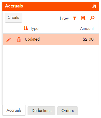
With the addition of Tabs as an option when defining a Group, App Builder will present the child panels and groups of that tabbed group one at a time. A row of tabs are added to let you toggle which child panel or group is visible. The visible child panel or group will fill the entire Group region within the page minus a small amount of space required for the tabs to display. See Figure 1.

Implementation
-
Panel Group Layout Option: Tabbed
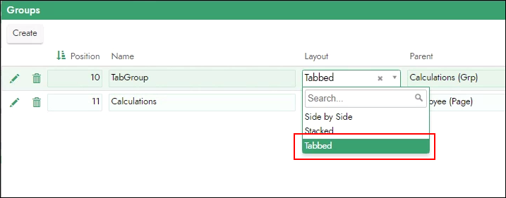
When you are defining a Panel Group within a page, there is a new Layout option available that is named Tabbed. This is where you define that a Panel Group should be rendered using a tabbed layout. Tabbed is a value in the Layout list. See Figure 2.

Note
Tabs and Scroll cannot be set on the same Group.
-
Overflow handling
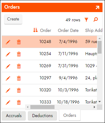
If the content of a child panel is too large to fit within the page space allocated to the tab group, that child panel will display scrollbars. See Figure 3.
