Control groups in Jitterbit App Builder
Control groups are containers that you can use to visually group together related controls that reside in the same panel. You can fine-tune the appearance and display of the information within these containers by using configuration options available when creating the groups, or through the use of styles.
Control groups are not to be confused with Panel groups, used for organizing panels on a page.
Usage
Control groups are used to organize controls in a panel, which is especially useful for panels that need to display a large number of controls. For instance, the panels pictured below contain two control groups each:
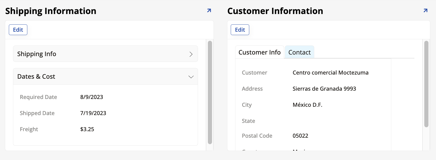
The Shipping Information panel contains the Shipping Info and Dates & Cost control groups, arranged as an accordion, while the Customer Information panel contains the Customer Info and Contact control groups, arranged as tabs. All these display options are controlled by the developer.
Create and organize control groups
To create a control group:
-
Go to App Workbench > Pages and select the page you want to work on.
-
If the panel you're organizing already exists, click its Controls button. Otherwise, create it and then access its control list.
-
In the control list, click + Control. The Add a Control dialog opens.
-
In the Control Type field, click to see the dropdown menu and scroll to find the Group section. Three options are available:
-
Accordion: The controls are shown or hidden in an "accordion" that users can open and close.
- When Accordion is selected, the Control Subtype field becomes available. Use it to choose whether more than one group can be disclosed at the same time (select Multiple) or if opening one should automatically close the others (select Single). The default is Single.
-
Field Group: The controls are listed in a field group, a container with a title chosen by you. The layout of the controls (fields) inside the container can also be customized.
Note
Field groups were previously referred to as control sets, field sets, zones, or simply as groups.
-
Tab: The controls are shown in tabs that users can click between.
-
-
In the Name field, enter a name to identify each control group.
-
Click Next and Finish.
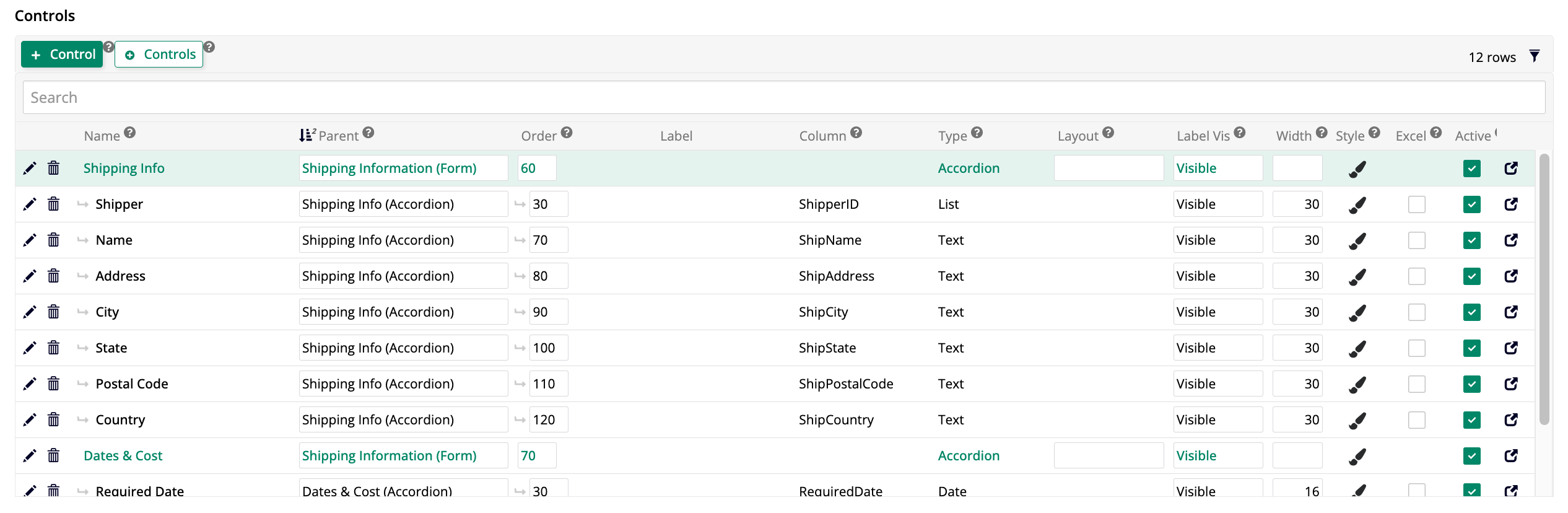
Now, any controls in the panel can be assigned to the control group you've created, which is listed among the other controls. The screenshot below shows the control list of the Shipping Information panel pictured earlier. Notice the two control groups among them, and how the other controls have them as parents.
By editing the Order field, you can alter the sequence in which the control groups are shown, as well as the sequence of the controls inside each group.