Observability metrics on the Agents page in Jitterbit Management Console
Introduction
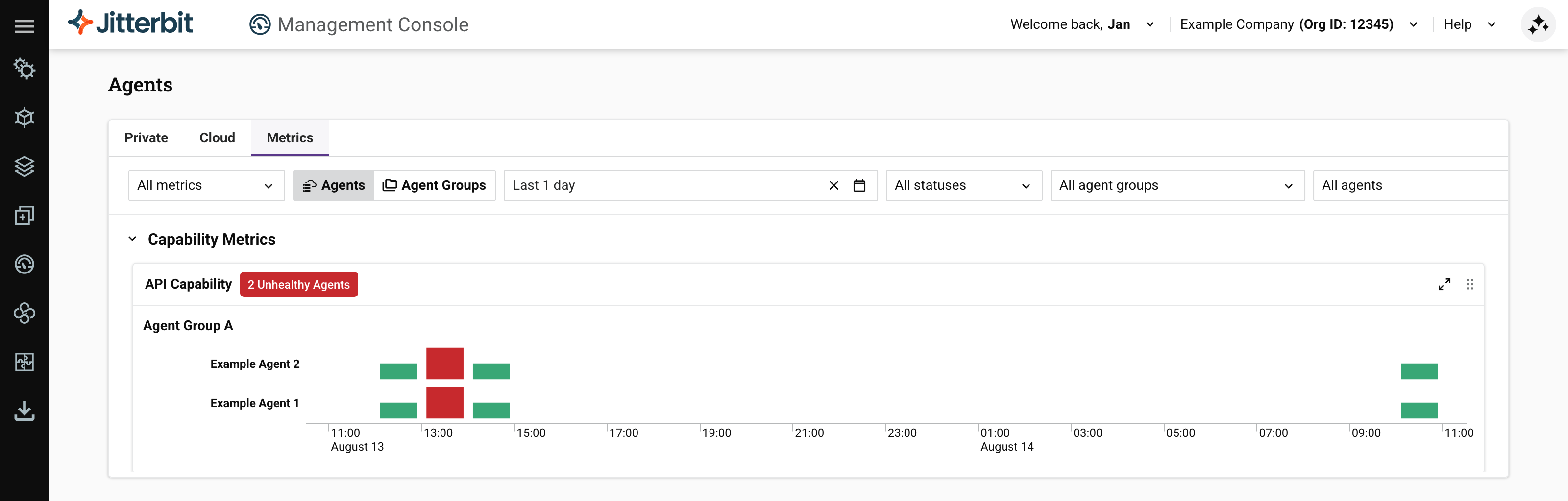
To monitor private agents and groups, select the Metrics tab:
Note
You must enable native observability on every private agent you want to monitor.
The Metrics tab contains a toolbar, and charts grouped into two sections, Capability and Service.
Toolbar
The toolbar has these controls:
-
Metrics selector: Select which metrics charts to show.
-
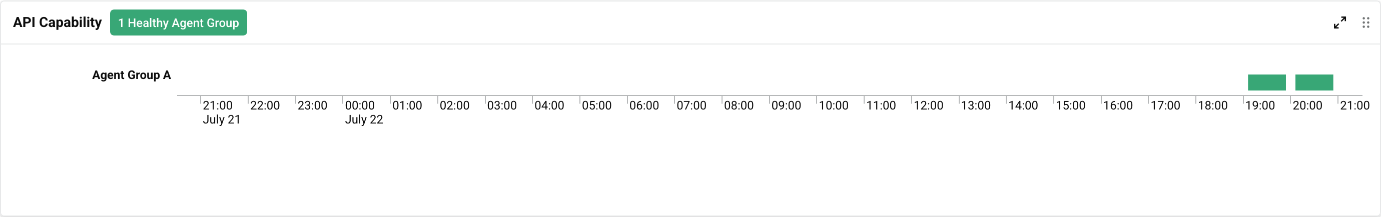
View selector: Select Agents to view metrics for individual agents, or Agent Groups to view metrics for whole agent groups:
Example chart in Agents view Example chart in Agent Groups view 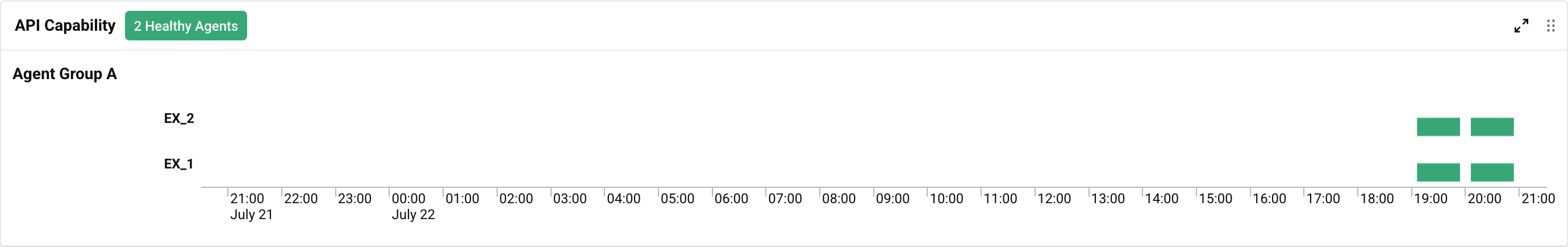
-
Date range selector: Select the date range to show metrics for. The default date range is the past 24 hours. To increase the time resolution of charts, either change the date range, or click on a colored segment. Subsequent clicks decrease the range until the limit (1 minute resolution) is reached. Your browser's locale determines how dates are shown.
-
Statuses selector: Select which of the following statuses to show:
-
Healthy: The agent or a member of the group is accepting operations for processing.
-
Degraded: The agent or a member of the group is in an unknown state.
-
Unhealthy: The agent or a member of the group cannot process operations.
-
-
Agent group selector: Select which agent groups to show metrics for.
-
Agent selector: When the view selector is set to Agents, select which agent to show metrics for. (When the view selector is Agent Groups, this control is inactive.)
Observability metrics charts
Info
See the Reference section for examples of each private agent observability metrics chart.
Charts plot data using the following colors to indicate your private agents' or private agent groups' health:
| Status | Example | Description |
|---|---|---|
| Healthy | 2 Healthy Agents | Agent or agent group is operational and capable. |
| Degraded | 1 Degraded Agent | Agent or agent group has partial or reduced capabilities. |
| Unhealthy | 1 Unhealthy Agent Group | Agent or agent group had critical issues resulting in loss of operational capabilities. |
The meaning of each status varies with the metric, and some metrics can show any status, while others can show only two. The following table shows which metrics can show which statuses, and what the status means:
| Category | Metric | Healthy | Degraded | Unhealthy |
|---|---|---|---|---|
| Capability | API Capability | Capable | Incapable | |
| Overall health | Capable | Incapable | ||
| Run Operation Capability | Capable | Incapable | ||
| System Resource Capability | Capable | Incapable | ||
| Service | Apache | Service is up | Service is down | |
| Cleanup | Service is up | Service is down | ||
| PGBouncer | Service is up | Service is down | ||
| PostgreSQL | Service is up | Service is down | ||
| Process Engine | Service is up | Service is down | ||
| Scheduler | Service is up | Service is down | ||
| Tomcat | Service is up | Service is down | ||
| Verbose Log Shipper | Service is up | Service is down |
For each of the following metrics, the status depends on the percentage of capacity used:
- Healthy: Less than 75% used.
- Degraded: Between 75% and 90% used.
- Unhealthy: More than 90% used.
| Category | Metric |
|---|---|
| Service | Agent Services Client |
| Apache Threads | |
| PostgreSQL Connections | |
| Rest Client | |
| Local Rest Client | |
| Tomcat Threads | |
| Pending Run Operations | |
| Pending Log Sync |
You can expand or move charts with these controls:
-
Expand: Click to expand the chart to fill the window. Click to return the chart to its original size.
-
Move: Click and drag to move the chart to another position.
For some charts, you can switch between bar and line charts using the and icons. Line charts have shaded regions showing the threshold values for each agent health status, Healthy, Degraded, or Unhealthy:
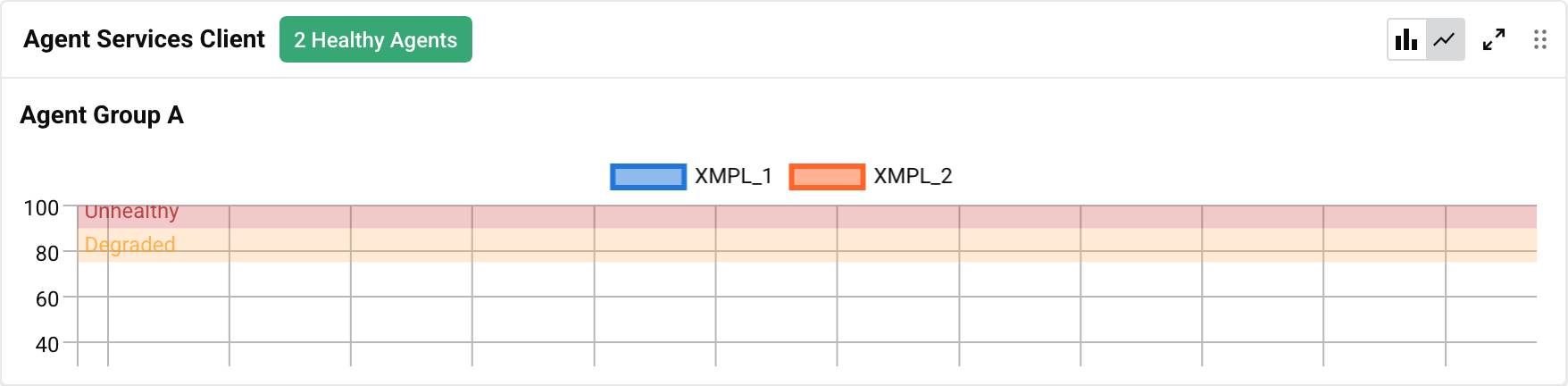
For charts that have them, line charts are the default view when the Management Console Agents page is first loaded.