Introducción a App Builder - Lección 5: Controles
Esta es la quinta lección de la serie de tutoriales Introducción a App Builder.
Controles de lista
Cuando aprendimos sobre objetos de negocio, o reglas, en la Lección 3, discutimos dos tipos: objetos fuente y objetos de lista. Para recapitular brevemente, aprendimos que los objetos fuente están destinados a mostrar el contenido de una tabla dada en la capa de datos. Los objetos de lista, por otro lado, se utilizan para crear menús desplegables en nuestras aplicaciones. Ahora que hemos creado varias páginas, usemos los objetos de lista que tenemos para agregar menús a ellas.
-
En App Workbench > Páginas, encuentra Producto, una de las páginas emergentes que creamos en la lección anterior. Haz clic en el ícono de lápiz para editarla.
-
En el panel Diseño del Panel de Página, haz clic en Controles.
-
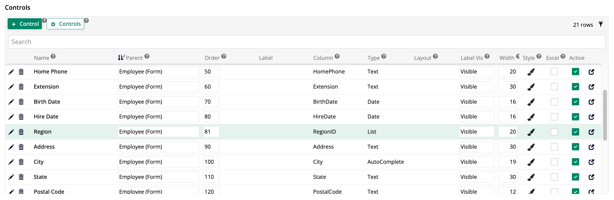
Aquí, puedes ver una lista de todos los controles que se muestran actualmente en esta ventana emergente. Cuando dejamos que App Builder eligiera automáticamente las columnas del objeto de negocio que usaría para esta página, eligió todas las columnas excepto las creadas por audit lite y aquellas en formato UUID, que no son legibles para los humanos. Agregaremos otro control. Haz clic en + Control. Aparece el cuadro de diálogo Agregar un Control:
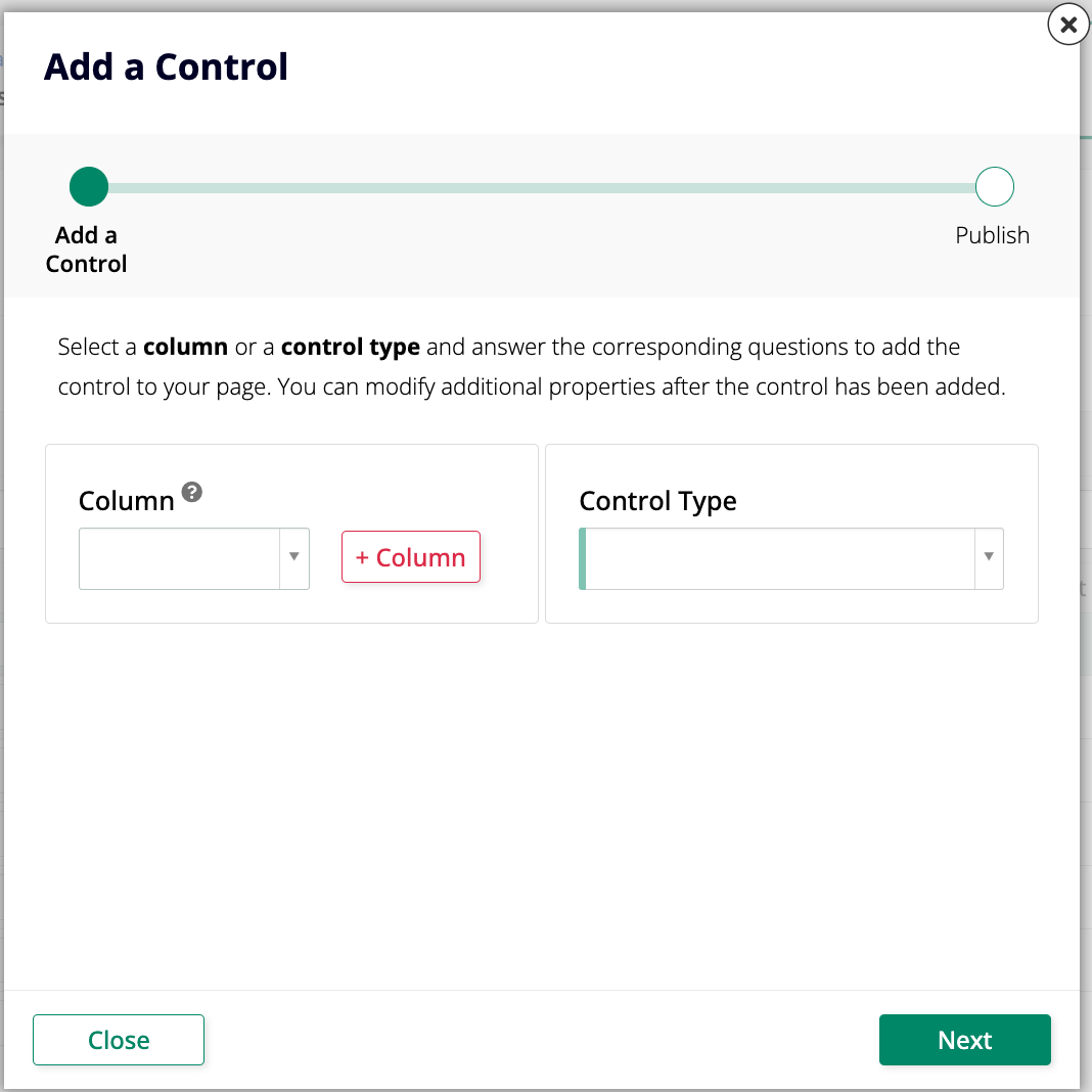
-
En el menú Columna, selecciona SupplierID. Un nuevo campo, Nombre, aparece automáticamente debajo de él, ya conteniendo el nombre
Supplier. El campo Tipo de Control selecciona automáticamente Lista. -
Haz clic en Siguiente.
-
En el siguiente paso del asistente, usa el menú Fuente para seleccionar Supplier (Lista), el objeto de lista que hemos creado previamente. Si los campos de Tipo de Uso del objeto de lista han sido seleccionados correctamente, los siguientes dos campos se completarán automáticamente y puedes omitir los Pasos 7 y 8.
-
Usa el menú Clave (Columna) para seleccionar Supplier ID (PK).
-
Usa el menú Título (Columna) para seleccionar Proveedor.
-
Haz clic en Siguiente, luego en Finalizar.
-
Navega a la página de Productos y haz clic en Ver Página. Elige cualquiera de las entradas en la lista y haz clic en el botón al final de la fila. Nota que la página emergente de Producto ahora tiene un nuevo campo Proveedor. Si haces clic en el botón Editar, verás que es un menú desplegable.
Tiempo de práctica: Agregar otro control de lista
Repite el mismo proceso que hemos realizado arriba para agregar una lista de Categoría a la página de Producto. Nuestra aplicación Northwinds necesitará ambas listas.
Agregar relaciones entre tablas
En Lección 2, creamos una tabla llamada Región. Sin embargo, actualmente está aislada, lo que significa que no se conecta a ninguna de nuestras otras tablas, por lo que no podemos usar la información que contiene. Vamos a solucionar eso creando una relación entre ella y la tabla de Empleado. De esta manera, podremos hacer un seguimiento de dónde trabaja cada empleado.
Primero, necesitamos agregar una nueva columna a la tabla de Empleado.
-
En App Workbench > Tablas, encuentra la tabla de Empleado y ábrela.
-
Haz clic en + Columna.
-
Asigna a la nueva columna el nombre
RegionID. En el panel de Tipos de Datos, asegúrate de que el menú Lógico tenga seleccionada la opción ID Único y el menú Físico se ajustará automáticamente a UUID. -
Haz clic en Guardar.
-
Como buena práctica, haz clic en Resultados para verificar que la columna RegionID se haya agregado.
-
La nueva columna RegionID ahora aparece en la lista. App Builder la ha identificado como una clave externa basada en el análisis del esquema de datos, y es una buena práctica hacer cumplir esta restricción haciendo clic en el símbolo + que aparece en la columna FK. Aparecerá un mensaje de confirmación. Haz clic en Continuar.
El siguiente paso es asegurarnos de que la nueva columna también se agregue a la regla que construimos basada en esta tabla.
-
En App Workbench > Reglas, encuentra la regla de Empleado (Fuente) y ábrela.
-
En el panel de Tablas, verás la lista de columnas de la tabla Empleado utilizada por la regla. Encuentra la columna RegionID que has creado recientemente y selecciona su casilla para incluirla.
Ahora, podemos agregar un control de lista a la página emergente de Empleado para indicar dónde trabaja cada empleado.
-
En App Workbench > Páginas, encuentra la página Empleado y ábrela.
-
En el panel de Diseño del Panel de Página, haz clic en Controles.
-
Haz clic en + Control.
-
En el menú de Columna, selecciona RegionID y haz clic en Siguiente.
-
En Fuente, selecciona Región (Lista). La selección de Clave (Columna) debe ser RegionID (PK) y el Título (Columna) debe ser Región.
-
Haz clic en Siguiente, y luego en Finalizar.
-
Cuando el Constructor de Aplicaciones termine de crear el nuevo control, volverás a la lista de controles. Modifica la columna Orden para que el nuevo control se muestre antes de la información de ubicación del empleado:
-
Para comenzar a usar el nuevo control, navega a la página de Empleados, haz clic en Ver Página y abre los detalles de cualquier empleado. Asegúrate de que el campo Región esté mostrando donde esperas que esté. Los campos deben estar vacíos, así que revisa varios empleados y asígnales una región, eligiendo Región de la Costa Este para algunos y Región de la Costa Oeste para otros. Esto será importante cuando avancemos a temas más avanzados más adelante.
Controles HTML
Si navegas nuevamente a la página de Empleados y haces clic en el botón para ver detalles sobre la empleada llamada Laura Callahan, notarás que el campo Notas está mostrando texto HTML en bruto. Vamos a repasar los pasos para que el HTML se muestre correctamente.
-
Navega a la página de Empleados y haz clic en Ver Página.
-
Haz clic en el botón que muestra detalles sobre un empleado y espera a que aparezca la ventana emergente de Empleado.
-
Haz clic en el ícono de hamburguesa en la parte superior derecha de la página para abrir el panel de acciones y haz clic en Diseñador en Vivo.
-
Cuando se abra el menú lateral del diseñador en vivo, haz clic en el campo Notas para resaltarlo. Al hacerlo, el diseñador en vivo mostrará opciones de edición para ese campo.
-
En la pestaña Propiedades del Control, el menú Tipo de Control actualmente muestra Texto. Esto significa que el Constructor de Aplicaciones simplemente está mostrando lo que hay en la columna sin ningún cambio. Selecciona HTML en su lugar. Esto hará que el Constructor de Aplicaciones trate el contenido correctamente, interpretando el código HTML.
-
Haz clic en Guardar. El campo Notas ahora muestra texto estilizado y formateado:

Crear, Actualizar y Eliminar controles
Los paneles en el Constructor de Aplicaciones ofrecen la opción de crear, actualizar o eliminar registros. Sin embargo, no siempre deseas dar a los usuarios todas estas opciones. Otras veces, hay limitaciones de espacio y deseas eliminar algunas de las opciones porque sus íconos ocupan espacio en las pantallas de tu aplicación. Aprendamos cómo hacer cambios en estas características.
Editar las opciones de crear y actualizar
El Constructor de Aplicaciones te permite cambiar la forma en que funcionan los íconos de crear y actualizar, específicamente qué áreas se vuelven disponibles para editar al hacer clic en uno de los íconos. Aprendamos cómo modificando el funcionamiento de las opciones en nuestra página de Clientes.
-
Navega a la página de Clientes y haz clic en Ver Página para previsualizarla.
-
Haz clic en el ícono de hamburguesa en la parte superior derecha de la página para abrir el panel de acciones y haz clic en Diseñador en Vivo.
-
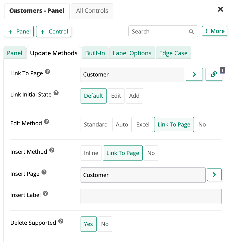
Haz clic en el panel de Clientes para que el diseñador en vivo muestre opciones de edición para él.
-
En la pestaña Métodos de Actualización, cambia tanto las opciones de Método de Edición como de Método de Inserción a Vincular a Página. Esto significa que cuando un usuario intente editar una entrada o agregar una nueva, será vinculado a una página de tu elección, en lugar de la interfaz de edición en línea que se muestra por defecto. Elige la página emergente de Cliente que ya hemos creado:
-
Haz clic en Guardar. Una vez que App Builder guarde, sal del diseñador en vivo y prueba tus cambios. Intenta hacer clic en Crear o en el ícono de edición y verifica que se muestre la página emergente de Cliente.
Tiempo de práctica: Editar las opciones de crear y actualizar para otras páginas
Repite el proceso que hemos realizado anteriormente en la página de Clientes para las páginas de Empleados, Proveedores, Transportistas y Productos, utilizando sus respectivas páginas emergentes.
Deshabilitar eliminar y crear en una página
Vamos a deshabilitar las funciones de eliminar y crear en la página de Parámetro, que creaste al final de Lección 4. Este es un buen ejemplo para usar porque los parámetros que rigen toda la aplicación nunca deben ser eliminados ni debe haber más de un conjunto.
-
Navega a la página de Parámetro y haz clic en Ver Página para previsualizarla.
-
Haz clic en el ícono de hamburguesa en la parte superior derecha de la página para abrir el panel de acciones y haz clic en Diseñador en Vivo.
-
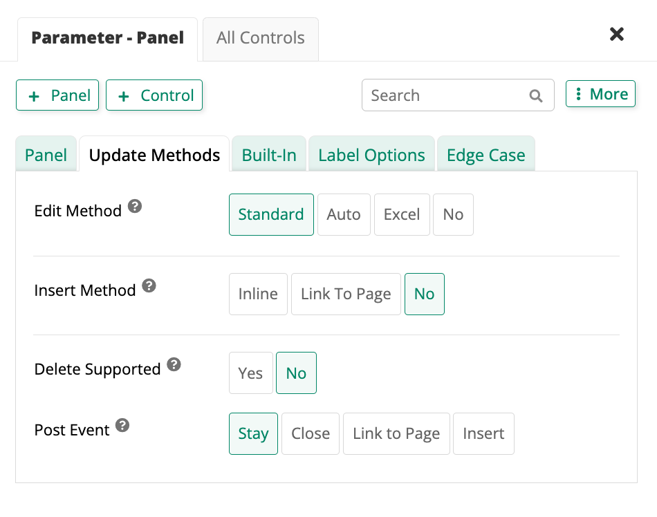
Haz clic en el panel de Parámetro para que el diseñador en vivo muestre las opciones de edición para él.
-
En la pestaña de Métodos de Actualización, encuentra la opción de Método de Inserción. Selecciona No, ya que no queremos que se agreguen nuevos conjuntos de parámetros.
-
En la misma pestaña, encuentra la opción de Eliminar Soportado. Si Sí está resaltado, un botón de Eliminar será visible en la ventana emergente. Haz clic en No para asegurarte de que el botón no se muestre.
-
Cuando App Builder guarde los cambios, nota que el botón de Eliminar desaparece.
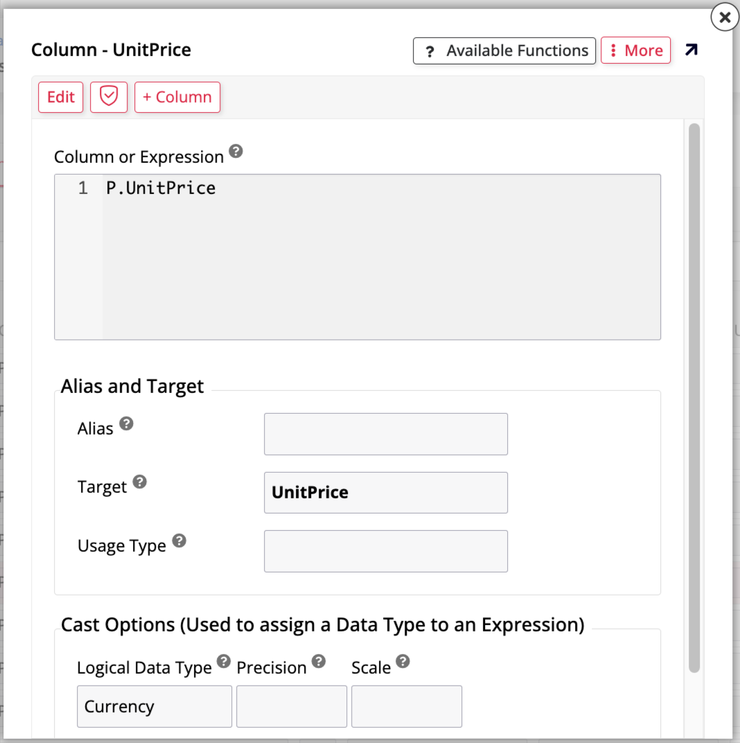
Usar un control de moneda
Echa un vistazo a la página de Productos. La columna de Precio Unitario está mostrando valores como números simples, pero se supone que son cifras monetarias. Editaremos ese control para que formatee los valores de la manera que esperamos. Hay varias formas de hacerlo, pero lo haremos desde la capa de negocio.
-
En App Workbench > Rules, encuentra la regla Product (Source), ya que es la base de la página de Products, y haz clic para editarla.
-
En la pestaña Columns, localiza la fila que apunta a la columna UnitPrice y haz clic en el ícono de edición .
-
En la sección Cast Options, utiliza el campo Logical Data Type para seleccionar Currency. Haz clic en Save:
Nota
También puedes editar el campo sin el popup, haciendo clic en el ícono de lápiz o haciendo clic directamente en el campo bajo Logical en línea.
-
Regresa a la vista previa de la página de Products. Los precios deberían mostrarse correctamente ahora.
Review and wrap-up
En esta lección, hemos aprendido sobre varios tipos diferentes de controles. Hemos trabajado con controles de lista, archivo, HTML, crear, actualizar, eliminar y de moneda. También creamos relaciones entre tablas. Continuaremos explorando las características de App Builder para mejorar nuestra aplicación en las próximas lecciones. Avanza a Lesson 6: Binding.