Introducción a App Builder - Lección 4: La capa de UI
Esta es la cuarta lección de la serie de tutoriales Introducción a App Builder.
La capa de UI
Como su nombre lo sugiere, la capa de UI es donde los desarrolladores de App Builder definen lo que se muestra a los usuarios finales de las aplicaciones, incluidas las páginas que se utilizarán para navegar por ellas.
En las lecciones anteriores, comenzamos con la capa de datos, donde viven nuestros datos, y los organizamos en tablas. Luego, en la capa de negocio, creamos los objetos de negocio, o reglas, que nos permitirán recuperar los datos para leerlos, mostrarlos y modificarlos. Ahora que esta estructura subyacente está lista, podemos trabajar en la UI de nuestra aplicación.
La UI de una aplicación de App Builder se compone de tres partes: páginas, paneles y controles. Definamos estos tres términos:
-
Página: Una página es solo la estructura. No tiene ningún dato y contiene solo un panel o varios paneles.
-
Panel: Un panel es una sección o área que se sitúa sobre la página. Los paneles contienen datos derivados de las reglas a las que los conectas. Hay varios tipos de paneles en App Builder, pero en estas lecciones, solo usaremos dos:
-
Formulario: Solo muestran información de un registro a la vez.
-
Cuadrícula: Muestran información de múltiples registros.
-
-
Control: Un control identifica qué componente específico de datos de una fuente de datos deseas mostrar o examinar.
Veamos cómo funcionan estos conceptos en la práctica creando una página.
Crea tu primera página: Categorías
Vamos a crear y agregar a nuestra aplicación una página que mostrará todos los registros en la tabla Categoría. Sigue estos pasos:
-
Accede al App Workbench. Puedes hacerlo haciendo clic en el ícono de hamburguesa en la parte superior derecha de cualquier página, lo que revela el panel de acciones, y luego seleccionando App Workbench.
-
Hay múltiples formas de crear páginas en App Builder. Ve a la pestaña Páginas y haz clic en el botón + Página allí. Se abre el asistente Crear una nueva página:
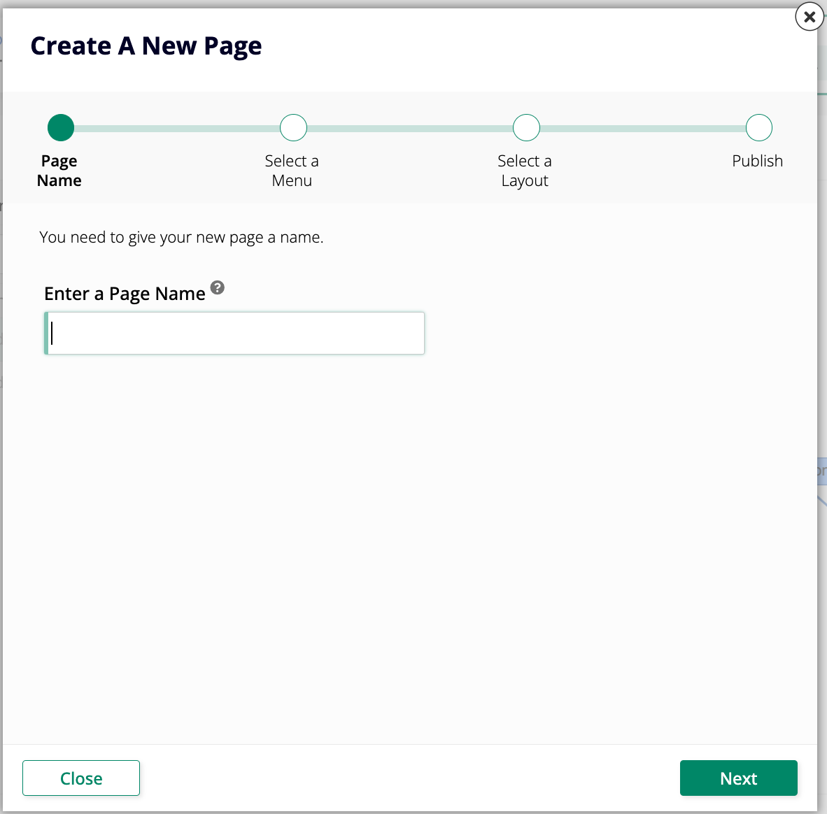
-
Ingresa
Categoríascomo el nombre de la página. Usaremos un nombre en plural para esta página porque mostrará múltiples registros de categorías. Haz clic en Siguiente. -
En Seleccionar un Menú, debes elegir el menú en el que deseas que aparezca tu nueva página. Selecciona Configuración.
-
En Seleccionar un Diseño, elige un diseño para la nueva página. Aunque se puede cambiar más tarde, debes seleccionar uno para poder crear la página. Selecciona Página Completa y haz clic en Siguiente.
-
Haz clic en Finalizar y App Builder creará la página. Después de unos momentos, verás la página de Edición de Página, donde puedes continuar configurando el contenido de la página.
Acabas de crear tu primera página en App Builder. Aún no tiene nada, pero puedes ver cómo se ve haciendo clic en el botón Ver Página en la página de Edición de Página. App Builder abrirá una nueva pestaña en tu navegador para mostrarte el estado actual de la página. Puedes mantener esa pestaña abierta y actualizarla periódicamente mientras continúas trabajando.
Agregar contenido a tu página
Continuemos configurando la página de Categorías. Hemos elegido un diseño para ella y decidido dónde se puede encontrar, pero necesitamos agregar contenido.
Ve a App Workbench > Páginas y encuentra la página de Categorías que acabas de crear. Haz clic en el ícono de lápiz al final de su fila para entrar en modo de edición.
Una vez que estés en modo de edición, sigue estos pasos:
-
En el panel de Diseño de Página, haz clic en Elegir Tipo de Panel. Se abre el asistente de Crear un Panel:
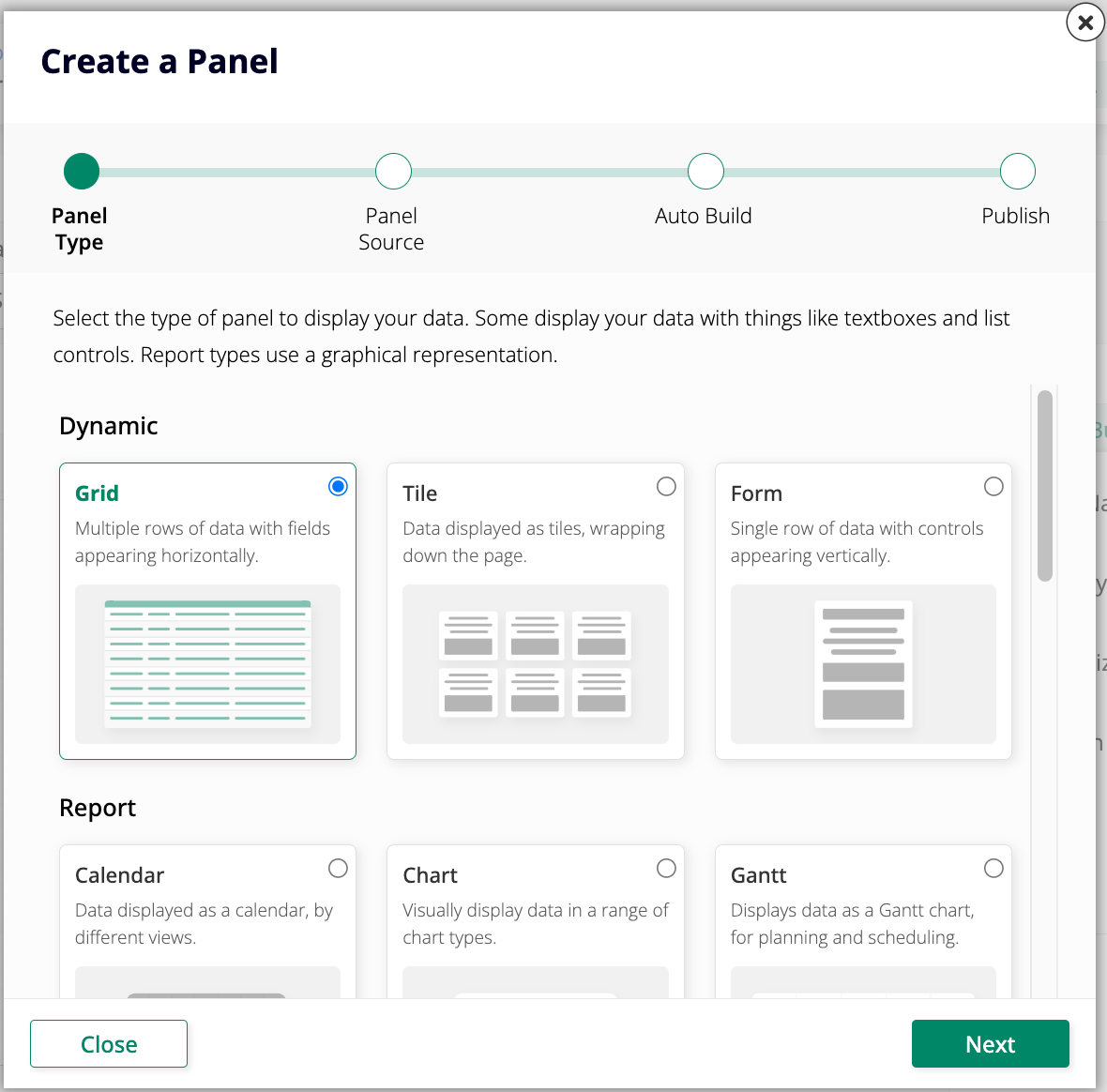
-
Estamos tratando de mostrar todos los registros de una tabla específica, así que selecciona Cuadrícula como el Tipo de Panel y haz clic en Siguiente.
-
Selecciona Categoría (Fuente) como la Fuente del Panel, ya que esa es la regla que se conecta a la tabla que contiene los datos que queremos. Haz clic en Siguiente.
-
App Builder preguntará si deseas que agregue controles automáticamente a tu panel. Será útil hacerlo manualmente cuando hay muchas columnas en una tabla y no necesitas todas, pero en el caso de esta página que estamos creando ahora, selecciona Auto Build y haz clic en Next.
-
Haz clic en Finish.
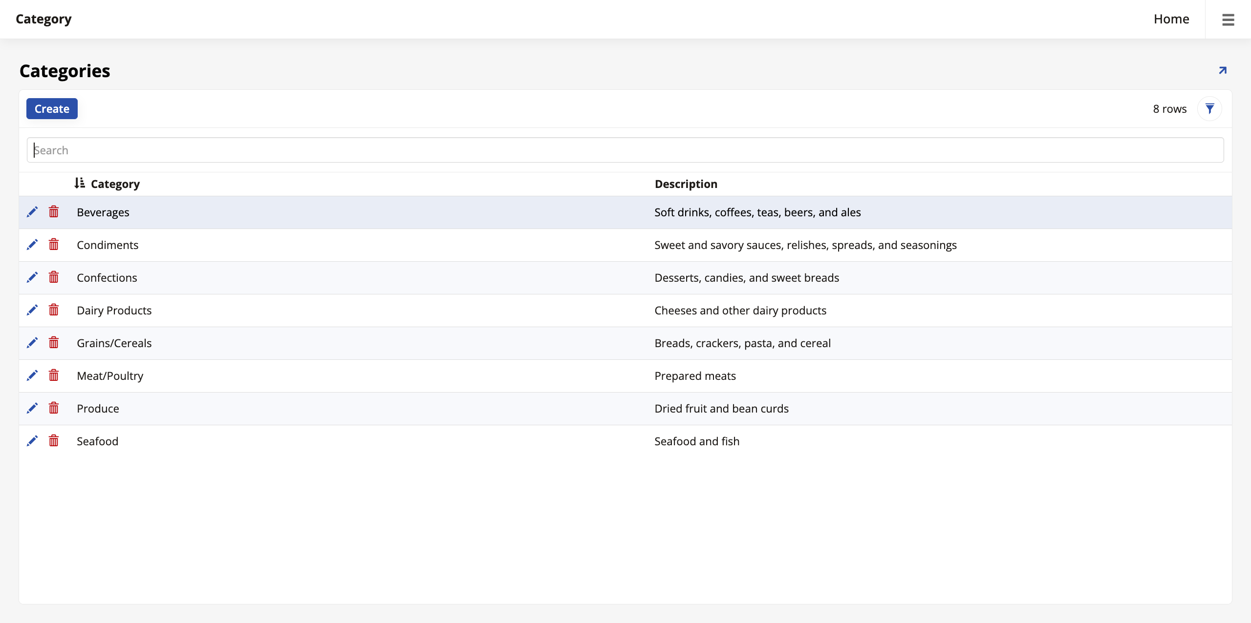
Después de unos momentos, el Page Panel Layout se actualizará, mostrando los controles que App Builder creó para la página. Si haces clic en View Page, la vista previa debería verse así:
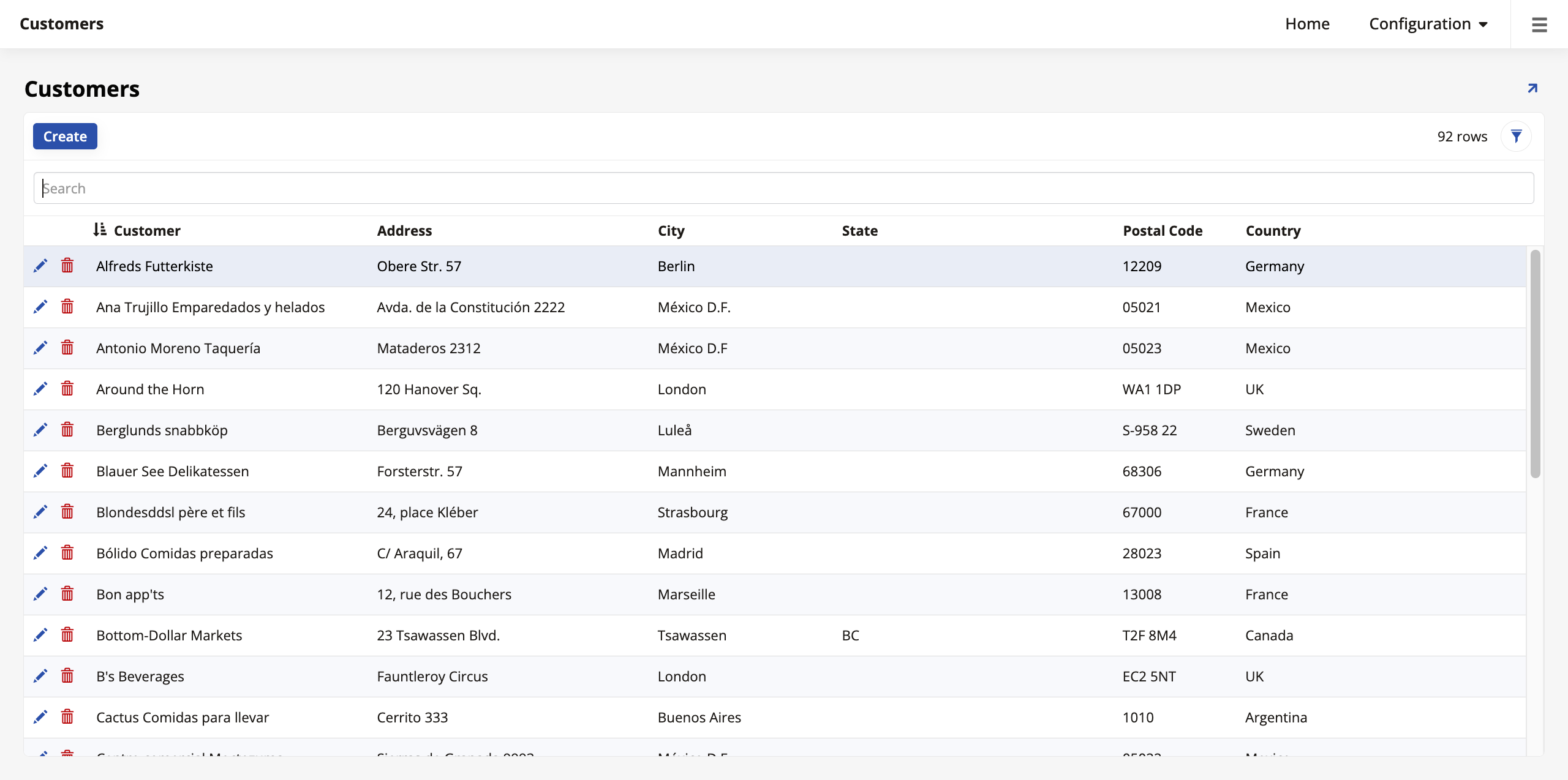
Crear una segunda página: Clientes
Vamos a crear otra página, pero esta vez seleccionaremos sus controles manualmente:
-
Repite los Pasos 1 y 2 de cuando creaste la página de Categorías.
-
Dale a esta nueva página el nombre
Clientes. Haz clic en Next. -
En Select a Menu, elige Home.
-
En Select a Layout, elige Full Page.
-
Haz clic en Finish y espera a que App Builder cree la página. Cuando termine, estarás en la pantalla de edición de la nueva página.
-
Haz clic en Choose Panel Type y selecciona Grid como el Panel Type de la nueva página. Haz clic en Next.
-
Esta vez, en lugar de permitir que App Builder agregue controles automáticamente a tu panel, selecciona Choose Manually y haz clic en Next. Aparece un paso adicional en el asistente, pidiéndote que selecciones qué columnas del objeto Customer (Source) deseas usar:
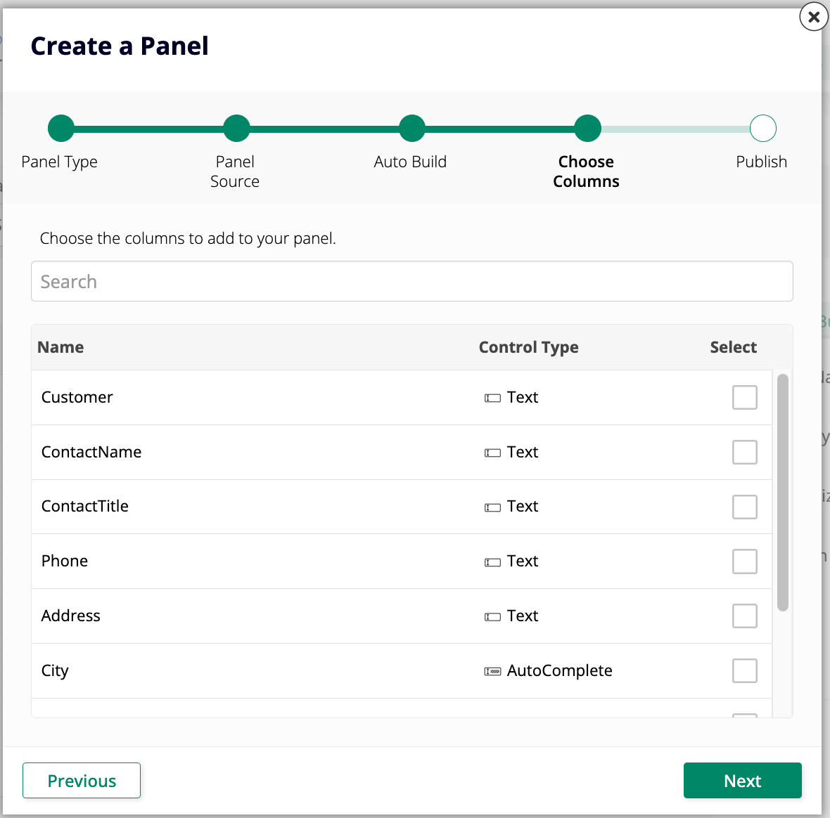
No necesitamos mostrar todas estas en nuestra interfaz de usuario. Selecciona las columnas Customer, Address, City, State, PostalCode y Country. Haz clic en Next, y luego en Finish.
Cuando App Builder termine de agregar los controles, haz clic en View Page nuevamente para ver el resultado. La página de Clientes debería verse así:
Tiempo de práctica: Crear más páginas
Nuestra aplicación Northwinds necesitará más de dos páginas para funcionar correctamente, así que vamos a crear algunas más. Antes de comenzar, ten en cuenta lo siguiente:
-
Al seleccionar las fuentes del panel, asegúrate de seleccionar los objetos de origen, no los objetos de lista.
-
Cuando se te pida seleccionar un menú para cada página, selecciona el menú de Configuración.
-
Cada página debe tener entre cinco y seis controles para que se pueda leer cómodamente, ¡así que elige sabiamente qué columnas crees que son más esenciales para mostrar en la interfaz de usuario!
Agrega páginas similares a las que acabamos de construir para los objetos de negocio Productos y Regiones.
Nota
Puedes encontrar otro botón de + Página en la página de inicio de App Workbench. Funciona de la misma manera que el de la pestaña Páginas.
Páginas emergentes
Las páginas emergentes se muestran sobre una página base y pueden mostrar datos adicionales a través de sus propios controles. Son útiles porque te permiten mostrar mucho más que solo cinco o seis controles en una página determinada. Pueden contener tantos datos como desees y pueden desplazarse infinitamente.
Agregar una emergente a la página de Clientes
Te guiaremos sobre cómo agregar una página emergente a una página base existente utilizando la página de Clientes.
-
Ve a App Workbench > Páginas y haz clic en + Página.
-
Ingresa el nombre
Cliente. Esta vez usaremos un nombre en singular porque esta página mostrará solo un registro. -
Haz clic en Siguiente.
-
En Seleccionar un Menú, elige Ninguno.
-
En el paso de Seleccionar un Diseño, sin embargo, selecciona Formulario Emergente. Haz clic en Siguiente y luego en Finalizar.
-
Cuando App Builder termine de crear la página, haz clic en + Elegir Tipo de Panel y selecciona Formulario, ya que la emergente solo mostrará datos de una sola fila. Haz clic en Siguiente.
-
Selecciona Cliente (Origen) como la Fuente del Panel.
-
Puedes dejar que App Builder seleccione las columnas automáticamente, ya que esta emergente se utilizará sobre la página de Clientes para mostrar todos los detalles de un cliente determinado. Selecciona Construcción Automática y haz clic en Siguiente.
-
Haz clic en Finalizar.
-
Ahora que hemos creado nuestra página emergente, necesitamos vincularla a la página base donde queremos que sea accesible. Regresa a la pantalla de edición de la página de Clientes desde la pestaña de Páginas de App Workbench.
-
Ve al panel de Métodos de Actualización.
-
En el campo Enlace a Página, selecciona Cliente, la página emergente que acabamos de crear.
-
Haz clic en Guardar.
Después de unos segundos, App Builder se actualizará. Si haces clic en Ver Página ahora para ver la página de Clientes, verás que cada fila en la lista tiene un botón al final. Haz clic en el botón y la página de Cliente aparecerá en primer plano, conteniendo información detallada sobre el cliente listado en esa fila.
Tiempo de práctica: Crea más páginas emergentes
Para practicar la creación de páginas emergentes, vamos a crear dos más:
-
Crea una emergente para el objeto de negocio Productos, mostrando detalles sobre una entrada individual en la página base.
-
Crea una página emergente llamada Parámetro basada en la regla Parámetro (Fuente). Recuerda que Parámetro es una tabla única que solo almacena un registro, compuesto por una clave primaria y cualquier otro valor que necesites almacenar con ese parámetro. Esta página emergente debería ir en el menú de Configuración en lugar de ser accesible desde una página base.
Acelerador de creación de páginas
App Builder ofrece una forma más rápida de crear páginas simples basadas en objetos fuente, similar al acelerador que ayuda en la creación de los propios objetos. Veamos cómo puedes usarlo para acelerar tu proceso de creación:
-
Navega a la pestaña Banco de Trabajo de la App > Tablas y abre la tabla Empleado.
-
En el panel Tabla, hay una sección titulada Aceleradores. Haz clic en el botón Publicar en Capa de UI. App Builder abrirá un asistente muy similar al que aparece cuando creas una página desde la página de Páginas, con los siguientes pasos:
-
Primero, App Builder preguntará desde qué menú debería ser accesible la nueva página. Selecciona Configuración y haz clic en Siguiente.
-
A continuación, App Builder preguntará sobre el diseño. Selecciona Cuadrícula y Formulario, porque se crearán dos páginas siguiendo el patrón que hemos hecho manualmente arriba: Empleados y Empleado, siendo la primera una lista de todos los registros y la segunda una emergente que muestra detalles sobre uno individual. Haz clic en Siguiente.
-
Haz clic en Crear Páginas. App Builder tomará unos momentos para crear las páginas. Una vez que termine, puedes encontrar las páginas recién creadas yendo a App Workbench > Páginas y visitando sus vistas previas.
-
Ahora que sabes cómo funciona el acelerador, úsalo para crear páginas para las tablas restantes en nuestra capa de datos: Transportistas y Proveedores.
Revisión y conclusión
Revisemos lo que hemos aprendido en esta lección. Nos hemos familiarizado con la capa de UI de App Builder y comenzamos a crear nuestras primeras páginas. Estas páginas derivan sus datos de los objetos de negocio y las tablas que creamos en las lecciones anteriores.
En las próximas lecciones, profundizaremos nuestra comprensión de las capas y aprenderemos a realizar varias otras tareas básicas en cada una de ellas. Comienza avanzando a Lección 5: Controles.