Introduction to App Builder - Appendix C: The UI layer in App Builder (Advanced)
This is the third and final appendix of the Introduction to App Builder tutorial series. These appendices complement the lessons in the series, and provide more in-depth information about concepts introduced.
In this lesson, we'll dive deeper into the UI layer of App Builder, the area where we control directly what final users see and interact with.
Tile panels
Creating pages with tile panels allows us to show information from a given business rule just like the grid panels we've used in the tutorials. The choice between one or the other comes down to aesthetic preference. With tile panels, the access to create, edit, or delete actions is done through a linked page.
To demonstrate, let's convert our existing Employees page from grid panels to tile panels.
-
Access the Employees page preview.
-
Click the hamburger icon to open the action drawer, then select Live Designer.
-
Click the Employees panel to make the live designer show options for it.
-
In the Panel tab, change the selection from Grid to Tile.
-
Notice the Tile Width field that appears. This setting, unique to tile panels, controls the width of each individual tile. The height is determined automatically by the number of controls displayed on the tile. Leave it at the default value for now.
-
Click Save.
This transforms the Employees page, as now the individual entries in the Employees business object is shown in tiles instead of in a list. However, the tiles now have too many controls. Tiles look best when they have between three and five controls, so edit the list of controls, either from the live designer or from the app workbench, selecting the ones you consider most important. When you're done, your Employees page will look similar to this:
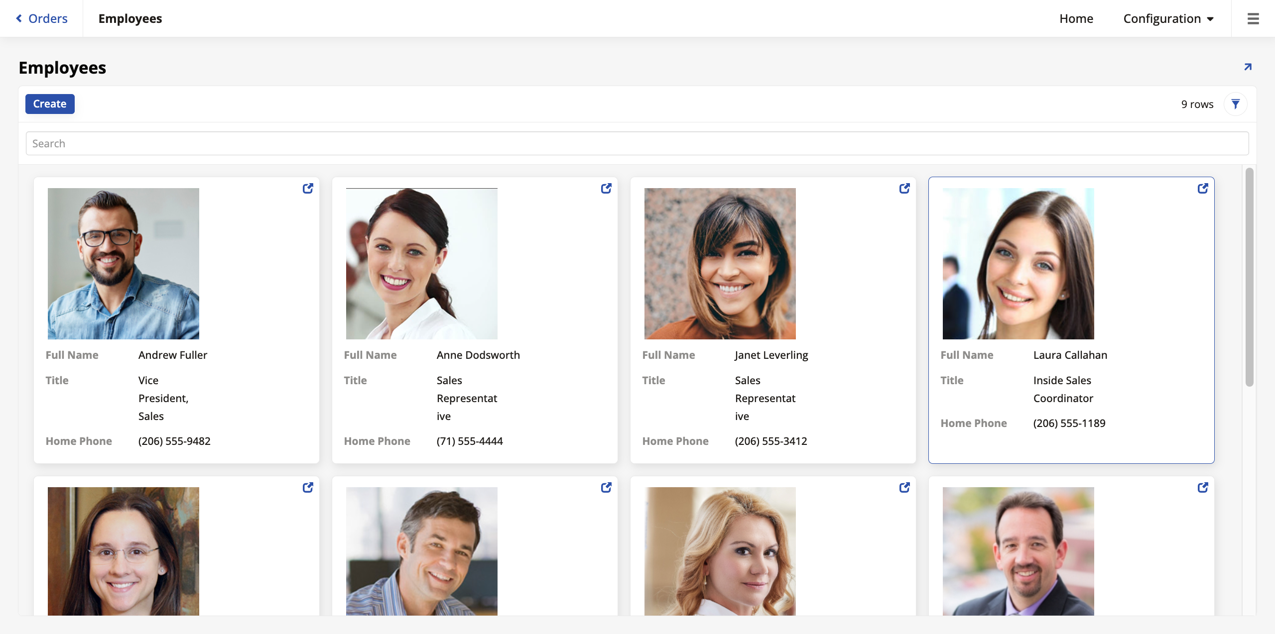
Chart panels
App Builder offers several types of chart panels. Showing charts in your pages can be a powerful visual tool. To use chart panels in your pages, the business objects that feed the pages need aggregate values. We'll demonstrate this by creating a business object with the purpose of using it to make a page that shows the employees in a chart organized by each employee's order total.
-
Go to App Workbench > Rules and click + Rule.
-
Give the new rule the name
OrderDetail (Total by Employee), then select Chart in the Purpose field and OrderDetail in Target. Click Create. -
When App Builder creates the rule, add the Order table in the Tables tab and select the EmployeeID column. This is the only existing column we'll need, so if App Builder has automatically selected any others, deselect them.
-
In the Joins tab, make an inner join using Order as the Left column and Order Detail as the Right.
-
Still in the Joins tab, make sure that the Join Columns panel is joining the OrderID columns of both tables.
-
In the Columns tab, click + Column and, in the Column or Expression field, enter this syntax:
SUM(OD.Quantity*OD.UnitPrice*(1-OD.Discount))In Alias, enter
SumLineTotal. -
Click Save.
-
Still in the Columns tab, assign each of the two columns a Usage Type:
-
For EmployeeID, pick Category. This defines how the data is grouped (e.g., the labels on the X-axis of a bar chart).
-
For the
SumLineTotalcolumn we created, pick Value. This represents the numeric data to be displayed on the chart (e.g., the height of the bars on the Y-axis).
-
-
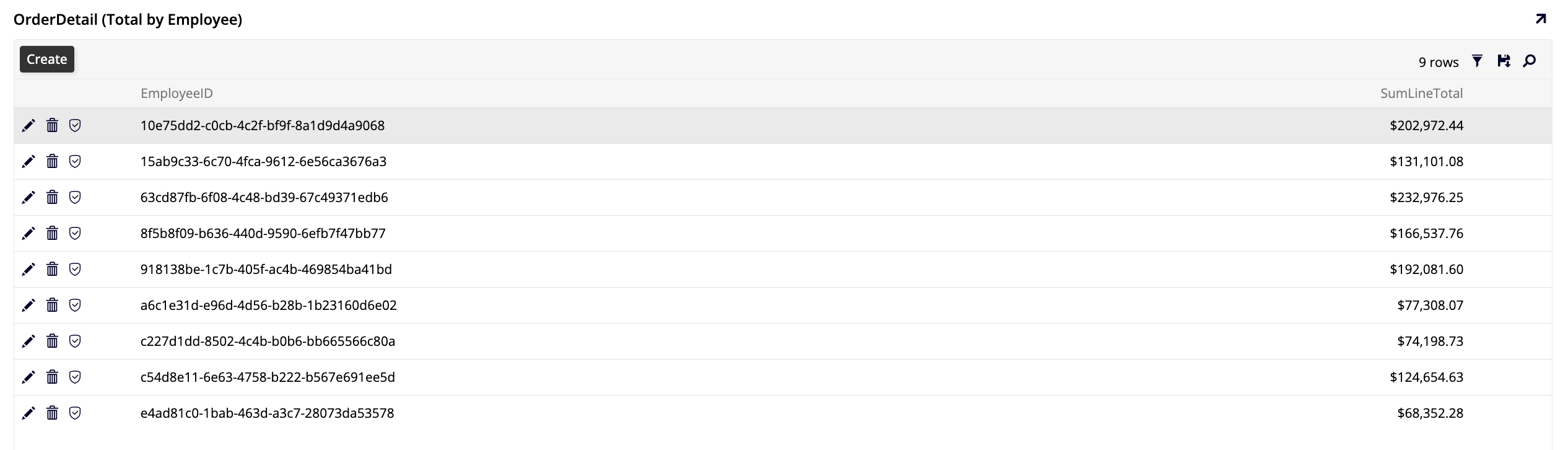
Click Results in the Rule panel to make sure the rule is calculating the total sold by each employee, like so:
Now that the business object we'll need is ready, let's make our chart panels page.
-
Go to App Workbench > Pages and click + Page.
-
In Enter a Page Name, enter
Order Total by Employee. Click Next. -
Select Reports as the menu. This will place the new page under a new menu called Reports that will appear between Home and Configuration. Click Next.
-
Select Full Page as the page layout. Click Next and Finish.
-
Once App Builder creates the page, click + Choose Panel Type.
-
Select Chart as the panel type. Click Next.
-
Pick OrderDetail (Total by Employee) as the source panel. Click Next and Finish.
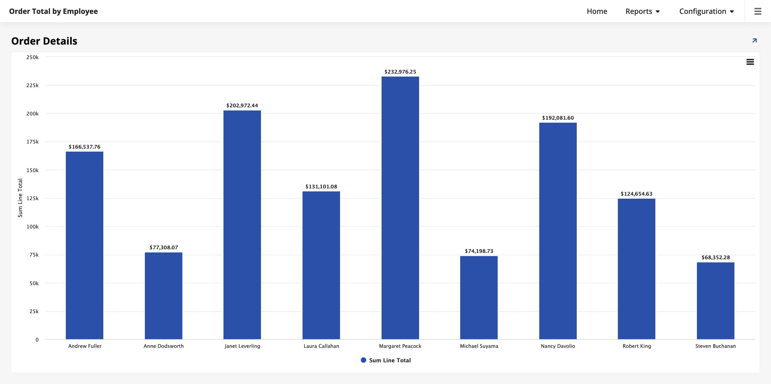
App Builder will create the page and you can visit its preview:
Sort chart data
You can apply sorting to your charts to make them easier to interpret and analyze. You can sort a chart by its Value column or by a completely different criteria that isn't in the table. To demonstrate, let's sort our chart by the employees' hire date.
-
Go to App Workbench > Rules and find the OrderDetail (Total by Employee) page. This is the business object that the chart is based on.
-
In the Tables tab, locate the Employee table and select the HireDate column.
-
Next, in App Workbench > Pages, open the Order Total by Employee page and go to its controls page.
-
Click + Control to add a new control. In the Add a Control dialog, select the Hire Date column. Crucially, in the Control Type field, select Sort. Complete the addition of the new control.
-
(Optional) Once the new control is added, click its icon at the end of the row and visit the Position & Width tab. In the Sort Direction field, you can alternate between ASC (ascending) and DESC (descending) order.
If you revisit the page preview now, you'll see that the bars are organized by employee hire date.
Add chart drill-down
Chart panels can be made interactive by adding navigation, allowing users to "drill down" into the data. In the example we're using, we can configure the chart so that clicking on a specific employee's bar navigates the user to the Orders page, filtered to show only that employee's orders.
-
Return to the Controls list for the Order Total by Employee page.
-
Click the icon at the end of the row to edit the Sum Line Total control (the Value control).
-
Open the Edge Case tab.
-
Open the Rare Navigation Settings section.
-
In the Link To Page field, select the Orders page.
-
Click the binding icon to make sure that App Builder has bound the two pages correctly. The Source Column should be EmployeeID (PK).
Now, when viewing the chart, you can click on any bar to be taken to the Orders page, which will automatically filter its data to show only the orders placed by the customers of the employee you clicked.
Note
The ability to link pages and apply bindings is not limited to charts. This same technique can be applied to almost any control (buttons, text fields, images) to create a navigable, interconnected application.
Further reading
To learn more about the different ways to visualize data, see Chart types.
Other charting forms
Charts can be configured with multiple categories or values to display more complex data relationships.
-
Multiple categories: You can group data by more than one category. For example, adding
Regionas a primary category andEmployeeas a secondary category would first group the sales by region, and then by employee within each region. This is often visualized using a stacked or grouped bar chart. -
Multiple values: You can display multiple numeric values for each category. This is common for mixed chart types, where you might show sales totals as bars (on one Y-axis) and average discount as a line (on a second Y-axis) for the same employee.
Practice time: Add a second category
Modify the OrderDetail (Total by Employee) business object to include a second category. Join to the Employee table, add the RegionID column, and set its Usage Type to Category. Then, view the chart again to see how it changes. You may need to adjust the chart type (for instance, to a stacked column chart) in the panel settings to best visualize the new data structure.
Advanced data visualization
Beyond standard charts, App Builder provides specialized panels to visualize data geographically, chronologically, or linearly. In this section, we will demonstrate the other panel types that App Builder supports.
Calendar panels
Calendar panels are excellent for visualizing events over time. We will add a calendar to the Customers page that shows when a specific customer's orders were shipped.
-
Create the business object:
-
Go to App Workbench > Rules and click + Rule.
-
Name it Order (Calendar).
-
Set the Purpose to Calendar and the Target to Order.
-
Click Create.
-
In the Tables tab, select OrderNumber, ShippedDate, and CustomerID.
-
In the Columns tab, set the Usage Type for OrderNumber to Description and ShippedDate to Start.
-
-
Add the panel:
-
Go to the Customers page.
-
Add a new panel of type Calendar and select Order (Calendar) as the source.
-
App Builder should automatically bind this panel to the main Customers panel using CustomerID.
-
Name the panel Order Calendar.
-
Now, when you select a customer, this calendar will display their shipments.
Additionally, you can also link the calendar to the Orders page. That way, when a user selects a customer and their orders appear on the calendar, each one of them can be clicked on, taking the user to the details of that order. Follow these steps:
-
Navigate to the Customers page preview.
-
Open the Live Designer and select the calendar panel.
-
In the Update Methods tab, select Orders in the Link To Page. App Builder should bind the two pages automatically, but you can double check to make sure that the binding criteria is the OrderID field.
-
Click Save.
Now, when you select a customer in the Customers page and their orders appear on the calendar, you can click each individual one to be taken to the Orders page to see details.
Map panels
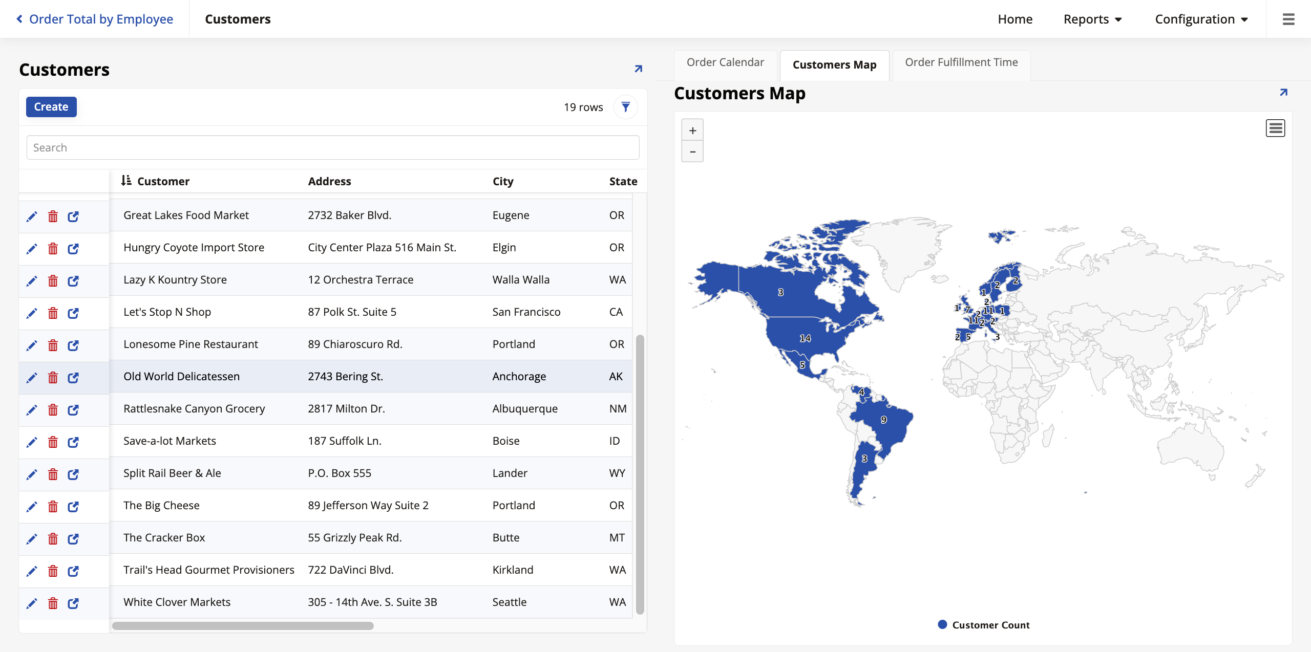
Map panels allow you to visualize data on a geographic map. We will create a map that displays the number of customers per country.
Note
App Builder uses the Highmaps library. Highmaps requires specific country names to map data correctly (e.g., "United States of America"). However, our Northwinds data uses abbreviations like "USA" or "UK". We must normalize this data in our rule.
-
Create the business object:
-
Create a new rule named Customer (Map).
-
Set the Purpose to Map and Target to Customer.
-
In the Columns tab, add a count expression:
Count(1)and alias it as CustomerCount. Set its Usage Type to Value. -
Add a column for the country. To fix the naming mismatch, use this expression:
REPLACE(REPLACE(Country, 'USA', 'United States of America'), 'UK', 'United Kingdom'). -
Alias this column as NormalizedCountry and set its Usage Type to Category.
-
-
Add the panel:
-
Add a new panel to the Customers page of type Map.
-
Select Customer (Map) as the source.
-
In the Map Source field (found in the panel settings), select
custom/world.
-
The Customers page now shows a heatmap of where your customers are located globally.
Gantt panels
Gantt charts are used for scheduling and timelines. We will use one to visualize the duration of orders (from Order Date to Shipped Date).
-
Create the business object:
-
Create a new rule named Order (Gantt).
-
Set the Purpose to Gantt and Target to Order.
-
Click Create.
-
In the Tables tab, select OrderNumber, OrderDate, ShippedDate, and CustomerID.
-
In the Columns tab, set the following Usage Types:
-
OrderNumber: Task
-
OrderDate: Start
-
ShippedDate: End
-
-
-
Add the panel:
-
Add a new panel to the Customers page of type Gantt.
-
Select Order (Gantt) as the source.
-
Ensure it is bound by CustomerID.
-
Organize with tabs
You now have three new panels on your Customers page, which might make it crowded. To keep the page organized, we will place all these new panels inside a tab panel group (a concept introduced in Lesson 6). Follow these steps:
-
In the Customers page edit screen, create a new Panel Group.
-
Set the Layout to Tabbed.
-
Add your Order Calendar, Customer Map, and Order Gantt panels to this group.
You now have a sophisticated dashboard that allows you to tab between a timeline, a map, and a schedule of your customer's activity. Here's what the Customers page looks like now with the calendar chart highlighted (but notice the tabs that allow you to see the other charts as well):
Network graphs
Network graphs are used to visualize relationships between entities. We can use this to visualize the reporting structure of our employees.
-
Create the business object:
-
Create a new rule named Employee (Network).
-
Set the Purpose to Network Graph and Target to Employee.
-
Click Create.
-
Select EmployeeID, ReportsToEmployeeID, and LastName.
-
Set the Usage Type for EmployeeID to Node and ReportsToEmployeeID to From.
-
Optionally, set LastName as the Node Label so names appear on the chart instead of IDs.
-
-
Add the panel:
-
Add a new panel to the Employees page of type Network Graph.
-
Select Employee (Network) as the source.
-
Add it to the panel group that contains the other three panels to keep the page organized.
-
Initially, this is what the panel looks like on the page. In the panel settings, you can adjust the layout and colors to better visualize the hierarchy.:

Pivot panels
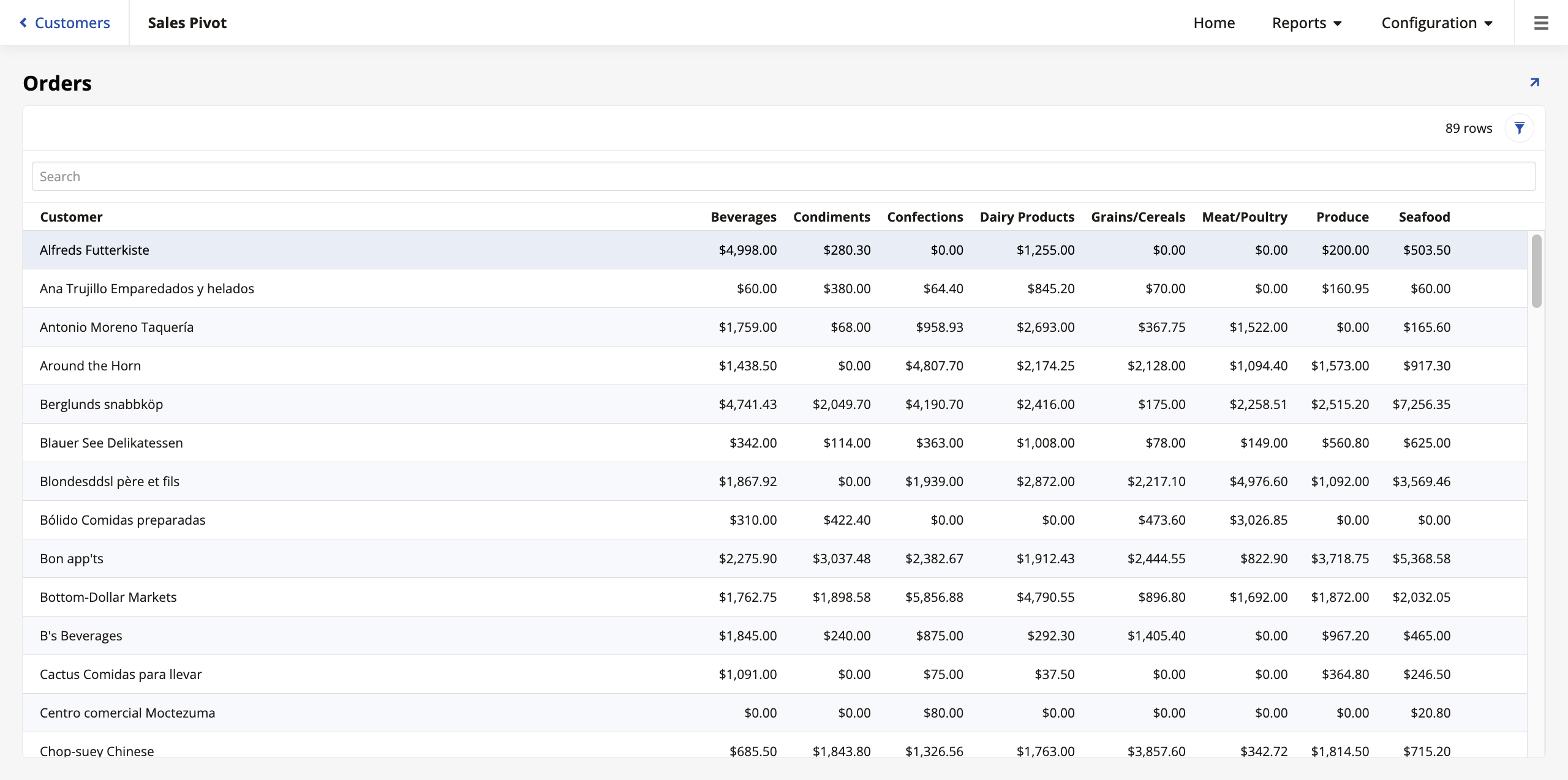
Pivot panels allow you to summarize large sets of data by cross-referencing two different categories. We will create a pivot table that displays the total sales amount per customer (row) broken down by product category (column).
-
Create the business object:
-
Create a new rule named Order (Pivot).
-
Set the Purpose to Pivot and the Target to Order.
-
In the Tables tab, add the OrderDetail, Product, Category, and Customer tables.
-
In the Columns tab, add the Customer and Category from their respective tables, and the following expression for the total price (remember to give it a descriptive alias):
Sum(OD.Quantity * OD.UnitPrice).
-
-
Create a page to add the new panel:
-
Create a new page named Sales Pivot. Place it in the Reports menu and use a full-page layout.
-
Add a panel of type Pivot and select Order (Pivot) as the source.
-
In the Controls settings:
-
Set Customer as the Row.
-
Set Category as the Column.
-
Set the expression you created (using the alias you gave it) as the Value.
-
-
When you visit the page preview, you should see a pivot table showing the total orders by customer, organized by category.
Advanced panel layouts
Beyond standard grids and forms, App Builder offers layouts designed for specific navigation and display needs.
Lane panels
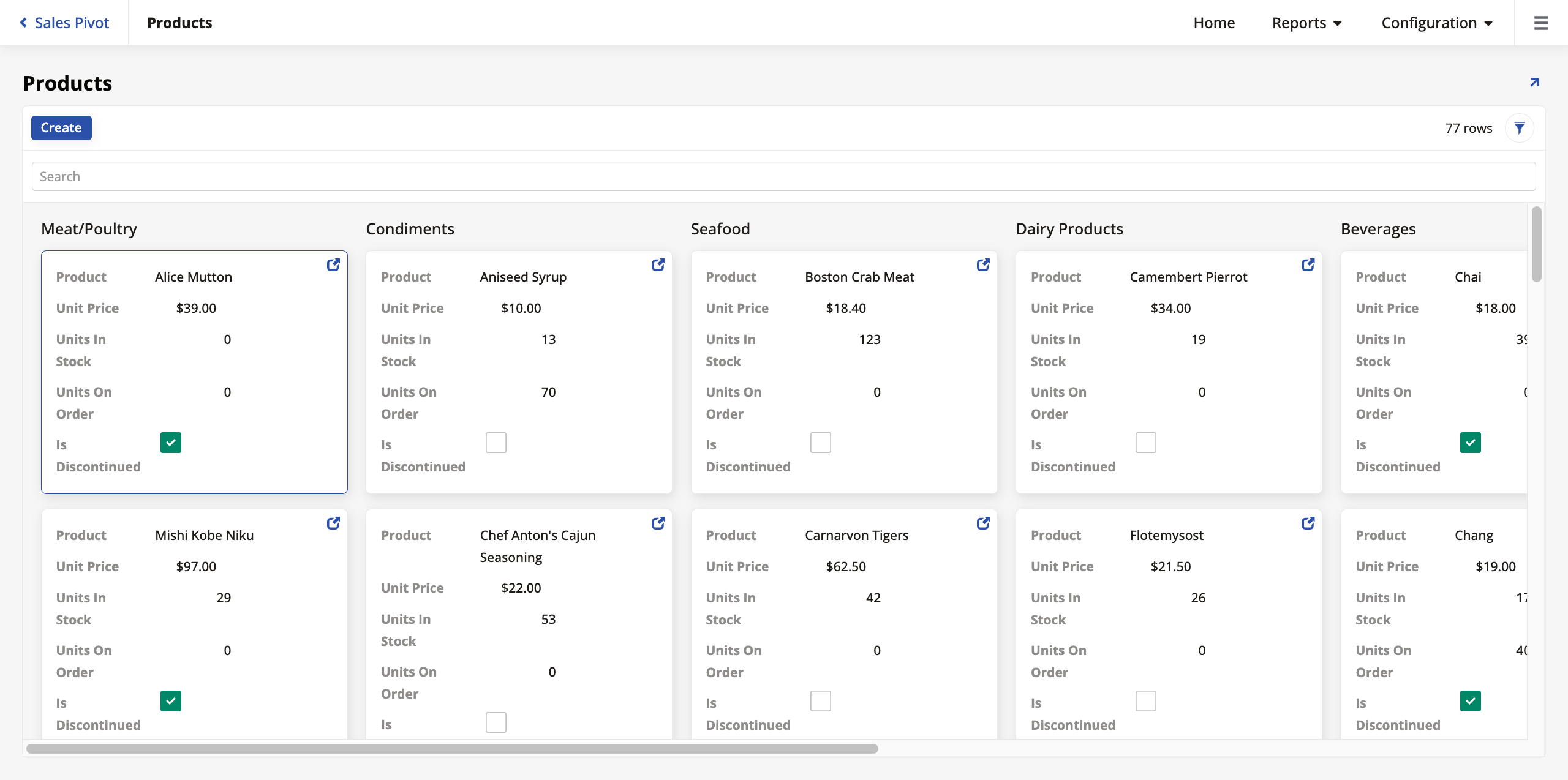
Lane panels allow you to group records into vertical or horizontal lanes, similar to a Kanban board. Let's convert our Products page to use this layout.
-
Convert the panel:
-
Navigate to the Products page.
-
Open the Live Designer and select the Products panel.
-
Change the Panel Type from Grid to Lane.
-
Click Save.
-
-
Configure grouping:
-
Go to the Controls settings in the page edit screen.
-
Click + Control and add CategoryID as a control, with the name Category.
-
Once the Category control is added, click to edit it. In the Position & Width tab, check the Group By checkbox. This tells App Builder to create a separate lane for each product category.
-
-
Adjust panel settings:
-
Return to the page edit screen.
-
In the Edge Case tab, open the General section, and enter
100in the Rows Per Request field. Since lane panels display more data visually than grids, increasing this limit ensures categories don't look empty.
-
The Products page now looks like this:
Frame panels
Frame panels act as containers that load other pages within them. This is the mechanism behind the standard application sidebar.
-
How it works: Your Home page typically contains a Menu panel (the sidebar) and a Frame panel (the main content area). When you click a link in the sidebar, the target page loads inside the Frame panel, rather than navigating the entire window.
-
Escaping the Frame: Sometimes you want a link to break out of the frame (e.g., a "Sign Out" button or a large report). To do this, configure the link's Target behavior to Popup or use a Redirect action, which forces the navigation to occur at the top window level.
Advanced form logic: Visibility rules
In Lesson 4, we learned about Form panels. We can control which fields appear on a form using visibility rules.
Static visibility
A static visibility view sets a rule that is always true. For example, let's ensure the Country field is always required on the Employee form.
-
Go to the Employees page edit screen.
-
Select the Employees panel to see its edit options.
-
Click More > Visibilities.
-
Click Register to create a new visibility rule.
-
Set the Type to Static.
-
Set the Column to Country.
-
Set the Value to Require.
-
Click Save.
-
Dynamic visibility rules
Visibility can also change based on data. For example, the State field is relevant for US addresses but not for UK addresses (in our dataset). Let's hide the State field unless the Country is "USA".
-
Create the logic rule:
-
Go to App Workbench > Rules and click + Rule.
-
Name it Employee (Visibility).
-
Set Purpose to Visibility and Target to Employee.
-
In the Columns tab, add a new column expression to define the logic:
IIF(Country = 'USA', 'Require', 'Hide'). -
Target this expression to the State column.
-
-
Apply the rule:
-
Return to the Employee panel's Visibilities settings.
-
Click Register and set Type to Rule.
-
Select Employee (Visibility) as the rule.
-
Now, when editing an employee, the State field will vanish if the Country is not "USA" and become required if it is.
Badges
A badge is a small indicator placed on a button that displays a dynamically updated count. Badges are useful for showing users at-a-glance information, such as the number of orders for a customer or tasks in a queue.
To demonstrate, we will add a button to the Customers page that navigates to a list of that customer's orders. The button will feature a badge showing the total number of orders placed by that customer.
First, we need a business object that can count the orders for each customer. A subquery is perfect for this.
-
In App Workbench > Rules, click + Rule.
-
Configure the rule with the following settings:
-
In the Name field, enter
Order (Count by Customer). -
In the Purpose field, select Subquery.
-
In the Target field, select Customer.
-
-
Click Create.
-
In the Tables tab, add the Order table.
-
In the Joins tab, create a Left Outer join from Customer (Left) to Order (Right) on CustomerID. Using a left outer join ensures that customers with zero orders are still included in our results.
-
In the Columns tab, add two columns:
-
Select the CustomerID column from the Customer table.
-
Click + Column to create an expression:
-
Column or Expression:
IsNull(Count(O.OrderID), 0) -
Alias:
OrderCount
This expression uses the IsNull() function to count the orders for each customer. Using this function ensures that if a customer has no orders, the badge will display
0. -
-
-
Click Save.
Next, we must add this count to our main Customer (Source) business object.
-
In App Workbench > Rules, open the Customer (Source) business object.
-
In the Tables tab, click + Tables and add the subquery we just created, Order (Count by Customer).
-
In the Joins tab, create an Inner join between Customer (Left) and our subquery (Right) on CustomerID.
-
In the Columns tab, click + Column. Select the OrderCount column from the subquery rule to make it available to pages using this business object.
Finally, let's configure the button and its badge on the Customers page.
-
Navigate to the Customers page and open the live designer.
-
Click the Customers panel, then click + Control.
-
Configure the button:
-
In the Control Type dropdown, select Button.
-
In the Name field, enter Orders.
Note
Leave the Column field empty, because assigning a column here would make that column's value be used as the button's label text. In our case, we want to use the static text "Orders".
-
-
Click Next to go to the Navigation settings. In the Link to Page dropdown, select Orders. App Builder will automatically create the binding on CustomerID.
-
Click Next and Finish.
-
Select the newly-created Orders button to make the live designer show options for it.
-
In the Button tab, open the Miscellaneous (Button) section.
-
In the Badge Source (Column) dropdown, select OrderCount.
-
Click Save and exit the live designer.
You should now see an Orders button for each customer, with a badge displaying their total order count. Clicking the button takes you to the Orders page with the orders placed by that customer already selected.

Further learning
This concludes this deep dive into the details of App Builder's UI layer. If you haven't yet, see Appendix A for a closer look at the data layer, or Appendix B for the business layer.
To continue learning about App Builder, visit Jitterbit University.