How to create a secondary axis chart in Jitterbit App Builder
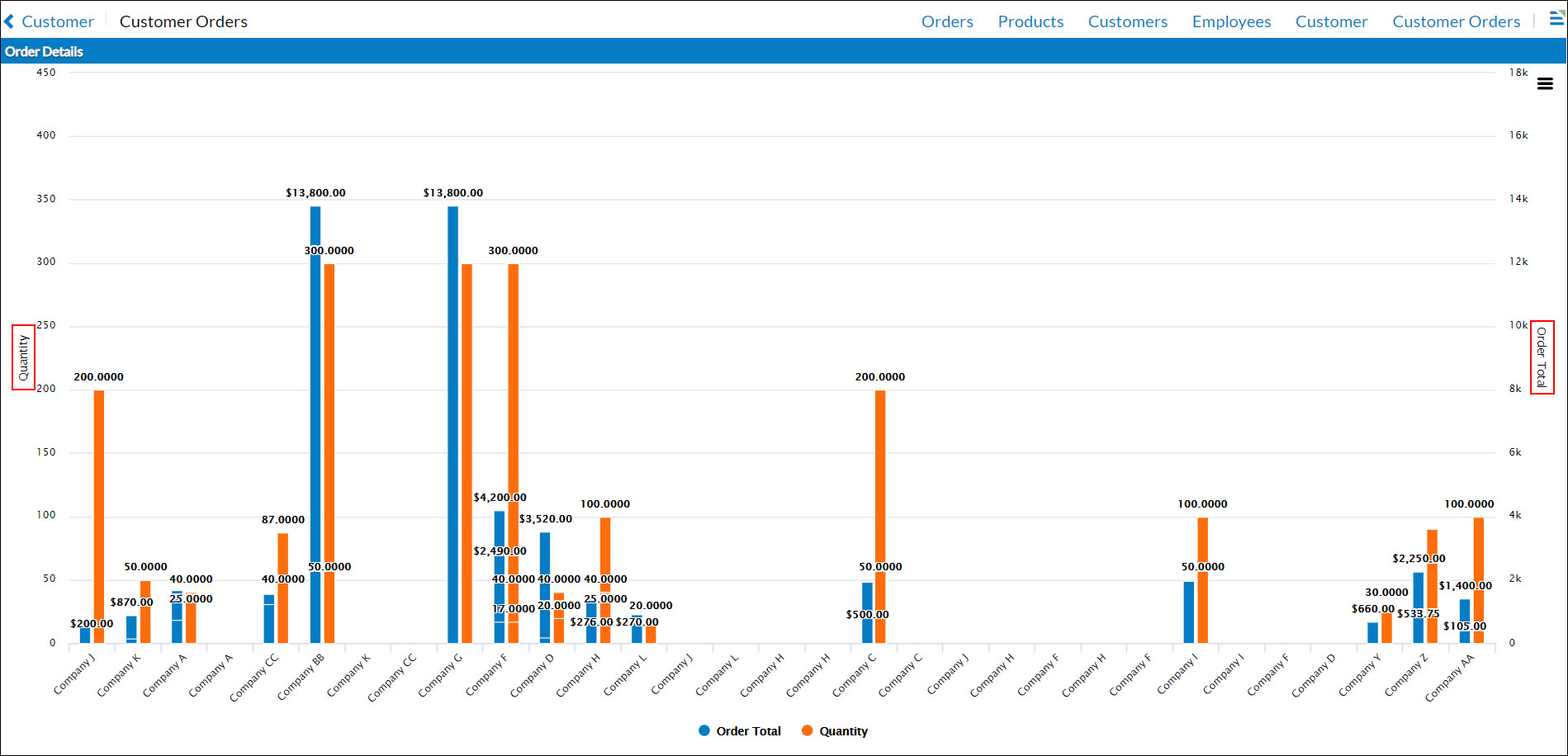
This article will step you through how to create a Chart that has a Secondary Axis in App Builder. Using Secondary Axis you can present a Chart with two vertical axis showing different types of data, for example Quantity and Order Totals. By default, App Builder assigns multiple Value Columns to the same vertical axis, which is likely not what you are attempting to do. Here is an example of a Chart with a secondary axis defined:

To create a Chart instead with two separate Vertical Axis, follow this guide.
The first step to creating any Chart in App Builder is to have a Business Rule that contains the data you want to display. For the purpose of this scenario we will assume we have a Business Object or Chart Rule already created for OrderDetails (Total by Employee). This Business Object joins the Order and Order Detail tables, and contains Columns for OrderDetail.Quantity, Orders.Employee_ID, and an expression that derives an Order Total dollar amount (Alias as OrderTotal).
To create a secondary axis chart
- From the App Workbench click + Page
- Provide a Name for the Page and click Create. For example: Customer Orders
- Click Next
- Select a Menu to link the page from and click Next. For example: Reports
- Select the Full Page layout and click Next
- Review proposed updates and click Finish
- Click the Proceed button
- Click the Chart option and click Next
- Locate the Business Rule created for this chart, click Select, and click Next
- Review proposed updates and click Finish
- Go to the Action Drawer > Design this page and select the chart
- Confirm the Chart Type is set correctly. For example: Column
- Verify the Panel Name is what you'd like to display. For example: Order Details
- Click the + Control button in the Controls panel
- Select the Column that contains data you wish to display along the first vertical axis. For example: Quantity
- Set the Control Type as Value
- Click the + Control button
- Select the Column that contains data you wish to display along the second vertical axis. For example: Order Total
- Set the Control Type as Value, and set the Chart Axis (in Additional Attributes) to Secondary
- Click the + Control button
- Select the Column that contains data you wish to display along the horizontal axis. For example: Customer_ID
- Set the Control Type to Category
- Navigate back to the app view and refresh the screen. You should now see your Chart display with the Secondary Axis information presented.