Rolling total / mixed chart type in Jitterbit App Builder
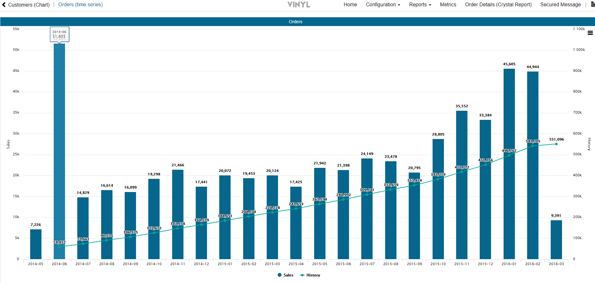
This article will step you through how to create a Chart that has a Secondary Axis in App Builder. Using Secondary Axis you can present a Chart with two vertical axis showing different sets of data, in this example Sales and Historical Sales. This Chart will use the "Mixed" Chart Type to create a bar and line Rolling Total Chart.
Note
The Mixed Chart Type does not support the ability to configure multiple Categories. If you try and configure a second Category, App Builder will display an App Builder validation error indicating "The changes could not be saved. You cannot have multiple categories when using multiple values."
How to configure a rolling total / mixed chart type
By default, App Builder assigns multiple Value Columns to the same vertical axis, which is likely not what you are attempting to do.
The first step to creating any Chart in App Builder is to have a Business Object that contains the data you want to display. For the purpose of this example we will assume we have a Business Object already created for Order (TimeSeries). This Business Object joins together two OrderTimeSeries Subqueries which provide aggregate values for Sales and Historical Sales data, along with Period data for the horizontal axis used to map out the data.

- Navigate to the App Workbench
- Click + Page
- Provide a Name for the Page and click Next. For example: Orders (Time Series)
- Select the Menu Location where you want to add the page. For example: Reports
- Click Next
- Select the Full Page layout and click Next
- Review the proposed updates and click Finish
- Click the Proceed button
- Select the Chart panel type and click Next
- Locate the Business Object created, click Select and click Next. For example: Order (TimeSeries)
- Review the proposed updates and click Finish
- Go to the Action Drawer > Design this page
- Select the chart
- Set the Chart Type to Mixed
- Verify the Panel Name is what you'd like to display. For example: Orders
- Click Save
- Click the Controls button to review the Controls added to the Chart, make any adjustments as needed
- Click the + Control button in the Controls panel
- Select the Column that contains data you wish to display along the first vertical axis. For example: Sales
- Set the Control Type as Value, and click Save
- In the Additional Attributes, set the appropriate Chart Type and Chart Axis information. For example: Column and Primary
- Click the + Control button to add in the next Control
- Select the Column that contains data you wish to display along the second vertical axis. For example: History
- Set the Control Type as Value
- In the Additional Attributes, set the appropriate Chart Type and Chart Axis information. For example: Line and Secondary
- Click the + Control button to add in the next Control
- Select the Column that contains the data you wish to display along the horizontal axis. For example: Period
- Set the Control Type to Category and make any additional display changes required. For example: If the Column is a List, input the List Control Properties information required
- Navigate back to the app view and refresh the screen. You should now see your Chart display with the Rolling Total with primary and secondary axis information.