Progress bar HTML template in Jitterbit App Builder
HTML Templates can be used to achieve many different types of UI/UX elements in an app. This article presents an overview of using an HTML Template to present a Progress Bar in the application UI layer of an app.

To create the HTML template
- Navigate to the App Workbench
- Click on the Look & Feel tab
- Click the Templates tab
- Confirm the Collection selected is where you want to add the HTML Template
- Click the +Template button
- Assign a Name. For example: Progress Bar
- Check to enable Translations if applicable
- Click the checkmark icon to save
- Enter the HTML syntax on the Source tab region. See the HTML syntax example.
- Click Save
- Click +Parameter and define the required Parameters. See Template Parameters.
HTML syntax example
<style>
.progress-ecd {
    width: 100%;
    height: 80px;
}
.progress-ecd .hdr span {
    float: right;
}
.progress-ecd .bar {
    position: relative;
    height: 20px;
    background-color: #ccc;
    border-radius: 3px;
}
.progress-ecd .bar .percent {
    color: {{TextColor}};
    background-color: {{BgColor}};
    width: calc({{Percent}} - 25%);
    height: 20px;
    border-radius: 3px;
    padding-left: 3px;
    max-width: 100%;
}
.progress-ecd .bar .ref {
    position: absolute;
    left: 75%;
    top: 0;
    width: 2px;
    height: 20px;
    background-color: #737373;
}
.progress-ecd .bar .ref:before {
    content: attr(data-ref);
    font-weight: 300;
    position: absolute;
    width: 100px;
    left: -50px;
    top: 100%;
    color: #888;
    text-align: center;
}
</style>
<div>
<div class="progress-ecd" style="margin-bottom:20px;">
    <div style="font-size: 16px; font-weight:500; height: 20px; margin-bottom: 4px;">{{Title}}</div>
    <div class="hdr" style="font-weight: 200; margin-bottom: 8px;">{{Subtitle}}<span style="font-weight: 500; ">{{Percent}}</span></div>
    <div class="bar">
        <div class="percent">{{Value}}</div>
        <div class="ref" data-ref="{{Limit}}"></div>
    </div>
</div>
</div>
Template parameters
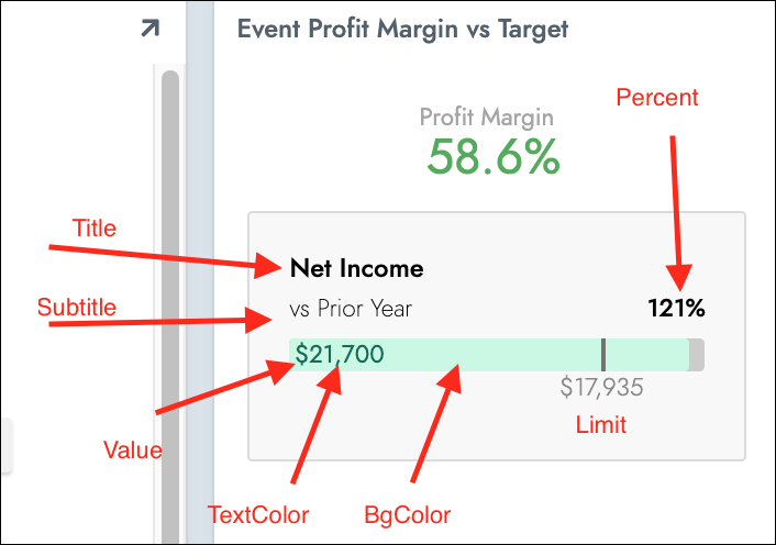
The following list of Parameters should be configured if you are using a Progress Bar as an HTML Template:
- TextColor
- BgColor
- Title
- Subtitle
- Percent
- Value
- Limit
Color customization for "limit" parameter
You can optionally choose to customize the colors used by the Progress Bar, to help visually indicate if a value is under or over the defined "Limit" parameter. Changing the color if it passes the limit helps visualize that an important threshold has been crossed. For instance, changing the color to red if a budget is exceeded, and otherwise showing it as green. To achieve this you could define IIF statement logic (see example) in the panel's underlying Business Object, cast it as string for logical data type, then pass it in as the BgColor on the template. This example syntax illustrates the IIF statement used in the Business Object:
IIF(Value >= Limit, '#Color1', '#Color2')
Note
Colors defined in the IIF statement should represent valid hex color code values. For example: #ff0000
Limitations and callouts
If you are using more than one Progress Bar on a single page or panel with multiple rows like a Tile, all Progress Bars will inherit the styles of the last instance by default. This is because the TextColor, BgColor, and Percent values are substituted in the style definition of the class. To overcome this limitation, you can instead place these styles inline, and the Progress Bars will then behave as expected when having different values.
Inline style example:
<div class="percent" style="font-size: 16px; width: calc({{Percent}} - 25%); color: {{TextColor}}; background-color: {{BgColor}};">{{Value}}</div>