How to customize the login page in Jitterbit App Builder
Introduction
The App Builder login page can be customized to look however you want it to. This page teaches you how you can do that customization, following the best practices recommended by Jitterbit. You can customize both the logo and the login form, including the form's header, controls, or sign in button.
This customization affects the main App Builder login page, which is used by developers, testers, and end-users. However, because each environment (Development, QA, and Production) has its own login page, the customizations you make in the development environment won't immediately be seen by end-users. Ship the new theme you create from one environment to the next using Release management.
Important
This page describes the recommended method to create custom login pages. Other methods, such as scripting against the database or unsealing App Builder, are not recommended as they may not work after an update.
Note
This page describes how to customize the existing login page. If you want to create your own login page, effectively taking control of how users authenticate, see Login page requirements.
Customize the logo
There are two ways to customize the logo: upload an image, or use a base64-encoded image.
If you use a new login theme in a Development environment and you'd like to push it to Production, save the custom theme in the theme Collection that will make the trip to production.
Create a custom login theme
-
Navigate to IDE > Look and Feel.
-
Confirm you have a Collection selected that you can modify.
-
Click the + Theme button.
-
In the Theme Name field, enter a name for the new custom theme.
-
Open the Base Theme menu, then select Login Base Theme.
-
Click the Save button.
-
In the Components panel, select Login form.
-
In the Styles panel, click the + Style button. The Style Settings dialog opens.
-
Open the Area menu, then select Login logo.
-
Open the Style Type menu, then select Background Image.
-
Enter the properly formatted syntax for a Base64 encoded image in the 1 - Background image field. To generate the Base64 code, follow the instructions in Create a Base64 encoded background image. For example:
`data:image/gif;base64,R0lGODlhEAAQAMQAAORHHOVSKudfOulrSOp3WOyDZu6QdvCchPGolfO0o/XBs/fNwfjZ0frl3/zy7////wAAAAAAAAAAAAAAAAAAAAAAAAAAAAAAAAAAAAAAAAAAAAAAAAAAAAAAAAAAAAAAACH5BAkAABAALAAAAAAQABAAAAVVICSOZGlCQAosJ6mu7fiyZeKqNKToQGDsM8hBADgUXoGAiqhSvp5QAnQKGIgUhwFUYLCVDFCrKUE1lBavAViFIDlTImbKC5Gm2hB0SlBCBMQiB0UjIQA7` -
Enter a description in the Technical Help field.
-
Click the Save button.
Create a Base64 encoded background image
To use a local JPG, PNG or GIF image file to customize your login page, you must generate a Base64 encoding for the image. To do this, follow these steps:
-
Access the Base64 Image Encoder.

-
Drag and drop or click the Or Click Here button to upload your JPG, PNG or GIF image file.
-
After your file is finished processing, click on the resultant Show Code button.
-
Click the Select all button in the For use in
<img>elements section.
-
Click the Copy to Clipboard button.
-
This is the properly formatted image code syntax you will paste into the background image value in App Builder on your custom login theme.
Multiple login themes
If you create multiple login themes, a user with administrator access must define which one of them gets used. To do so, follow these steps:
-
Select IDE > Security Providers.
-
In the Configuration panel, click Edit.
-
Use the dropdown menu under Login Page Theme to configure which one of the login themes created should be used by your application.
-
Exit out of App Builder and refresh your web browser to test the results.
Use an App Builder hosted image
-
Navigate to Look and Feel.
-
Add the image you want to use to a Collection that your application has access to.
-
After you've added the image, click on the corresponding Open Record icon.
-
Scroll to the Relative URL field and click the Copy button.
-
Follow steps 1-10 in the Create a custom login theme section.
-
At step 11, input the copied to clipboard syntax for your hosted image. It will look something like
/service/image/ImageID, whereImageIDrepresents the unique value copied to your clipboard. For example:/service/image/2bc0d8a0-2cd7-4e8d-b074-eebfb1b9b6d2.
Note
When referencing image paths in themes, the exact syntax may differ slightly depending on how the App Builder hosting URL has been configured. The recommended way to reference an image path is to start the path value with ./, for example ./service/image/153f5b0b-c367-4409-a428-23813b6a5ab2.
-
Review the image path value and if it does not start with
./, manaully adjust as needed. -
Enter a description in the Technical Help field and click Save.
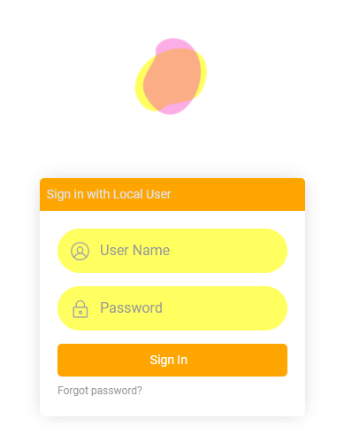
Customize the login form
You can customize other parts of the login form as well as the logo. To do this, use the different available Component – Subcomponent styles available in the Look and Feel > Themes area of App Builder. Some examples are described below.
Advanced aspects of customization may require you to work with custom theme interfaces. For example, if you want to target one but not all buttons appearing on the login form you could write a custom interface to target just one of the buttons.
Target the login form header
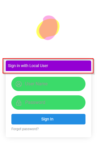
-
Navigate to the custom login theme defined for your login form.
-
Select Login form from the Components panel.
-
Click + Style from the Styles panel.
-
Select Login Form Header as the Area.
-
Select the appropriate Style Type for the customization. For example, if you're looking to change the color of the region, select Background Color.
-
Provide the appropriate Value information. For example:
darkvioletNote
If your theme has defined primary, secondary, and complementary colors defined, you may need to append
!importantto the value. For example:darkviolet!important. -
Click Save.
-
Exit out of App Builder and refresh your web browser to test results.
Target the sign in button
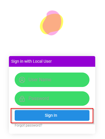
-
Navigate to the custom login theme defined for your login form.
-
Select the Controls form from the Components panel.
-
Click + Style from the Styles panel.
-
Select Button as the Area.
-
Select the Style Type as appropriate to customization. For example, if you're looking to change the color of the region, select Background Color.
-
Provide the appropriate Value information. For example:
#ffa500Note
If your theme has defined primary, secondary, and complementary colors defined, you may need to append
!importantto the value. For example:#ffa500!important. -
Click Save.
-
Exit out of App Builder and refresh your web browser to test results.
Target the form controls
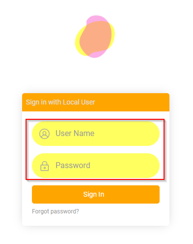
-
Navigate to the custom login theme defined for your login form.
-
Select Controls from the Components panel.
-
Click + Style from the Styles panel.
-
Select Form Control as the Area.
-
Select the Style Type as appropriate to customization. For example, if you're looking to change the color of the region, select Background Color.
-
Provide the appropriate Value information. For example:
#ffff60Note
If your theme has defined primary, secondary, and complementary colors defined, you may need to append
!importantto the value. For example:#ffff60!important. -
Click Save.
-
Exit out of App Builder and refresh your web browser to test results.