How to create a menu in Jitterbit App Builder
Menus are the primary way of letting users navigate your applications. They can provide access to specific pages by grouping and listing them in a format that's easy to understand and use. Some are automatically set up when you create an application. Other menus you must set up yourself. This page describes the process of creating and configuring a new menu in App Builder.
Default menus and home page
By default, every new application has the following menus and home page:
-
Application Menu is the menu set to be visible in the application toolbar.
-
Mobile defines menus that are visible only on mobile devices.
-
Home is the default page used as the app's home page.
You can create your own menus as well as change which ones are shown on your app.
Create a menu
To create a menu, follow these steps:
-
Select App Workbench > UI Layer - Menu. The Menus panel opens.
-
The Menus panel lists the menus that currently exist. The Menu Diagram panel illustrates the structure of the selected menu, including any sub-menus and their items.
-
Click the + Menu button on the Menus panel.
-
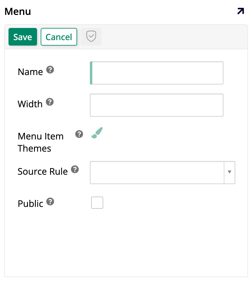
Enter the following information:
-
Name: A name for the new menu. This is the only mandatory field.
-
Width: A fixed width value for the new menu.
-
Menu Item Themes: If you use themes, choose one here to apply styling to the menu items.
-
Source Rule: Pick an underlying source rule.
-
Public: Enable to allow the menu to be used in another application.
-
-
Click the Save button. You can now interact with the Menu Items panel to add items to your newly created menu (see Add menu items to learn more).
Menu visibility
When a new application is created, App Builder automatically sets Home as the app's home page and sets up a menu called Application Menu to be shown on the right side of the top toolbar, visible on all pages. You can change these settings, like selecting your own page or menus to fill those roles, by following these steps:
-
Go to the App Workbench.
-
Click the App Settings tab.
-
In the App Settings panel, click More > Edge Case.
-
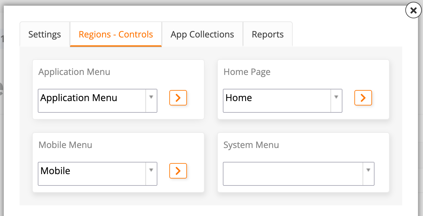
Pick the Regions - Controls tab:
-
Under Application Menu, select which menu should be visible on the right side of the top toolbar. The default is the menu with the same name.
-
Under Home Page, select a page to be the home page. The default is Home.
-
Under Mobile Menu, select which menu will be seen by users on mobile devices. The default is the Mobile menu.
-
Under System Menu, select a menu to be visible on the left side of the top toolbar. By default, there isn't one.
Note
In the dropdown, there is a system-created option called System Menu. When selected, it displays icons with some useful settings such as audit, user profile, languages, and others. However, all these settings are also available in the hamburger menu to the right of the top toolbar.
-
Add menu items
To add items to a menu, locate it by accessing App Workbench > UI Layer - Menu, and finding it in the Menus panel.
Once you've found the menu you want to add items to, you can click the icon, or double-click either its row or its name in the Menu Diagram panel to see a breakdown of its items.
The Menu Items panel will show all the existing items in that menu. To add a new item, click the + Menu Item button and the Menu Item dialog will open, containing the following tabs:
-
Settings: In this tab, the following fields are available:
-
Menu Control Types: Select Menu Item if you are adding an option to a menu or Nested Menu if you are creating a new sub-menu.
-
Parent Menu: Select the parent menu of the item you're creating.
-
Position: Enter a number to define the display order of this item.
-
Name: Enter the name of the new item.
-
Link To Page: Use the dropdown to select which of your application's pages this item should link to.
-
-
Link Options: The fields available in this tab depend on whether a page is selected in the Settings tab's Link To Page field:
-
If a page is selected, this tab shows these fields:
-
Link To Page Initial State: Select the initial state the linked page loads in: Default, Add, or Edit.
-
Link Target: Choose where the linked page will open; whether in the current window, in a new tab, etc.
-
Replace Page In History: Choose what the < Back button returns to after the linked page loads; see Configure how linked pages open for details.
-
-
If no pages are selected in Link To Page, this tab shows this field:
- External Link: Enter a link to another page on the App Builder server or to an external web resource; the URL entered must start with either
https://orhttp://. Once a value is entered, the Link Target field also appears.
- External Link: Enter a link to another page on the App Builder server or to an external web resource; the URL entered must start with either
If a menu item's link target changes to one that doesn't support Replace Page In History (for example, switching from Link To Page to an External Link that doesn't open in the current browser tab), App Builder automatically turns off Replace Page In History rather than leaving it enabled with no effect.
-
-
Display Options: In this tab, the following fields are available:
-
Label: Define a label that will appear in the menu.
-
Tooltip Label: Define the tooltip text that will appear when a user hovers over the item.
-
Image: Use the dropdown to search for and select an image to associate with the item.
-
Icon: Use the dropdown to search for and select an icon to associate with the item. See Icon categories for the available icon sets.
-
Label Visibility: Select whether the label should be Visible or Hidden in the application.
-
Theme: If you use themes, choose one here to apply styling to the item.
-
Active: This checkbox determines if the item will be displayed in the menu (enabled by default).
-
Click Save to confirm your settings and save the new item.
Add a menu to a Form panel
Any menu you've created can also be displayed directly inside a Form panel, instead of only being assigned to a menu role from App Settings. To do this, add an Inline Menu control to the panel. See Inline Menu for details on configuring the control.