Widget download library in Jitterbit App Builder
Overview
This page contains a library of widget downloads for use in App Builder. Widgets provide a code hook into App Builder, allowing a designer to take full control over how the field renders. Widgets can be used to improve the UI experience for users. (See also Widgets and Widget troubleshooting.)
Text format
Download
Description
Creates a mask in the targeted text box based on user input, and then stores the inputted data.
Parameters
TextFormat: stringTextPlaceholder: string
Text format
How you would like the value to be masked. Example: "(999) 999-9999" or "99/99/9999"
Here the Mask Definitions are:
- "a" represents an alpha character (A-Z, a-z)
- "9" represents a numeric character (0-9)
- "*" represents an alphanumeric character (A-Z, a-z, 0-9)
If you need a mask definition apart from those that are predefined (ex. Hex) you can add your own definition in the jquery. For example:
$.mask.definitions['h'] = "[A-Fa-f0-9]";
Date Picker with Enabled Dates
Download
Documentation
Description
This widget provides parameters to a date picker control for enabling specific dates on the calendar that can be selected by the user. All other dates will be disabled from selection.
Parameters
DatesToEnable: String of dates separated by a space and formatted asMM/DD/YYYY. For example:08/03/2022 08/12/2022 10/11/2022MinAvailableDate: String and is the date that the date picker uses to derive what month it should open to. For example:08/03/2022SelectedDateString: String and is the value of the table column in which you are saving on the row. Be sure to convert the date column in the business object to a string before passing it as a parameter. For example:08/12/2022
Implementation notes
When adding and defining the widget within App Builder, set the Modes Supported value to View and Edit.
Isdesktop
Download
Description
The IsDesktop widget will run on page load and check to see if the resultant viewport is considered a desktop browser. If the widget determines it is a desktop browser, it will set a Boolean field (IsDesktop) to 1. The widget wraps the output in a .widget-template-output-text class that can then be targeted by a developer if additional control is needed over the look and feel of elements on the screen.
Parameters
IsDesktop: Boolean
Implementation notes
- Add an IsDesktop Boolean column to a table. For example: Session
- To implement on a panel you can add a Checkbox Control that targets the new IsDesktop control on a panel that is set to full transparent with a height of 0. This ensures that the control won't take any space on the page but will load
- Once configured as described above, you can now use the Visibility column to control panel visibility
Ace Editor
Download
Description and parameters
The Ace Editor widget is an open source code editing utility written in JavaScript. App Builder uses this editor inside of the IDE. Add this widget anywhere in your App Builder app where you want to embed a code editor utility.
For more information and documentation see: Ace Code Editor v1.4.6
| Parameter Name | Default | Translatable |
|---|---|---|
autoComplete.mvSqlQueryId |
No | |
autoComplete.tableId |
No | |
bottom |
No | |
fontSize |
No | |
height |
No | |
left |
No | |
mode |
text | No |
position |
No | |
right |
No | |
singleLine |
0 | No |
theme |
tomorrow_night | No |
top |
No | |
width |
No |
Implementation notes
- When adding and defining the widget within App Builder, set the Modes Supported value to View and Edit
- When adding Widget Parameters you can define Static Values, for example:
- fontSize, Static Value, 14
- height, Static Value, 500
- mode, Static Value, xml
Dynamic Row Color
Download
Description
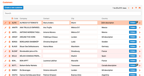
The Dynamic Row Color widget allows you to dynamically set the background color for rows in a Multi-row Panel. The value of the column that the widget is bound to determines the background color for that given row. A column value of " or null will revert the row background to the default color used for MRP rows.
Color can be specified as the color name or CSS value. For example: red, #f00, or #ff0000.
Parameters
N/A
Implementation notes
- When adding and defining the widget within App Builder, set the Modes Supported value to View and Edit
- Row color is determined based on the control mapped to the widget. This control must be mapped to a column defining the color
-
Add a derived column to the MRP panel Business Rule that defines color value. For example: RowColor. This column can contain dynamic logic, such as an IIF statement, to determine the color value. For example:
IIF((C.CompanyName is null or C.ContactName is null, '#fee', '') -
Add the derived column from Business Rule to the MRP as a Text type control and set the Widget value to use this widget
- Set the Priority to 1
- Define the Width as 1
- Set Label Visibility to Hidden
-
If you are not seeing the desired result, check any panel themes to see if active row has a color value defined (including white). You may need to change the active row background color to transparent.
Example
Character Count
Download
Description
This SRP/Form panel widget allows you to configure an upper character Limit parameter value, and requires a parameter defined for both CharLimit (character limit) as well as TextFieldID (ID for the field where the widget will be placed). Once the widget is enabled on a Text field, the widget displays both the field character Limit and Remaining values while in Edit mode.
To locate the TextFieldID, navigate to the Text field from the application UI view, open the field to Edit mode, and use a web browser developer utility to inspect the field. For example: Text-Area_0aae73c8-2002-42a2-99c4-242dac4f84db
Optionally configure an Index parameter with the widget, if you intend to configure the widget more than once on a panel.
Parameters
| Parameter Name | Default | Translatable |
|---|---|---|
CharLimit |
32 | Yes |
TextFieldID |
Yes | |
Index |
Yes |
Implementation notes
-
This widget requires you to create a blank Template, and apply this blank template to a Template control on the page. Include a comment in the Template such as "Hello World"
When you apply the Character Count widget to the Template control, be sure to specify TextFieldID in the widget parameter
-
If you are not seeing the character count information clear outside of Edit mode, uncheck the Target Container field from the Widget Definition.
Example

Bar Code / QR Code Scanner
Note
Since 4.0.35771 (11.34), the QR reader widget is built into App Builder and is selected when a field contains the names QRCode or Barcode.
Download
Description
This widget is a cross platform bar code and/or QR code reader.
Implementation notes
-
When adding and defining the widget within App Builder, set the Modes Supported value to View Only. After adding, place the widget on top of the Control you want the scanned value to populate. This Control should map to a String/NVarchar Column in an underlying table. If the name of this Control contains the text
qr, the QR code scanner widget is automatically placed on top. -
Confirm the panel state the widget appears in is set to Default. Check Panel > Edge Case > Initial Panel State value = Default.
-
Consider adding a second Text Control to the panel with Edit State = Read Only. This Control will render and display the scanned QR or bar code output value.
-
If you receive a
NotReadableError, this indicates the camera the widget is trying to use is already in use. For example: If you are on a video conference call using your camera for video feed, you may need to stop the video feed if you want to simultaneously demo an app with the Bar/QR Code scanner widget.
Github library link to view widget supported configurations: HTML5 QR Code
Example

Auto Event Runner
Download
Description and parameters
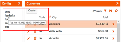
This widget will auto refresh the App Builder page based on the specified Interval Parameter.
Another possible use case for this widget is to close a panel after 10 seconds, for example. Add a Button to your page that runs an Event. Optionally set the Event to refresh data. Add this widget to the Button Control.
Setting Text to empty and ShowTimestamp to 0 allows it to run hidden. The 90000 is milliseconds, or 90 seconds.
| Parameter Name | Default | Translatable |
|---|---|---|
Interval |
90000 | No |
ClassNames |
No | |
Text |
Data loaded | No |
ShowTimestamp |
1 | No |
Clickable |
1 | No |
Example
Range Slider
Download
Documentation
http://refreshless.com/nouislider
Description and parameters
This slider lets the user edit a numeric field using a moving slider over a line.
As a designer you can set the Min, Max and Step values you support. The default is 0 to 100, with a step of 1.
The widget will automatically set the "pips", or little dots under the line to indicate the scale of the line.
| Parameter Name | Default | Translatable |
|---|---|---|
Max |
100 | No |
Min |
0 | No |
Step |
1 | No |
Example

Two Point Slider
Download
Documentation
http://refreshless.com/nouislider
Description and parameters
This slider lets the user edit two numeric fields using a moving slider over a line.
As a designer you can set the Min, Max and Step values you support. The default is 0 to 100, with a step of 1.
The widget will automatically set the "pips", or little dots under the line to indicate the scale of the line.
The LowColumn and HighColumn parameters don't have defaults and must be set to the control names that you want to bind the slider values to.
| Parameter Name | Default | Translatable |
|---|---|---|
Min |
0 | No |
Max |
100 | No |
Step |
1 | No |
LowColumn |
No | |
HighColumn |
No |
Example

Google Analytics
Download
Description and parameters
Tracks page changes and authentication. Sends to Google Analytics.
| Parameter Name | Default | Translatable |
|---|---|---|
Debug |
0 | No |
GA4Tag |
No | |
ObsoleteOptimizeCode |
No | |
ObsoleteTrackingCode |
No |
Example

From Now Date Formatter
Download
Parameters
| Parameter Name | Default | Translatable |
|---|---|---|
FromDate |
No | |
HideSuffix |
{false} | No |
Example

Image Rotater
Download
Description
Rotates an image stored in a binary cell. Creates two buttons, one rotates the image clockwise and the other counter-clockwise.
Only works in edit mode, but is designed to run in view state also so the view state doesn't render anything at all.
Example

Widget API Debugger
Download
Description and parameters
Simple widget which spits out the following widget api values:
- Locale (CultureId)
- Language (UiCultureId)
- All Parameters
| Parameter Name | Default | Translatable |
|---|---|---|
TestBindingControlName |
Yes | |
TestBindingEmpty |
Yes | |
TestBindingStringBrace |
Yes | |
TestBindingStringQuoted |
Yes | |
TestDefault |
My Default Value | Yes |
TestDefaultEmpty |
Yes |
Example

Web Font Loader
Download
Description and parameters
Loads the font specified via parameter. Defaults to Roboto.
The widget will load the specified font into the browser. This will happen when the site first loads so the user shouldn't see content that is not fonted correctly.
WebFontHostName: Host name to get the fonts. Can use google or any other font provider. Use // instead of http or https to avoid mismatching with the current secure state.WebFontName: The name of the font to load. This is appended to the URL so you can also use this parameter to load any other url parameters this host requires. (selecting only some text via text=Hello or choosing bold vs normal font weight)LinkMediaString: A value that specifies the conditions to apply the font. Values include a minimum width to exclude mobile devices,screen and (min-width:500px)or exclude when printing,not print
| Parameter Name | Default | Translatable |
|---|---|---|
LinkMediaString |
all | No |
WebFontHostName |
//fonts.googleapis.com/css?family= | No |
WebFontName |
Lato | No |
Example

Telephone Number Formatter
Download
telephone-number-formatter.zip
Description
Formats telephone numbers and allows editing.
Library definition
https://github.com/jackocnr/intl-tel-input
Parameters
-
AllowDropdown: bool
Show the icon in edit mode -
InitialCountry: string
Single country code, used as default when empty -
OnlyCountries: string
Limit your country selection list. In format "us,gb,cz,mx" without spaces -
PreferredCountries: string
These countries appear at the top of the list. In format "us,gb,cz,mx" without spaces -
UseNationalMode: bool
If the widget should show the country code or not
| Parameter Name | Default | Translatable |
|---|---|---|
AllowDropdown |
True | No |
InitialCountry |
us | No |
OnlyCountries |
No | |
PreferredCountries |
us,gb | No |
UseNationalMode |
true | No |
Example

Favicon Loader
Download
Description
Use to display a customized Favicon icon for the App Builder instance, that get displayed in the address bar area of the browser tab. The icon will also show on a mobile device's home screen (iOS and Android) when the site is added to the mobile device's home screen.
When installing the Favicon Loader, first upload the Zip file to the Widgets area of the Collection being used by the app (in Themes), select "Site level" for Modes Supported, and add the 4 Parameter values listed below. Next go to App Builder IDE > Configuration > Site Widgets, and add the Favicon Loader widget, and add the FaviconUrl Parameter with one of the 3 types of accepted URL formats (see below) along with entries for the other Parameters. If you're specifying multiple favicon icons, you'll need to add multiple instances of the Favicon widget (one per icon being specified).
Parameters
FaviconRel: Required value, add parameter to configuration along with value. Example: iconFaviconSizes: Value not required, but add parameter to configuration. Example: 16x16FaviconType: Value not required, but add parameter to configuration. Example: .png-
FaviconUrl: Required value, add parameter to configuration along with value. Example:https://realfavicongenerator.net/blog/wp-content/uploads/fbrfg/apple-touch-icon.pngURL Values Accepted:
- Full URL (Example:
https://example.com/service/image/4264b246-79d6-40ad-8f38-4213fa955de5?tag=%22eDWmFG%2Bwe4ismdUwh5fW0A%3D%3D%22) - Relative URL (Example:
/service/image/4264b246-79d6-40ad-8f38-4213fa955de5?tag=%22eDWmFG%2Bwe4ismdUwh5fW0A%3D%3D%22) - Base64 encoded data URL (Example:
data:image/png;base64,iVBORw0KGgoAAAANSUhEUgAAAEAAAABFCAYAAAD6pOBtAAAABmJLR0QA/...)
- Full URL (Example:
| Parameter Name | Default | Translatable |
|---|---|---|
FaviconRel |
icon | No |
FaviconSizes |
16x16 | No |
FaviconType |
image/png | No |
FaviconUrl |
No |
Example
![]()
Dial
Download
Description
Create a customizable UI dial control for display in App Builder.
When installing the Dial Widget, first upload the Zip file to the Widgets area of the Collection being used by the app (in Themes), select "Site level" for Modes Supported, and add the Parameter entries and values you need (supported Parameters are listed below). This assumes you already have a column in the Data Source that contains data you want to display with the Dial. Next, head to the page where you want to display the Dial for a Control. In the Control Designer, Widget Information section, specify the name of the Widget (e.g., Dial), set the Parameters information to provide a mapping between DialValue and the Control Name you wish to display on the Dial. Also set the Widget Interface Mode (e.g., Always) and Widget Active Mode (e.g., View and Edit).
Original source library definition
https://github.com/aterrien/jQuery-Knob
Parameters
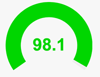
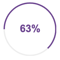
DialAngleArc: Numeric value from 0-360, 360 is full circle, anything less makes it more of a gauge. Example: 360DialAngleOffset: Numeric value from 0-360, for where the 0% starts and then goes around. Example: 270DialColor: Value not required, define color of dial on widgetDialDisplayInput: Default = true, if you want to hide input set to falseDialMax: Max value, default = 100. When using the widget to represent percentages, if the value can go over 100%, best practice is to calculate the Max in a different field as 100. The value you pass in needs to be multiplied by 100. For example:IIF(Value>100, 100, Value) AS Max.DialMin: Min value, default = 0DialReadOnly: Disables input and eventsDialStep: Step size, default = 1DialThickness: Gauge thicknessDialValue: Numeric Value to be represented by the Dial. Example: 98.1DialValueSuffix: Unit of measure represented by the Dial, default is percentage. Example: %DialWidth: Dial width. Example: 65%DialValuePrefix: Unit of measure represented by the Dial, positioned after/before the value. Example: $
| Parameter Name | Default | Translatable |
|---|---|---|
DialAngleArc |
360 | No |
DialAngleOffset |
270 | No |
DialColor |
No | |
DialDisplayInput |
true | No |
DialMax |
100 | No |
DialMin |
0 | No |
DialReadOnly |
true | No |
DialStep |
1 | No |
DialThickness |
.05 | No |
DialValue |
No | |
DialValueSuffix |
% | No |
DialWidth |
65% | No |
DialValuePrefix |
$ | No |
Examples
Copy to Clipboard (with icon)
Download
Description
Use to create a UI clipboard button control in App Builder that allows a User to copy the configured information/data into their machine clipboard memory (to be pasted and used elsewhere). No Parameters are required to be configured in order use this widget, you specify the value you want to copy as the Control field.
- If you need to change the widget appearance from the clipboard button to something else, edit the i class value from the view.html file
- The Tooltip text appearing when you copy is also customizable by editing the title value in the view.html file. This value is defaulted to read "Copied!"
Example

Copy to Clipboard (with button)
Download
Description
Use to create a UI clipboard button control in App Builder that allows a User to copy the configured information/data into their machine clipboard memory (to be pasted and used elsewhere). This widget allows you to use a button vs. an icon. No Parameters are required to be configured in order use this widget, you specify the value you want to copy as the Control field.
- If you need to change the widget appearance from the clipboard button to something else, edit the i class value from the view.html file
- The Tooltip text appearing when you copy is also customizable by editing the title value in the view.html file. This value is defaulted to read "Copied!"
Example

Multi File Upload
Download links
Use the links below to download the different versions of the Multi File Upload widget.
- Multi File Upload - Version 3.4
- Multi File Upload - Version 3.3
- Multi File Upload - Version 3.0
- Multi File Upload - Version 2.0
Description and parameters
The Multi File Upload widget uses the FilePond library. This widget allows multiple files to be uploaded synchronously or asynchronously by temporarily storing files in a single column. It uses the Save event to pull the file binary and move it to a separate table. From there, it can be processed further or moved to a local or network file system.
The widget is required and includes parameters for allowFileSizeValidation and maxFileSize.
The 3.4 version of the widget does not show a delete icon on uploaded files. In versions 3.3, 3.0, and 2.0, the delete icon is present, but not functional. Uploaded files can be removed with application logic.
The 3.0 version of the widget can be configured to restrict uploads that exceed a certain size. By default, the limit is set to 256KB and this value can be changed to any MB or KB file from the FilePond documentation, by editing the binder.js file. For more information, see FilePond file size validation.
Note
If you are uploading files to Amazon S3 Bucket, and want to create a tiered directory structure for the files, please see Amazon S3 file system.
| Parameter Name | Default | Translatable | Description |
|---|---|---|---|
allowImagePreview |
1 | No | Enable (1) or disable (0) preview for image file types. |
allowMultiple |
1 | No | Enable (1) or disable (0) adding multiple files. |
forceReload |
1 | No | Enable (1) or disable (0) running a global refresh after a batch of files has been uploaded. |
runSave |
1 | No | Enable (1) or disable (0) running the save event for each file being uploaded to the Business Object's file column. |
allowFileSizeValidation |
1 | No | Enable (1) or disable (0) to allow use of the maxFileSize parameter setting. |
maxFileSize |
5000KB | No | Value for the largest file size the widget will allow. Must be expressed in kilobytes and is a string value. |
In addition to parameters specified, the following parameters must be configured to take advantage of file size restriction:
-
allowFileSizeValidation: Default value of1. -
maxFileSize: No default.
More parameters are available to be configured based on the FilePond documentation under the Properties section. To add additional parameters/properties, you will need to edit the binder.js file in the widget directly.
Note
Any additional parameters/properties added may not work as expected and only the parameters above have been tested.
Geolocation
Download
Description
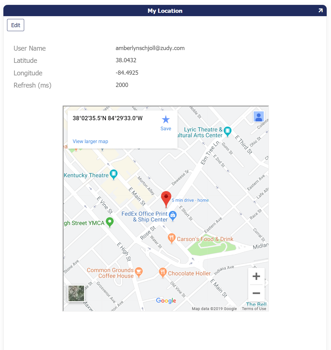
This widget takes your device's current location from HTML5 Geolocation. It will save the coordinates in the columns that are tied to controls with the nsmes "Latitude" and "Longitude". These can be hidden.
Parameters
RefreshRate(in milliseconds)
The widget default is set to -1 (Disabled). The record will not change/save until the system recognizes a change in location by comparing the table record vs your current location.
Example: RefreshRate=5000 will check your location every 5 seconds. When a change is determined the record will be changed.
| Parameter Name | Default | Translatable |
|---|---|---|
RefreshRate |
-1 | No |
Example
Signature
Download
Documentation
https://willowsystems.github.io/jSignature
Description
This widget will allow you to display or edit a drawn signature directly within the browser.
It is compatible with touchscreen devices and will save the signature as image data within a database field.
Parameters
Width: Numeric value width of the signature boxHeight: Numeric value height of the signature boxBackgroundColor: Background color of the signature boxColorImageFieldName: Parameter passed in from text control. Is the contol name of the image.LineWidth: Numeric value width of the line the users sign on top of
| Parameter Name | Default | Translatable |
|---|---|---|
Width |
None | No |
Height |
None | No |
BackgroundColor |
#FFFFFF | No |
Color |
#000000 | No |
LineWidth |
1 | No |
ImageFieldName |
Blank (Set by Data Field of Same Name) | No |
Example

Currency Format
Download
Description
This widget is available for Controls and changes an input into USD format where the cents are optional.
Parameters
N/A
Example

Rating Bars
Download
Description
This widget allows user to input/change a value by selecting from a graphic rating interface.
Parameters
RatingTheme: This value is a string, and will change the look of the Rating BarRatingValueOptions: This value is a string, and will change the values available in the Rating Bar
| Parameter Name | Default | Translatable |
|---|---|---|
RatingTheme |
No | |
RatingValueOptions |
No |
Example

Org Chart
Download
Description
This widget allows you to generate an Org Chart on a panel based on underlying data.
Parameters
ApiKey: This value represents the API Key App Builder issues the configured REST API resource the widget will utilizejsonUrl: This value represents the fully qualified URL path to access the JSON dataproperty.id: The Key value from the business object. For example:employeeIDproperty.items: The value for this should be 'items'property.label: This value should be from the business object and represents the subject value which appears on the Org Chart. For example:FullNameproperty.parent: This value should be from the business object and represents whom the subject reports into. For example:reportsToproperty.subtitle: This value should be from the business object and represents the subjects classification in the hierarchy. For example:titlesupport.linktopage: This value should be '1'support.wrapping: This value should be '1'
| Parameter Name | Default | Translatable |
|---|---|---|
ApiKey |
None | No |
jsonUrl |
None | No |
property.id |
None | No |
property.items |
None | No |
property.label |
None | No |
property.parent |
None | No |
property.subtitle |
None | No |
support.linktopage |
1 | No |
support.wrapping |
1 | No |
Example

Iframe Resizer
Download
Description
This widget supports keeping an iframe sized to its respective content. Handles window and content resizing, in page links, nesting, and multiple iframes.
Documentation
Parameters
Generally speaking, there are two components required to configure the iframe Resizer widget for use with an App Builder app:
- The outside page hosting App Builder in an iframe
- Inside the iframe where App Builder is running
For more information on configuring, see Display an App Builder page on a website with iframe
Site Banner
Download
Description and parameters
Site Banner is a sitewide widget that provides a banner across the top of all app pages. The banner is customizable and can easily be configured to read any text you would like. The widget supports the following 2 parameters:
- BannerText: BannerText should contain the text you want displayed within the banner. For example: "This is the Sandbox environment"
- BannerStyle: BannerStyles will contain the inline CSS that stylizes the banner. For example: text-align:center;background-color:yellow
| Parameter Name | Default | Translatable |
|---|---|---|
BannerText |
I am a site banner! | No |
BannerStyle |
text-align:center;background-color:yellow | No |
Example
