Label layout based on space in Jitterbit App Builder
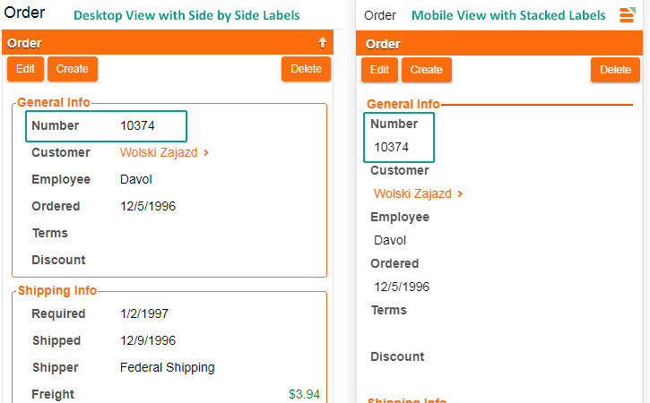
The positioning of Labels appearing within Panels is responsive based on device width. Depending on the amount of space available within a given Panel, a Label will either appear Side by Side or Stacked to its corresponding data value on the screen.
If a Form panel has enough space horizontally, it will use Side by Side to present labels. If a Form panel does not have enough horizontal space, it will Stack the labels instead. The amount of space used to determine whether a label displays as Side by Side or Stacked is determined by width of the panel. If a panel is considered less than "minimum panel width", labels will appear as Stacked.
Here is a screenshot displaying label position on panels, based on space. To help illustrate you can compare the same Order panel as viewed in desktop vs. mobile view:
