App workbench Tables tab in Jitterbit App Builder
Tables is the second tab in the App Workbench. It is the second tab that relates to the data layer of your application and is where you can see a list of all the tables present in the data sources connected to the current application, the relationships between them, and add new tables or edit the existing ones.
The image below shows the Tables tab for an application with a data source currently containing three tables:
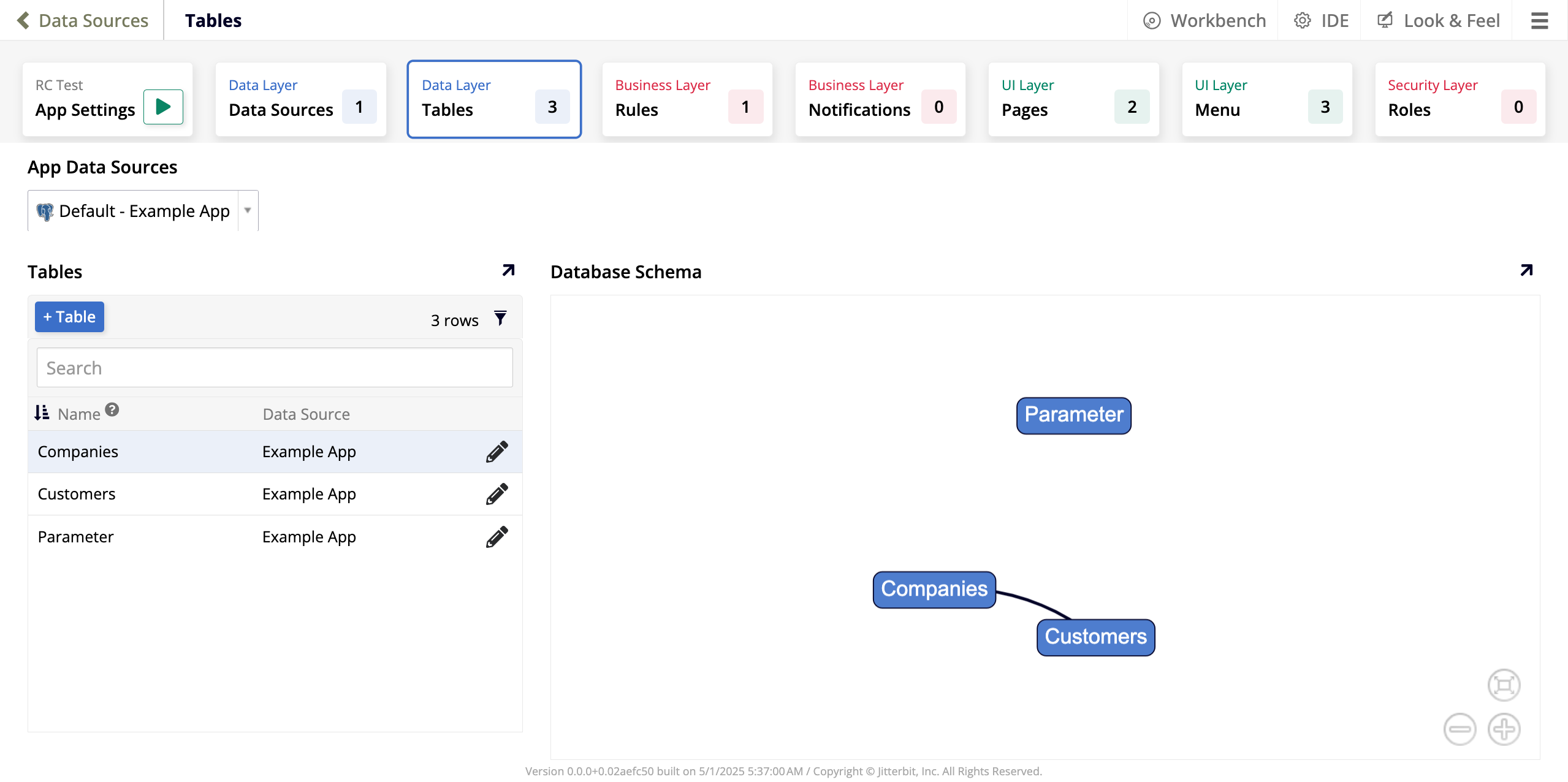
There are three panels:
-
In the App Data Sources panel, a dropdown menu lists all the data sources connected to the current application. The one selected by default is the primary data source.
-
The Tables panel shows:
-
The + Table button, which allows you to add a new table to the selected data source.
-
A table listing all the tables currently present in the selected data source. A search bar allows you to look up a specific table by name. Each row of the table includes these columns:
-
Name: The table name. Each table inside a data source must have a unique name.
-
Data Source: The data source where that table resides.
-
Click the pen icon to edit the table.
-
-
-
The Database Schema panel shows a visual representation of the relationship between your tables. In the image, each table is a node and the relationships between them (shared columns) are shown as the lines between them.
Create a table
To add a new table, follow these steps:
-
In the App Data Sources panel, use the dropdown to select the data source where you want to add a new table.
-
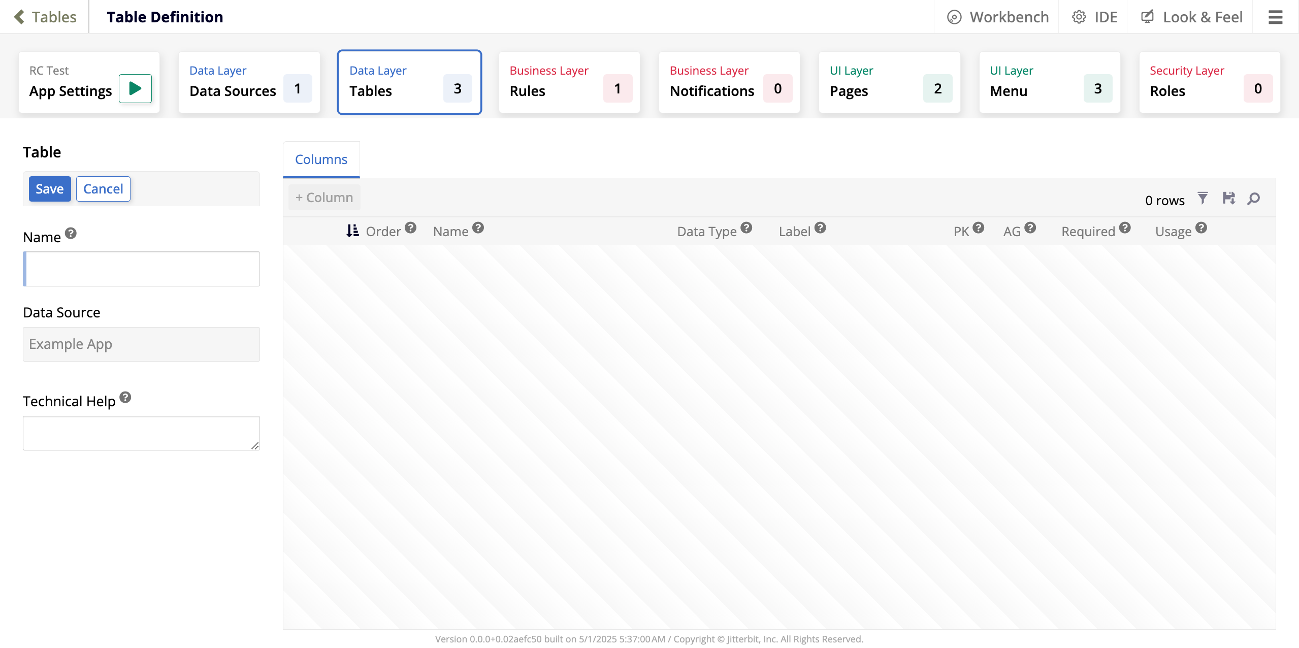
In the Tables panel, click + Table. The Table Definition page opens in create mode:
-
Use the Table panel to provide basic information about the table:
-
Name: Enter a name for your new table. Inside each data source, table names must be unique.
-
Data Source: This field shows which data source you're creating a table for.
-
Technical Help: A text box where you can enter additional information for other app developers about what the table contains. This text is not seen by app users.
-
-
Click Save to create the new table. If you want to discard your changes and return to the Tables tab instead, click Cancel.
-
The new table will be created containing one column, which has the same name as the table with the addition of
IDat the end. Now you can edit your new table the same way you can edit the existing ones.
Edit a table
When you create a table, you are immediately taken to the screen where you can edit it. If you want to edit an existing table, follow these steps:
-
In the App Data Sources panel, use the dropdown to select the data source with the table you want to edit.
-
In the Tables panel, locate the table you want to edit and click the pen icon. The Table Definition page will open in edit mode, where you can make your edits:
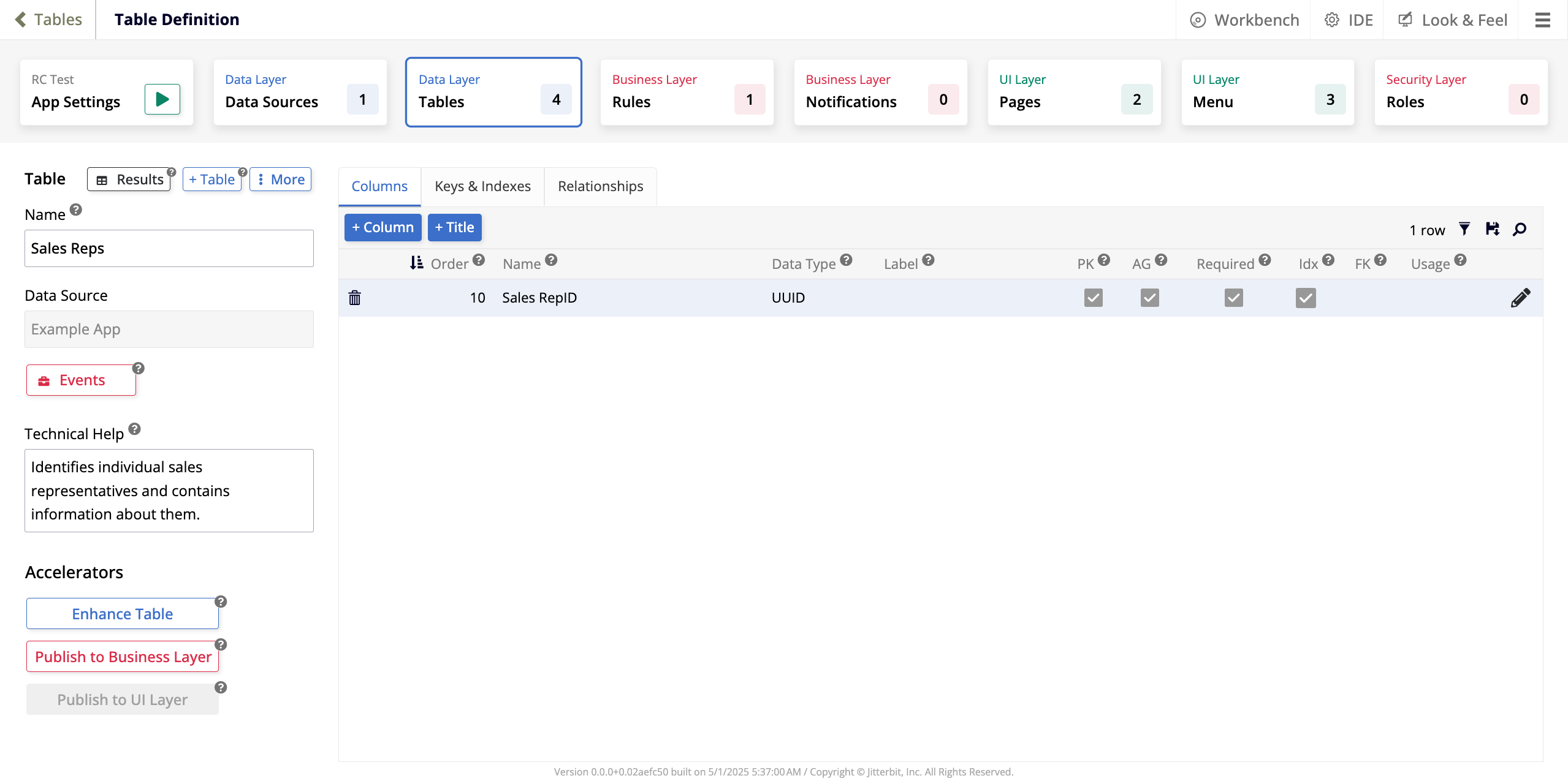
Table panel
The Table panel offers the following options for editing the table:
-
Results: Click to view all the records stored in the table.
-
+ Table: Click to create a new table in the same data source.
-
More: Click to see a list of additional options:
-
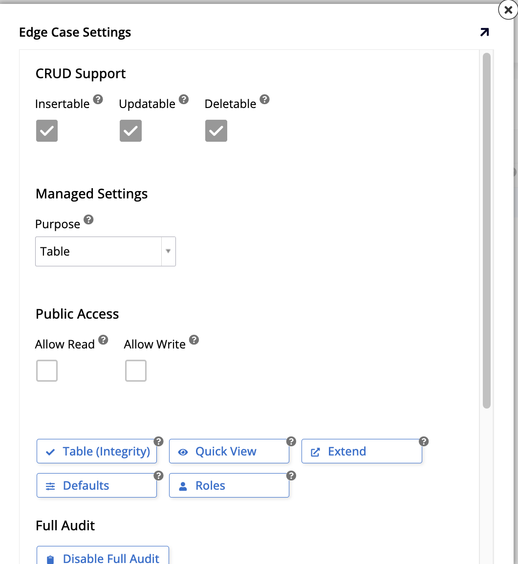
Edge Case: Click to open the Edge Case Settings dialog, where you can configure additional, advanced settings for the table:
-
Under CRUD Support:
-
Insertable: Select to allow table records to be inserted via CRUD rules.
-
Updatable: Select to allow table records to be updated via CRUD rules.
-
Deletable: Select to allow table records to be deleted via CRUD rules.
-
-
Under Managed Settings:
- Purpose: Use the dropdown menu to select the purpose of the table. The default selection is Table, a standard design and usage table where you manage all columns. You can also use it as a Managed Table, with automatic hidden bindings and truncating.
-
Under Public Access:
-
Allow Read: Select to allow the table to be accessed as a Read-Only object.
-
Allow Write: Select to allow the table to be accessed as a Write object.
-
Table (Integrity): Click to see an integrity check of all columns in the table, including information such as whether or not a column is a primary key, its data type, length, precision, etc.
-
Quick View: Click to see a quick grid view of data records contained in the table.
-
Extend: Click to use this table in a different data source.
-
Defaults: Click to configure and maintain default values for any of the columns in the table.
-
Roles: Click to configure and maintain roles or permissions levels for the table.
-
-
In the Full Audit section:
- Disable Full Audit: Click to disable full audit.
-
In the Danger Zone section:
-
Truncate: Click to delete all data currently stored in the table. This action cannot be reversed.
-
Install Option: Use the dropdown menu to define how the records stored in the table should be treated when the application is packaged as a release and installed in a new environment. The options are Developer Data, Shared Data, or User Data.
-
Label: Enter a label for the table.
-
-
-
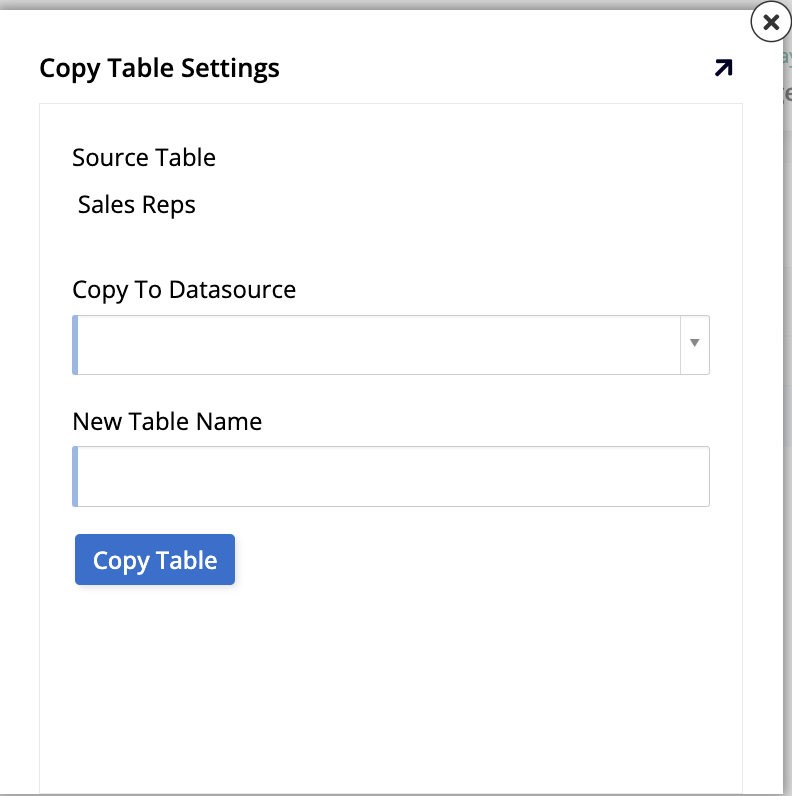
Copy Table: Click to open the Copy Table Settings dialog, where you can copy the current table to a different data source and assign it a name in its new location:
-
Source Table: Shows the current table.
-
Copy To Datasource: Use the dropdown menu to select which of the current app's data sources to copy the table to.
-
New Table Name: Enter the name the copied table should have in the other data source.
-
Copy Table: Click to copy the table.
-
-
Where Used: Click to see the Where Table Used page, where you can see an overview of all places in the current application where the table is used.
-
Changelog: Click to see a list of changes made to the table.
-
Delete Table: Click to delete the table from the application. You will be asked to confirm before App Builder goes through with the deletion.
-
-
Name: Edit the name of the table. Inside each data source, table names must be unique.
-
Data Source: The data source where that table resides.
-
Events: Click to open the Data Storage Events dialog, where you can configure any events associated with the table, either one of the four intrinsic events, or a custom event created by you. See Events to learn more.
-
Technical Help: A text box where you can enter additional information for other app developers about what the table contains. This text is not seen by app users.
-
Under Accelerators, there are options to speed up your table creation and editing process:
-
Enhance Table: Click to automatically create the table columns that are necessary to enable the audit lite feature.
-
Publish to Business Layer: Click to automatically create a business rule based on the current table.
-
Publish to UI Layer: If the table has a business object associated with it, click this button to launch the wizard that assists the creation of a new page.
-
Tabs panel
The right panel on the screen contains three tabs, described in the sections below, that assist you in adding information to your table.
Columns tab
In the Columns tab, you'll find the following options:
-
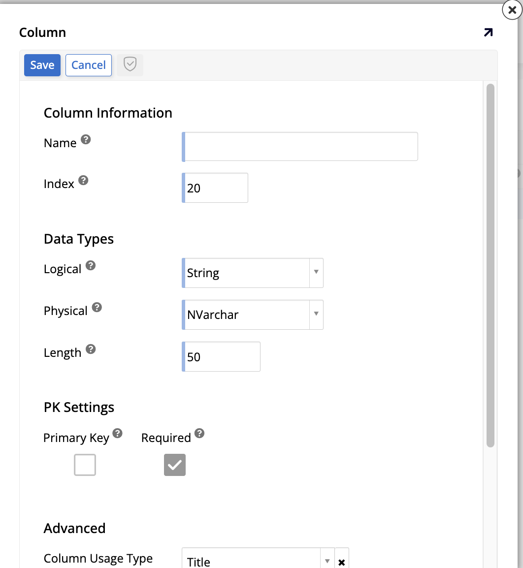
+ Column: Click to add a new column to the table:
-
Under Column Information, these fields are available:
-
Name: Assign a name to the column. The column names must be unique within the table.
-
Index: Enter a numeric value to determine the order of appearance of the columns in the table.
-
-
Under Data Types, the following fields appear:
-
Logical: Use the dropdown menu to select the type of data that column will hold.
-
Physical: Use the dropdown menu to select how the data will be stored.
-
Length: Enter the number of bytes used to store the number if the data type is Numeric. For Binary, Varbinary, and Image data types, the length is the number of bytes.
-
-
Under PK Settings, there are two checkboxes:
-
Primary Key: Select to define this column as a primary key.
-
Required: Select to make this column a required field. If unselected, the column can accept null values.
-
-
Under Advanced, the following options are presented:
-
Column Usage Type: Use the dropdown menu to select the type of usage for the column.
-
Default Value: (Optional) Enter a default value for the column.
-
Translatable: Select to turn on translations for the column. Data in the column that gets added or edited through the business layer will be translated automatically at runtime, and translating the application bundle will translate all data in the column.
-
-
Click Save to create the new column or click Cancel to discard your changes and return to the previous screen. When you click Save, App Builder will show the creation dialog again to facilitate the creation of several columns at once. When you are done creating columns, click the exit button.
-
-
+ Title: Click to automatically create a column with a user-friendly value based on the primary key. If there already is a column with the Title usage type, this button isn't shown.
-
A list of all the columns in the table. Click the filter icon to filter the items in the list, click the floppy disk icon to save the columns as a CSV file, or click the magnifying glass icon to search for a specific value. Each row in the list shows the following:
-
A trash can icon. Click to delete the column.
-
Order: The numeric value that determines the order in which the columns are listed.
-
Name: The name of the column.
-
Data Type: The data type of the values the column holds.
-
Label: The column's label, if there is one.
-
PK: Indicates which of the columns is a primary key.
-
AG: Indicates whether a value is automatically generated for the column whenever a new record is inserted into the table.
-
Required: Shows if the column is required.
-
Idx: App Builder suggests an index relationship based on data schema analysis.
-
FK: App Builder analyzes the columns of other tables to suggest foreign key relationships. To apply the suggested key, click the + icon.
-
Usage: Shows the usage type of the column.
-
A pen icon. Click to edit the column.
-
Keys & Indexes tab
In the Keys & Indexes tab, the following options are available:
-
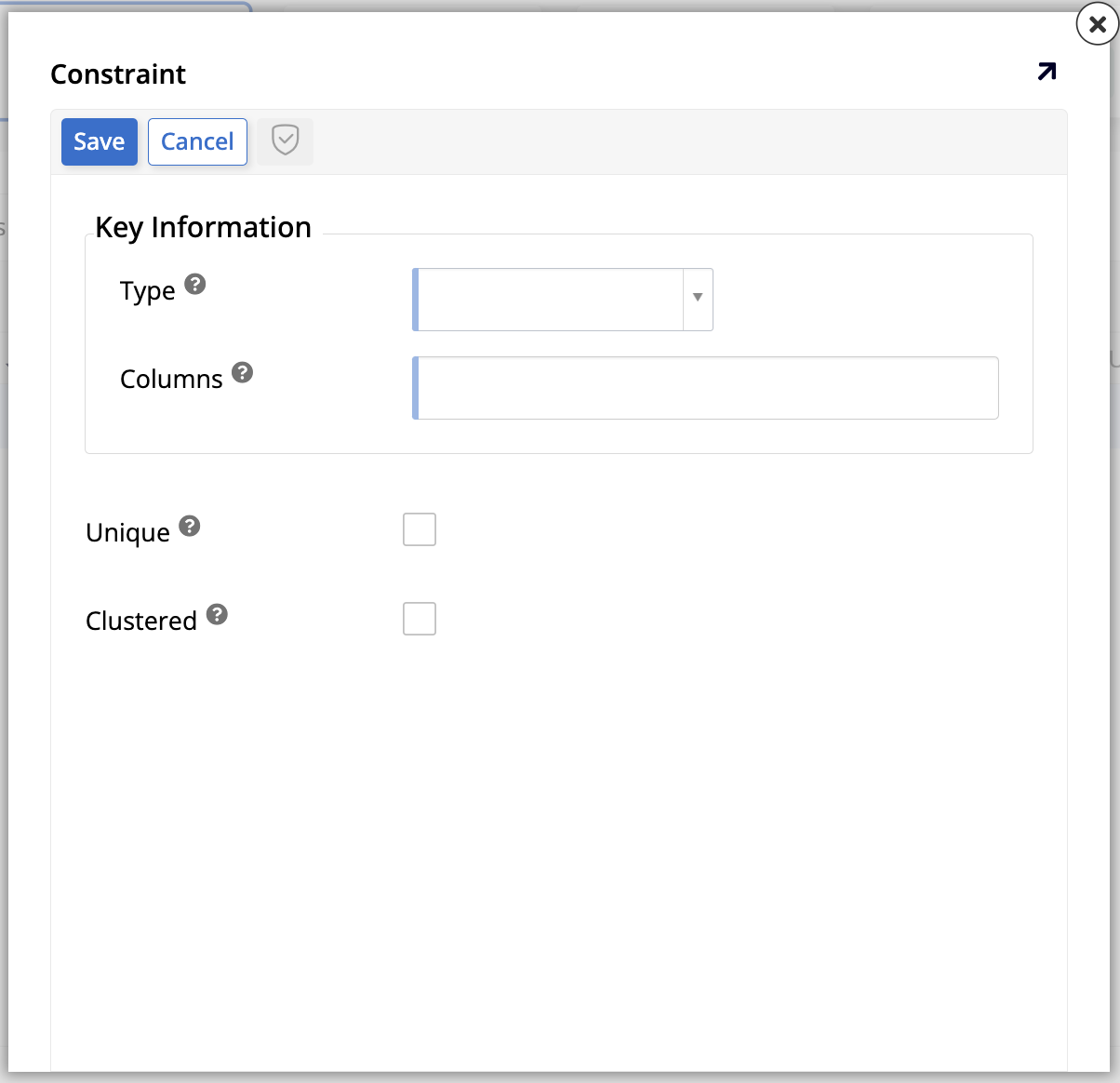
+ Key: Click to add a new key to the table. The Constraint dialog opens:
-
Under Key Information, the following options are available:
-
Type: Select the type of key, which alters the rest of the options in the dialog.
-
Columns: Select the columns to be associated with the key-index record.
-
-
Under Options, different checkboxes appear, depending on your choice of key Type:
-
Unique (shown for key type Index): Select to indicate that this field cannot be duplicated in the table.
-
Clustered (shown for key types Index and Primary Key): Select to make the table be sorted by this index. There can only be one clustered index per table.
-
Validate (shown for key types Primary Key and Unique Key): Select to make App Builder validate the indexed columns for uniqueness before saving:
-
When this option is selected, App Builder validates for potential conflicts before saving the row. A validation error is generated if a conflict is detected.
-
When this option is unselected (default), App Builder attempts to save the row without prior validation. An exception will occur if the save operation fails due to a conflict.
-
-
-
When you are done, select Save to create the new key or select Cancel to delete your changes and return to the previous screen.
-
-
A list of the current keys and indexes. Click the filter icon to filter the items in the list, or click the magnifying glass icon to search for a specific value. Each row in the list shows the following:
-
A pen icon. Click to edit the key.
-
A trash can icon. Click to delete the key.
-
Type: Shows the type of constraint. The options are Index, Primary Key, or Unique Key.
-
Columns: Identifies the column associated with the key-index record.
-
Unique: Shows a checkmark icon if that field cannot be duplicated in the table.
-
Clustered: Shows a checkmark icon if the table is sorted by that index.
-
A pen icon. Click to edit the key.
-
Relationships tab
In the Relationships tab, you can see how the current table relates to others in the data source:
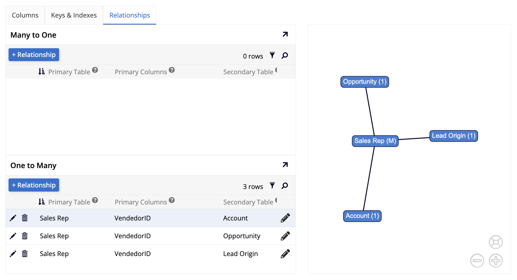
The Many to One and One to Many panels show lists containing all the tables that have a relationship with the current one, separated by type. Both lists can be filtered or searched, and each row on the table contains edit and delete icons. A visual representation of the relationships of the current table is also shown.