App workbench App settings tab in Jitterbit App Builders
App Settings is the first tab in the App Workbench. It is where you set up basic, initial information about your App Builder application. In addition, it contains shortcuts that take you to the main resources present in the other tabs.
The tab is divided into three panels. These are described in detail in the sections below:
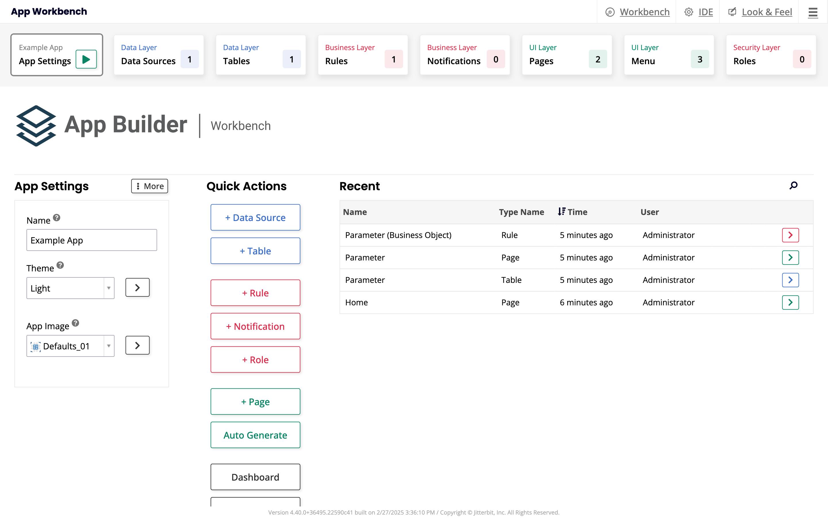
You can click the button next to the name of the tab to run your application in its current state.
App Settings panel
The App Settings panel shows these fields:
-
Name: See or change the name assigned to your application. Visible by default.
-
Theme: Pick a theme to provide customization for your application's look and feel.
-
App Image: Pick an image to use as the app logo that represents it in the site menu.
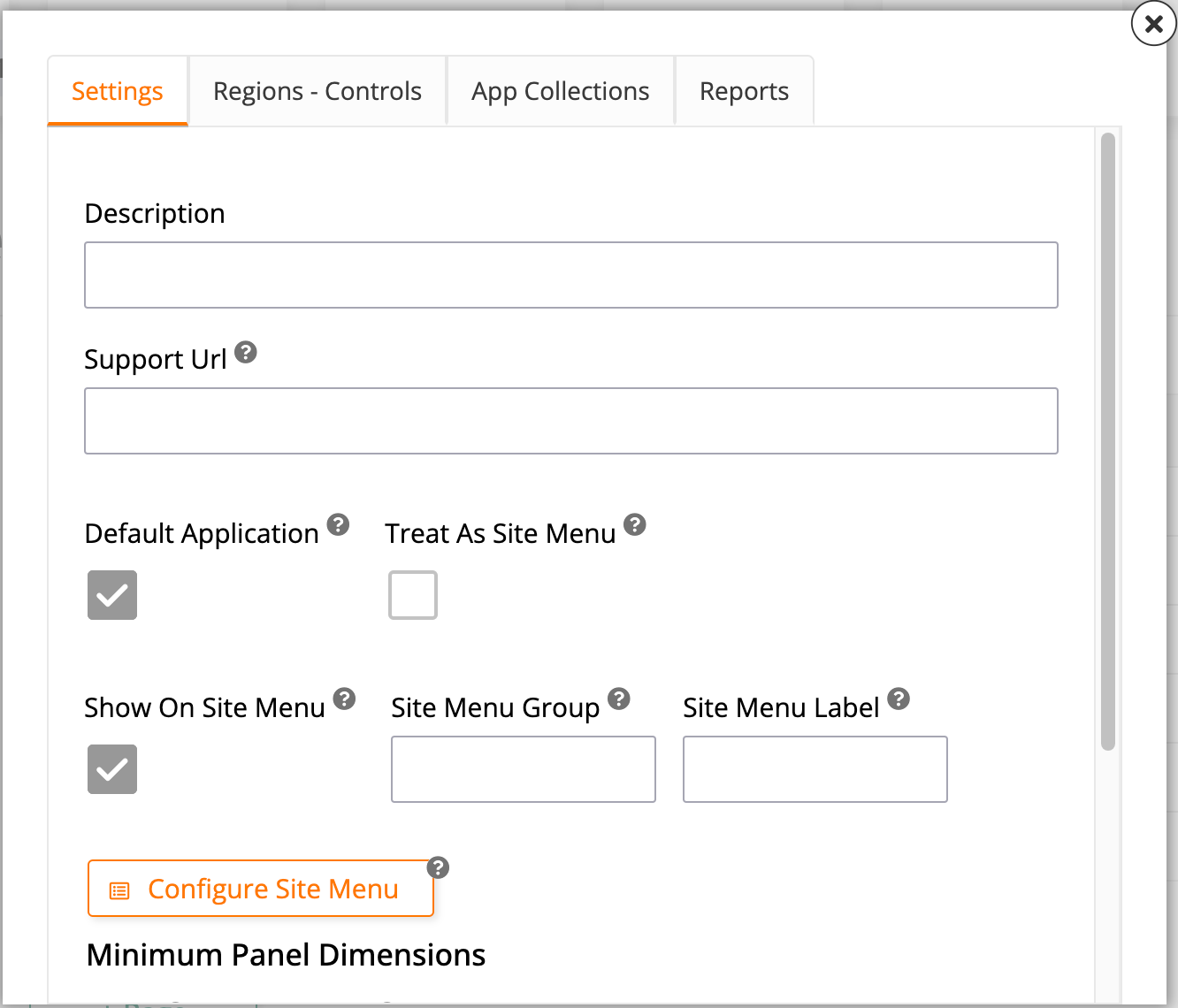
The More menu displays the following options:
-
Edge Case: Click to open a dialog with some additional configurations:
-
In the Settings tab, these options are available:
-
Description: Add a description for your application.
-
Support URL: Create a customized support link that appears in your app's action drawer.
-
Default Application: Select this checkbox to make the current application the default one that users are taken to after logging in.
-
Treat As Site Menu: Select this checkbox to treat the current application as a site menu, meaning that users who click Site Menu in the action drawer will be brought to it.
-
Show On Site Menu: Select this checkbox to include the current application in the list of applications shown in the site menu.
-
Site Menu Group: Add the current application to one of the groups in the site menu.
-
Site Menu Label: Pick a label to identify the current application in the site menu. This can be different from the application name.
-
Configure Site Menu: This button takes you to the Main Site Menu page, where you can configure and customize the site menu.
-
Minimum Panel Dimensions: Use the fields in this section to pick the minimum dimensions of panels in the current application. The default Width is 24 and the default Height is 21.
-
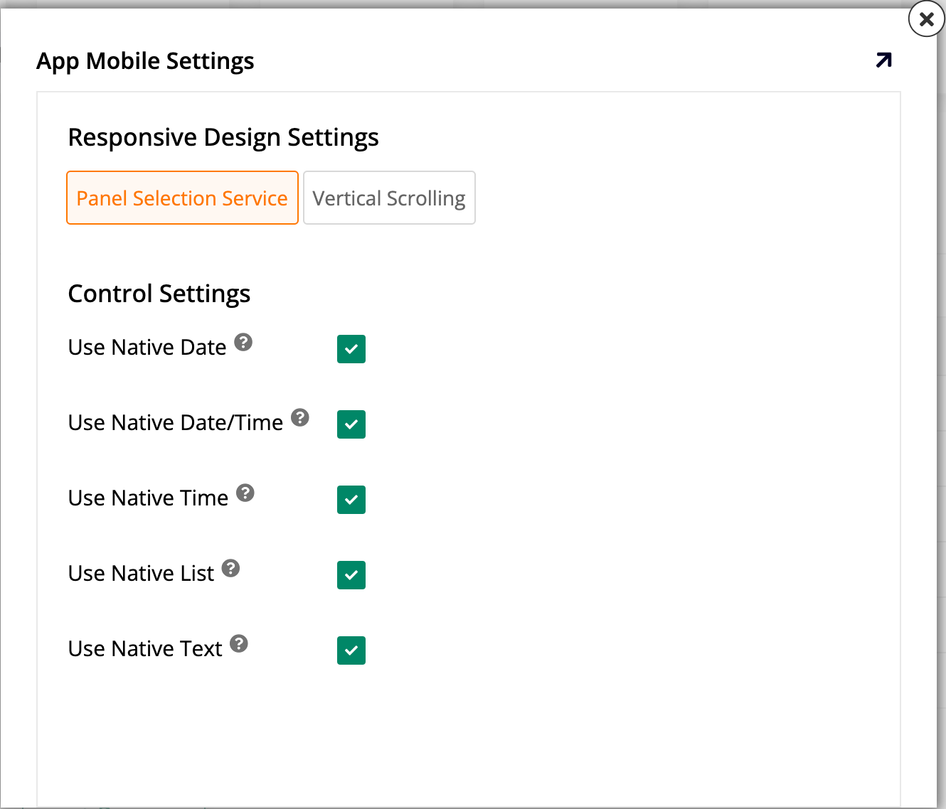
Mobile Settings: Click this button to configure and maintain settings only applicable to mobile devices. When you click it, the App Mobile Settings dialog opens, containing the following:
-
The Responsive Design Settings section, which lets you select between Panel Selection Service and Vertical Scrolling.
-
The Control Settings section, where there are checkboxes to let you decide which UI should be used for some controls:
-
Use Native Date: Select to use the mobile device's native UI when showing date controls. If unselected, App Builder's UI is used.
-
Use Native Date/Time: Select to use the mobile device's native UI when showing date/time controls. If unselected, App Builder's UI is used.
-
Use Native Time: Select to use the mobile device's native UI when showing time controls. If unselected, App Builder's UI is used.
-
Use Native List: Select to use the mobile device's native UI when showing list controls. If unselected, App Builder's UI is used.
-
Use Native Text: Select to use the mobile device's native UI when showing text controls. If unselected, App Builder's UI is used.
-
-
-
-
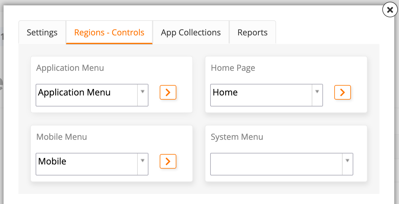
In the Regions-Controls tab, choose a home page and pick from the available options menus to fill these roles:
-
Application Menu: Select a menu to act as the application menu, visible on the right side of the top toolbar. The default is the menu with the same name.
-
Home Page: Select which page should act as the home page. The default is Home.
-
Mobile Menu: Select a menu to be seen by mobile device users. The default is the Mobile menu.
-
System Menu: Select a menu to act as the system menu, visible on the left side of the top toolbar. By default, there isn't one.
-
-
In the App Collections tab, see which collections the current application is a part of, and add it to new collections:
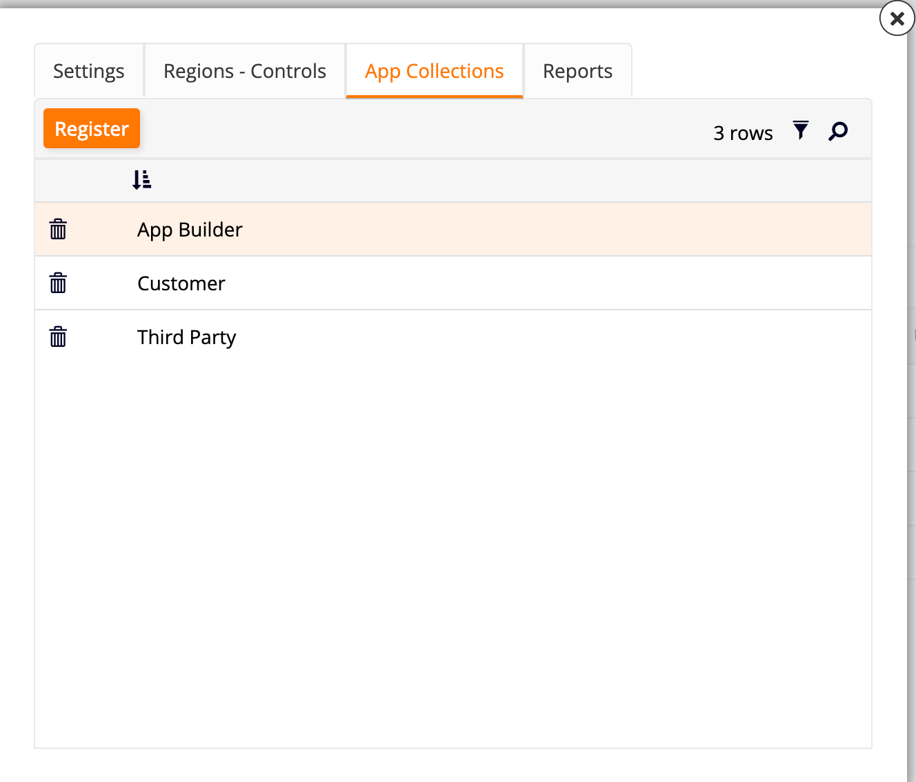
-
Register: Click this button to add the current application to a collection. A dropdown menu will appear, allowing you to select from the available collections. Click the icon to confirm your selection or the icon to cancel.
-
Use the icon to filter through the list of collections, and the icon to search for a specific one.
-
On each row of the collections list, use the icon to remove the current application from that collection.
-
-
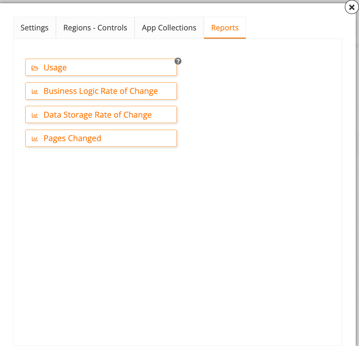
In the Reports tab, you can see summaries of the performance of key metrics:
-
Usage: Clicking this button opens the Reports dialog, where you can run four different reports:
-
Unused: Click to see whether the current application has any used pages.
-
Mistargeted: Click to see a list of mistargeted visibilities.
-
Doc: Click to generate a downloadable PDF document describing the current application's menus and pages.
-
Change: Click to see a graph showing how many new controls have been created in each month.
-
-
Business Logic Rate of Change: Click to see a graph showing how many new business rules have been created in each month.
-
Data Storage Rate of Change: Click to see a graph showing how many new data sources have been set up in each month.
-
Pages Changed: Click to see a graph showing how many pages have been changed in each month.
-
-
-
Snapshot: Click to take a snapshot of the current application. Later, you can restore the application to the state of the snapshot, retaining all settings.
-
Changelog: Click to see a dialog containing a list of all changes made to the application, including who made changes and when.
-
Copy Application: Click to copy the entire application to the existing environment.
-
Delete Application: Click to completely delete the application. This action cannot be undone.
Quick Actions panel
The Quick Actions panel gives easy access to the most important actions present in the other tabs of the App Workbench:
-
+ Data Source: Click to add a new data source to your current application.
-
+ Table: Click to add a new table in the data layer of the current application.
-
+ Rule: Click to add a new business rule.
-
+ Notification: Click to add a new notification.
-
+ Role: Click to add a new security role.
-
+ Page: Click to add a new page to the current application.
-
Auto Generate: Click to automatically generate pages based on the existing business rules that don't yet have a page associated with them.
-
Dashboard: Click to see dashboards offering a visual representation of the relationship between your data sources, menus, pages, and roles.
-
Diagrams: Click to see your existing workflow diagrams or create a new one.
Recent panel
The Recent panel shows a table listing the most recent changes made to the current application.
Use the icon to search for a specific edit. For each row on the table, the Name column shows what was changed, Type Name shows the type of component, Time records when the change was made, and User displays who made the change. In addition, you can click the button at the end of the row to be taken straight to the component that was modified.