Native mobile controls in Jitterbit App Builder
Overview
On a mobile device, App Builder can display certain control types either using its own UI, consistent with the rest of your application, or using the mobile device's own native UI elements, such as its built-in scrollable list picker.
You can set this behavior at two levels. Configure it once at the application level to set a default that applies across every control that supports it, or configure a specific control individually to override that default just for it.
Configure mobile rendering at the application level
Configuring this at the application level sets the default UI used across every control that supports it, unless a specific control overrides it individually. To configure it:
- Log in as a user in the Developers group.
- Locate your application on the Site Menu, then click its pencil icon.
- Select More > Edge Case.
- Click the Mobile Settings button.
This reveals the Control Settings section, with the following toggles, each disabled by default:
- Use Native Date: If enabled, uses the mobile device's native UI to display date fields instead of App Builder's own UI.
- Use Native Date/Time: If enabled, uses the mobile device's native UI to display date/time fields instead of App Builder's own UI.
- Use Native Time: If enabled, uses the mobile device's native UI to display time fields instead of App Builder's own UI.
- Use Native List: If enabled, uses the mobile device's native UI to display list fields instead of App Builder's own UI.
- Use Native Text: If enabled, uses the mobile device's native UI to display text fields instead of App Builder's own UI.

Configure mobile rendering at the control level
To override the application-level default for one specific control instead, configure this setting on the control itself. Only some control types, including List, Date, and Text, show a Mobile Settings accordion on their Edge Case tab. To configure it:
- Select Action Drawer > Live Designer for the panel with the control you want to configure.
- Select the control from the page view.
- Click the Edge Case tab.
- Expand Mobile Settings.
This reveals a Use Mobile Native Control field, with the following options:
- Application Default: (Default.) Always follows the Application setting under Mobile Settings.
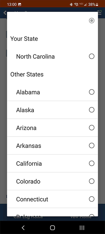
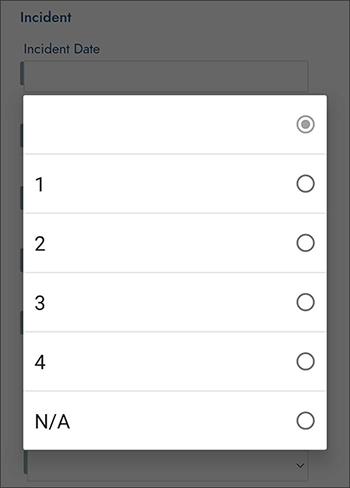
- Native: Uses the native controls on the mobile device such as scrollable popup lists. These lists respect group by titles, but do not display subtitles.
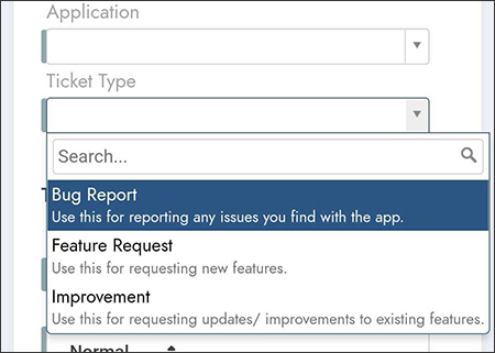
- Vinyl: Forces the mobile device to render App Builder's own version of the control, such as the drop-down style of list box with subtitles.
Some control types, such as Text, also show a Mobile Render Type field in this same accordion, letting you choose a mobile-optimized input type: Email, Phone Number, or URL.
Examples
The following examples compare how a List control renders with Native selected versus Vinyl (or Application Default, when the application-level setting uses App Builder's own UI) selected.
Native examples
With Native selected, grouped values keep their group titles but don't display subtitles:
Selecting a value opens the mobile device's own scrollable picker:
App Builder example
With Vinyl selected instead, the list displays as a dropdown-style box showing each option's description title and subtitle: