Controls in Jitterbit App Builder
Overview
A control displays a single piece of data, such as text, an image, or a date. Controls are the building blocks of an App Builder application: one or more controls make up a panel, and one or more panels make up a page, so the specific controls you choose determine what your users can see and edit. Controls can be one of several types, which control what the data shown looks like; see Control types for a list of every type available.
This page describes the shape of a control's own settings dialog.
Configure a control
Once a control has been added to a panel (see Add and delete a control for details), it can be configured using its settings dialog, accessible from either the Live Designer or the App Workbench. From the Live Designer, click any control on any page and its settings will appear in the designer. From the App Workbench Pages tab, visit the Page Edit page for the page where the control is, and click the Controls button for the panel that contains it. When the list of controls appears, double-click the row or click the Open record icon to see the control's settings.
The control settings vary a lot depending on the control type. This page describes the most common features, while specific options and details can be found on each control type's dedicated page (see Control types for a list of every type available). For instance, the screenshot below shows the settings dialog of an Inline Menu control:
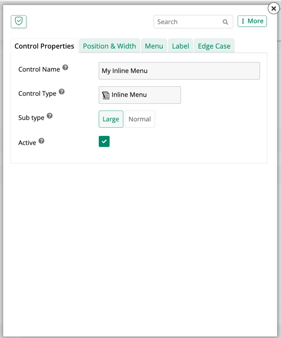
Control Properties
In the Control Properties tab, basic settings for the control are defined. The options shown vary a lot depending on control type. Common settings include Control Name, Control Type, Active, and Column. For instance, these are the options shown in the Control Properties tab for a Text control:
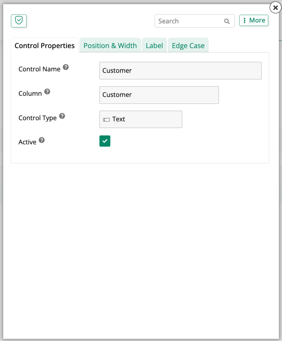
See your control type's own page under Types for the fields it specifically adds.
Position & Width
As with every tab in this dialog, this tab's exact fields can vary by control type. For most control types, it shows a single Position and Size accordion:
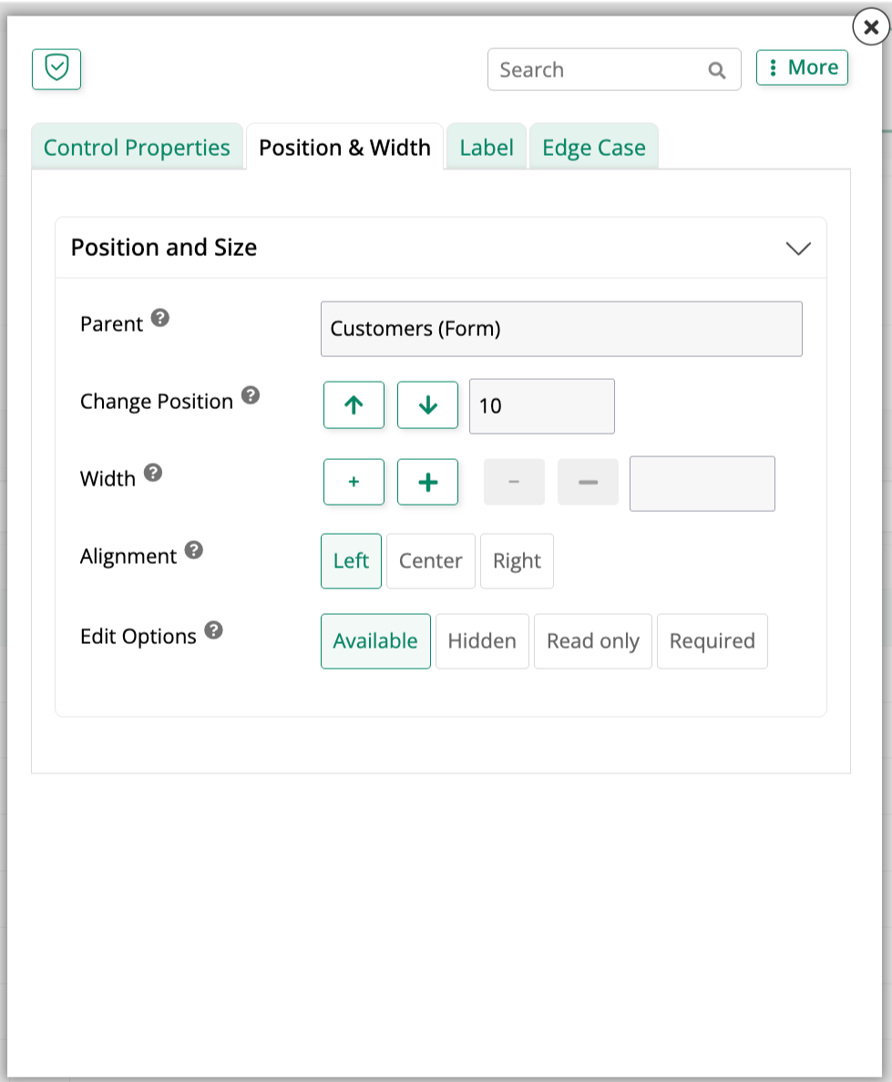
- Parent: The panel or container the control belongs to.
- Change Position: Reorders the control among its siblings, using the up and down arrows or by entering a position number directly.
- Width: Adjusts the control's width, either directly in the field or using the increment and decrement buttons.
- Alignment: Aligns the control's content to the Left, Center, or Right.
- Edit Options: Sets whether the control is Available, Hidden, Read only, or Required.
See Build a simple app for a walkthrough that uses several of these fields.
Label
Like the other tabs, this one's exact fields can vary depending on the selected control type. For most control types, it shows a single Label accordion:
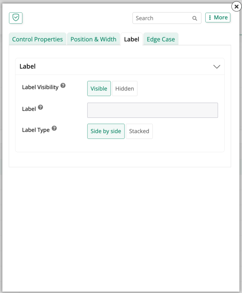
- Label Visibility: Shows or hides the control's label entirely.
- Label: The label text to display.
- Label Type: Displays the label Side by side with the control's value, or Stacked above it.
Edge Case
Edge Case holds a control's less commonly used settings. The accordions that appear here, as well as their exact fields, also vary a lot depending on the control type. This screenshot shows the Edge Case tab for a Text control:
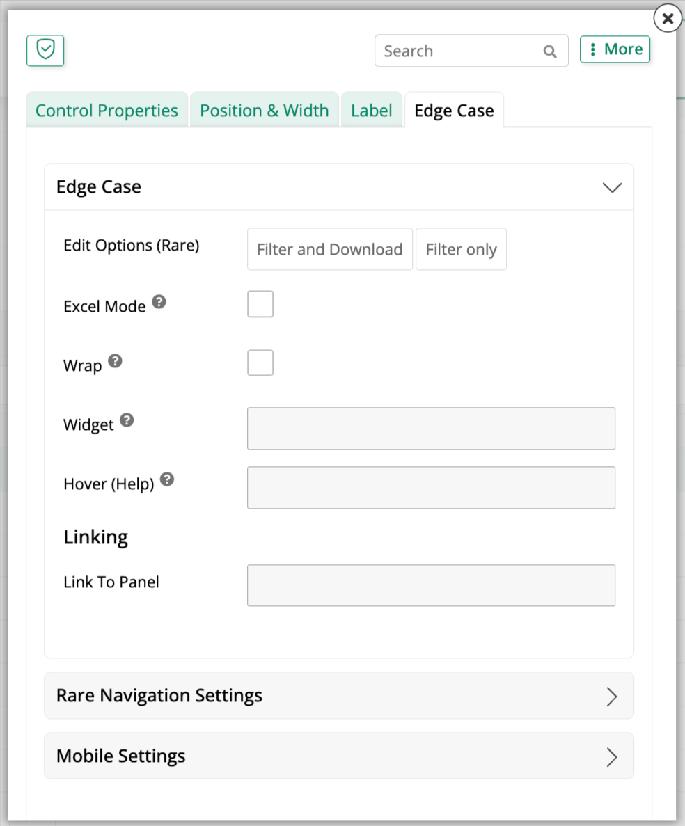
- Edit Options (Rare): Toggles between Filter and Download and Filter only.
- Excel Mode: Lets a control's value be edited and saved directly, the way a spreadsheet cell would, instead of entering a separate edit state.
- Initial Focus: (As of App Builder 4.69.) Makes the control a candidate to receive keyboard focus first when its panel, filter dialog, or grid row opens for editing. This option isn't available for every control type. For example, it doesn't appear for a Button control. See Initial Focus for details.
- Wrap: Wraps the control's displayed content instead of letting it overflow.
- Widget: Attaches a widget to the control.
- Hover (Help): Sets help text that appears when a user hovers over the control.
- Linking > Link To Panel: Links the control to another panel on the same page.
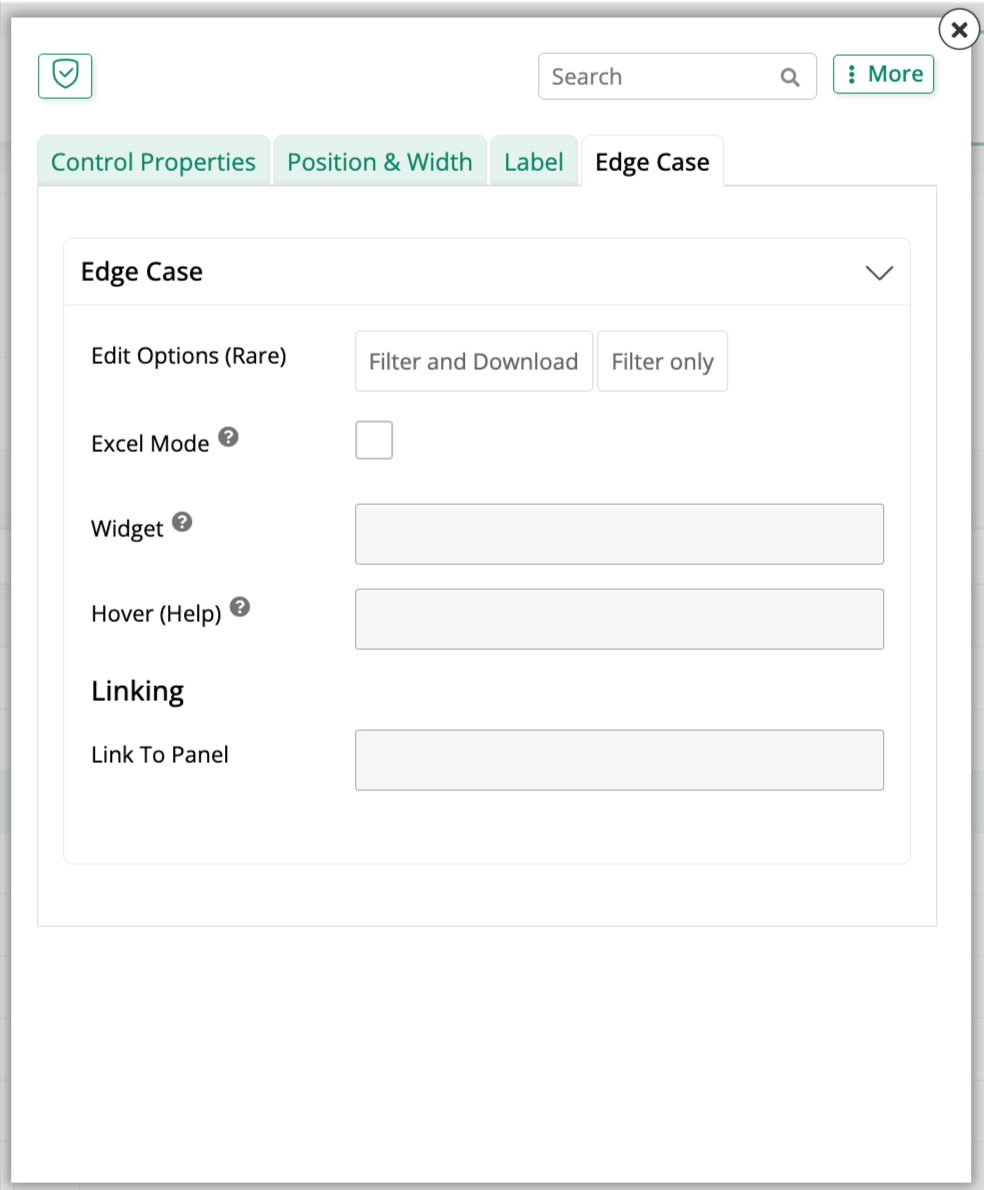
Beyond this base accordion, some control types show one or both of the following additional accordions, and some show neither. A Checkbox control, for example, shows only the base accordion:
Rare Navigation Settings
Use the settings in this accordion to turn the control's value into a link to another page, an event, or a URL:
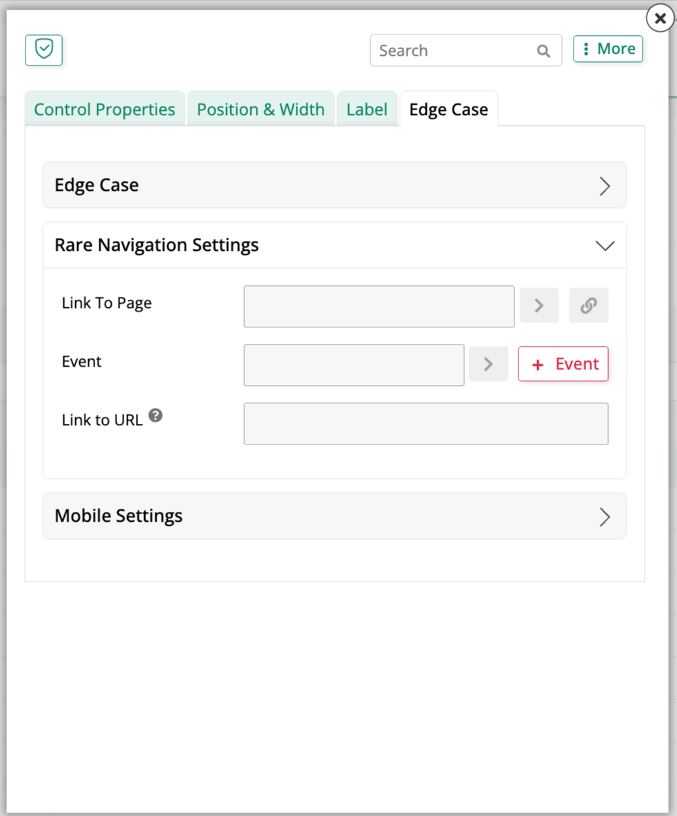
See Configure a control as a navigation link for which control types support this and how to configure it.
Mobile Settings
Use the settings in this accordion to control whether the control renders using the mobile device's native UI or App Builder's own UI on small screens:
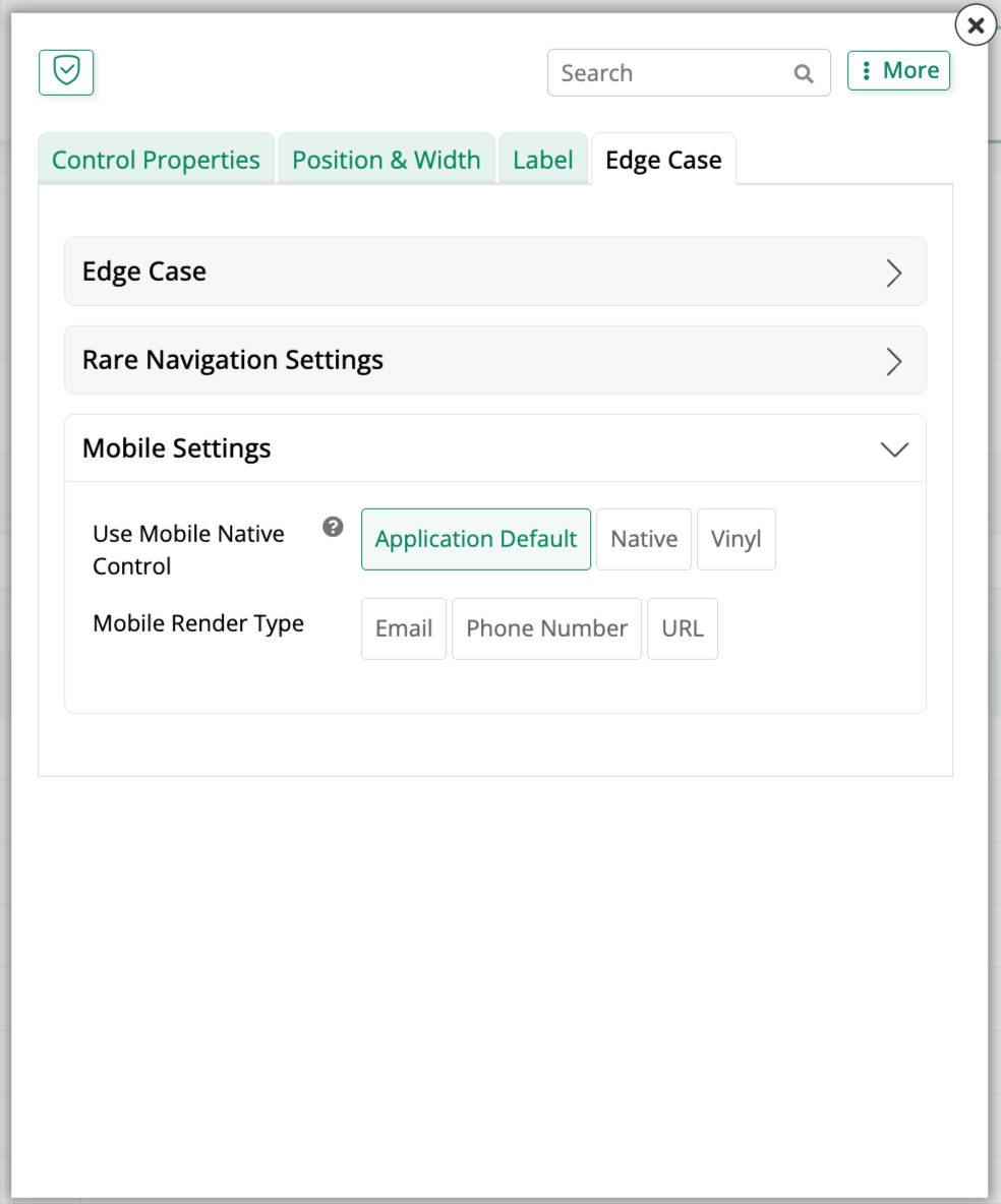
See Native mobile controls for how to configure this at the application level and for an individual control.
Initial Focus
Select Initial Focus in a control's Edge Case tab to have that control receive keyboard focus automatically when its panel, filter dialog, or grid row opens for editing. Users can start typing without clicking into the field first. This is useful for high-volume data entry, such as a barcode scan field or a search field. This option is available as of App Builder 4.69.
When Initial Focus applies
- A panel receives initial focus while it is in an insert or edit state, including a page that opens in an insert or edit state. A panel that only displays data receives initial focus on page load only if it contains a control in Excel Mode that has Initial Focus selected.
- A filter dialog receives initial focus when it opens.
- A grid row receives initial focus when it enters an insert or edit state. If the user previously set a focus column for the row, that column keeps the focus.
- The same setting applies to both insert and edit states.
- Each panel, filter dialog, and grid row can have its own initial focus field. When a page has more than one panel, a control with Initial Focus selected takes focus ahead of the first control in another panel.
Select more than one field
You can select Initial Focus on more than one control in the same panel. This is useful when controls display only under certain conditions. Controls that are hidden or disabled are skipped, and the first remaining selected control in the panel receives focus. If none of the selected controls can receive focus, focus goes to the first available control, as it does when no control is selected.
Limitations
- Hidden or disabled controls, and controls that cannot receive focus, never receive initial focus.
- Initial focus does not move focus if the user is already in a control in the same panel, dialog, or row. If the user starts editing by clicking a control, that control keeps the focus.
- Initial focus does not change the Tab or Shift + Tab order.
- Inside an embedded frame that does not have focus, the browser prevents automatic focus, so initial focus has no effect there.
Additional control settings
A few closely related settings live outside a control's own dialog. Related controls can be organized together; see Control groups for grouping them into an accordion, field group, or set of tabs. On a multi-row panel, a column's priority, sort order, width, and whether it's pinned are each configured separately from the control itself. Intrinsic control options add built-in create, update, and delete behavior to a control bound to a column, and a Button, Icon, or Image control can also show a badge.